Help us build this. Leave comments, suggest improvements, and help create better design documentation for agents.
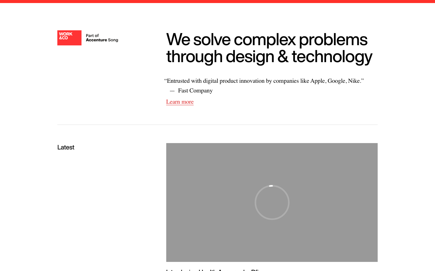
Work & Co
AgencyWork & Co presents an editorial-inspired aesthetic that balances corporate credibility with creative sophistication. The serif body typography against Helvetica headlines creates a publishing-meets-consulting tension, while the stark red accent punctuates an otherwise monochromatic palette. The generous whitespace and video-centric layout suggests confidence in letting their work speak louder than flashy design tricks.
Design Identity
Signature Color
Work Red
#FF0000
bold creative confidence and digital agency authority
Visual Identity
Distinctive typographic contrast between serif body text and sans-serif headlines, combined with fearless use of negative space and red as the only color accent in an otherwise grayscale world.
Component Style
Minimal intervention approach - clean sans-serif buttons and inputs with subtle styling, letting content hierarchy drive the experience rather than decorative UI elements.
Spacing Philosophy
Museum-gallery spacing with expansive breathing room between sections, creating a sense of premium curation and allowing individual elements to command attention.
Design Principles
- Headlines use HelveticaNowDisplay at 56px for maximum impact
- Body text exclusively in Adobe Garamond Pro for editorial credibility
- Red used sparingly as the sole color accent
- Video content takes center stage with full-width treatment
- Generous vertical spacing creates gallery-like presentation
Target Audience
Fortune 500 executives and marketing leaders seeking a sophisticated digital agency that balances creative vision with enterprise-grade execution.
Mood
Design descriptions are AI-generated based on visual analysis and may not fully reflect the brand's official design guidelines.
Design System
Typography Scale
| Element | Font | Size | Weight | Line Height |
|---|---|---|---|---|
| body | 16px | 400 | 18.4px | |
| h1 | 56px | 500 | 56px | |
| h2 | 21px | 500 | 28px | |
| h3 | 18px | 500 | 28px | |
| p | 20px | 400 | 30px | |
| a | 16px | 400 | 18.4px | |
| button | 18px | 500 | 27px | |
| input | 16px | 400 | 28px | |
| body | 16px | 400 | 18.4px | |
| h1 | 56px | 500 | 56px |
Color Palette
No colors extracted