Help us build this. Leave comments, suggest improvements, and help create better design documentation for agents.
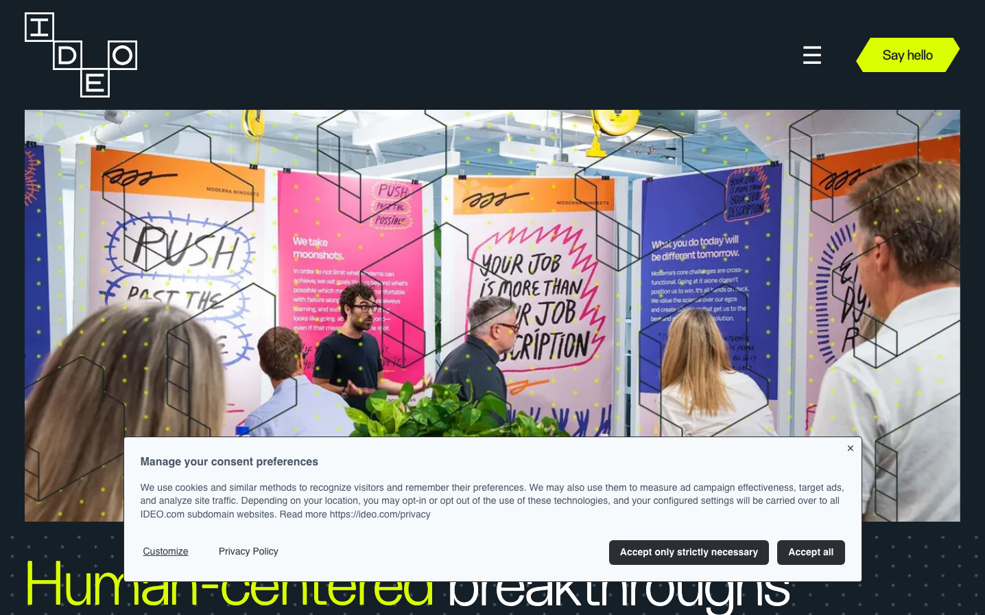
IDEO
AgencyIDEO's design approach is centered around human-centered design, focusing on empathy, creativity, and iterative problem-solving to create innovative solutions. Their design system reflects a distinctive balance between minimalism and functionality, catering to a diverse range of clients and industries.
Design Identity
Signature Color
Charcoal Gray
#2b2e35
This deep, sophisticated gray conveys IDEO's design expertise, professionalism, and commitment to crafting thoughtful, high-quality solutions.
Visual Identity
IDEO's visual language is characterized by a clean, modern aesthetic with a focus on simplicity and clarity. Their design leverages a restrained color palette, bold typography, and generous use of white space to create a sense of elegance and sophistication. The overall visual identity communicates IDEO's design philosophy of user-centric, innovative problem-solving.
Component Style
IDEO's UI components exhibit a balanced approach, blending minimal, streamlined elements with subtle, considered details. The design strikes a refined, polished tone, with gently rounded corners and a heightened emphasis on typography and layout over ornamentation.
Spacing Philosophy
IDEO's design system places a strong emphasis on the strategic use of whitespace, leveraging ample margins, padding, and negative space to create a sense of openness and clarity. This approach allows individual design elements to breathe and encourages focused user interaction.
Design Principles
- Human-Centered
- Simplicity
- Functionality
- Craftsmanship
- Innovation
Target Audience
IDEO's design caters to a diverse range of clients, including global corporations, startups, and nonprofits, who are seeking thoughtful, user-focused solutions to complex problems. The design appeals to a professional, design-conscious audience that values creativity, quality, and impact.
Mood
Design descriptions are AI-generated based on visual analysis and may not fully reflect the brand's official design guidelines.
Design System
Typography Scale
| Element | Font | Size | Weight | Line Height |
|---|---|---|---|---|
| body | 14px | 400 | 20px | |
| h1 | 90px | 300 | 88px | |
| h2 | 40px | 300 | 40px | |
| h3 | 40px | 300 | 40px | |
| p | 14px | 400 | 19.6px | |
| a | 14px | 400 | 14px | |
| button | 14px | 400 | 19.6px | |
| input | 14px | 400 | normal | |
| nav | 14px | 400 | 20px |
Color Palette
#2b2e35#f7fafc#4a5568#2d3748#edf2f7#38a169#ffffff#e53e3e#e2e8f0#f7c2c2#000000#a0aec0