Help us build this. Leave comments, suggest improvements, and help create better design documentation for agents.
Rally
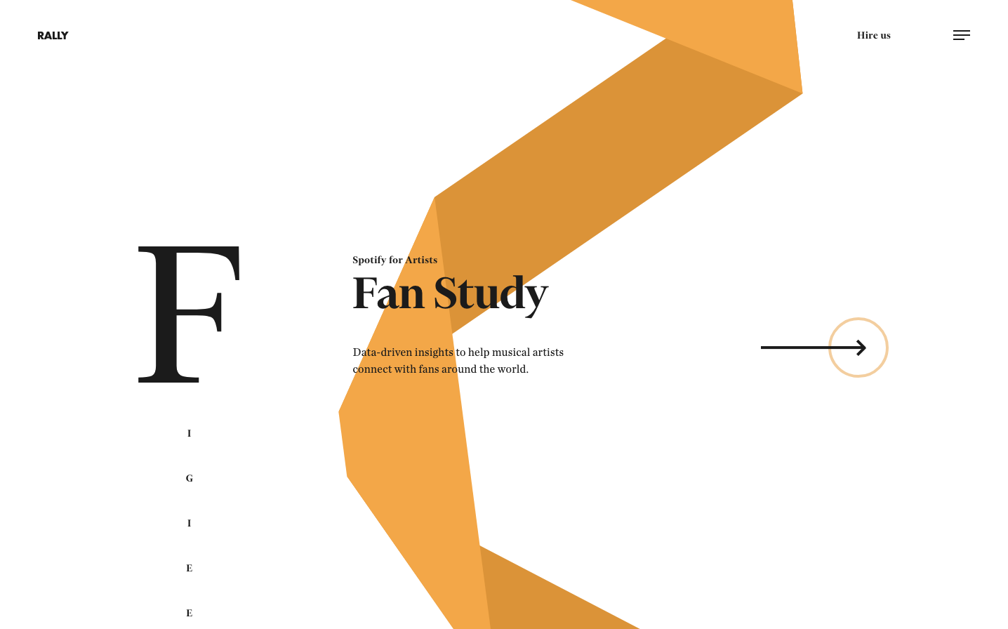
AgencyRally embodies a sophisticated editorial aesthetic that merges premium publishing with data analytics, using warm golden orange ribbons that flow like silk through stark typographic layouts. The brand feels like a luxury magazine for the music industry, where classical serif typography meets contemporary geometric abstractions.
Design Identity
Signature Color
Rally Gold
#E89441
Creative warmth and premium insights - the golden thread connecting artists to their audience data
Visual Identity
Flowing geometric ribbon elements that weave through classical serif typography, creating dynamic negative space relationships that feel both editorial and data-driven
Component Style
Minimal circular buttons with thin stroke outlines and no fills, emphasizing the geometric flow. Everything feels weightless and editorial, with components that breathe rather than demand attention
Spacing Philosophy
Generous whitespace creates museum-like breathing room, with the golden ribbon element serving as the only dense visual anchor. Extreme contrast between crowded geometric forms and vast empty space
Design Principles
- Typography uses only two families: Financier Display for headers, Chronicle Deck for body
- Golden ribbon elements never have hard edges - always flowing organic geometry
- Extreme size contrast: 72px headers against 16px body text
- Monochromatic palette with single accent color for maximum impact
- Vertical typography layouts with letters stacked individually
Target Audience
Independent musicians and music industry professionals who value artistic sophistication over flashy tech interfaces
Mood
Design descriptions are AI-generated based on visual analysis and may not fully reflect the brand's official design guidelines.
Design System
Typography Scale
| Element | Font | Size | Weight | Line Height |
|---|---|---|---|---|
| body | 0px | 400 | normal | |
| h2 | 72px | 600 | 73.8px | |
| h3 | 16px | 600 | 24px | |
| p | 16px | 400 | normal | |
| a | 0px | 400 | normal |
Color Palette
No colors extracted