Help us build this. Leave comments, suggest improvements, and help create better design documentation for agents.
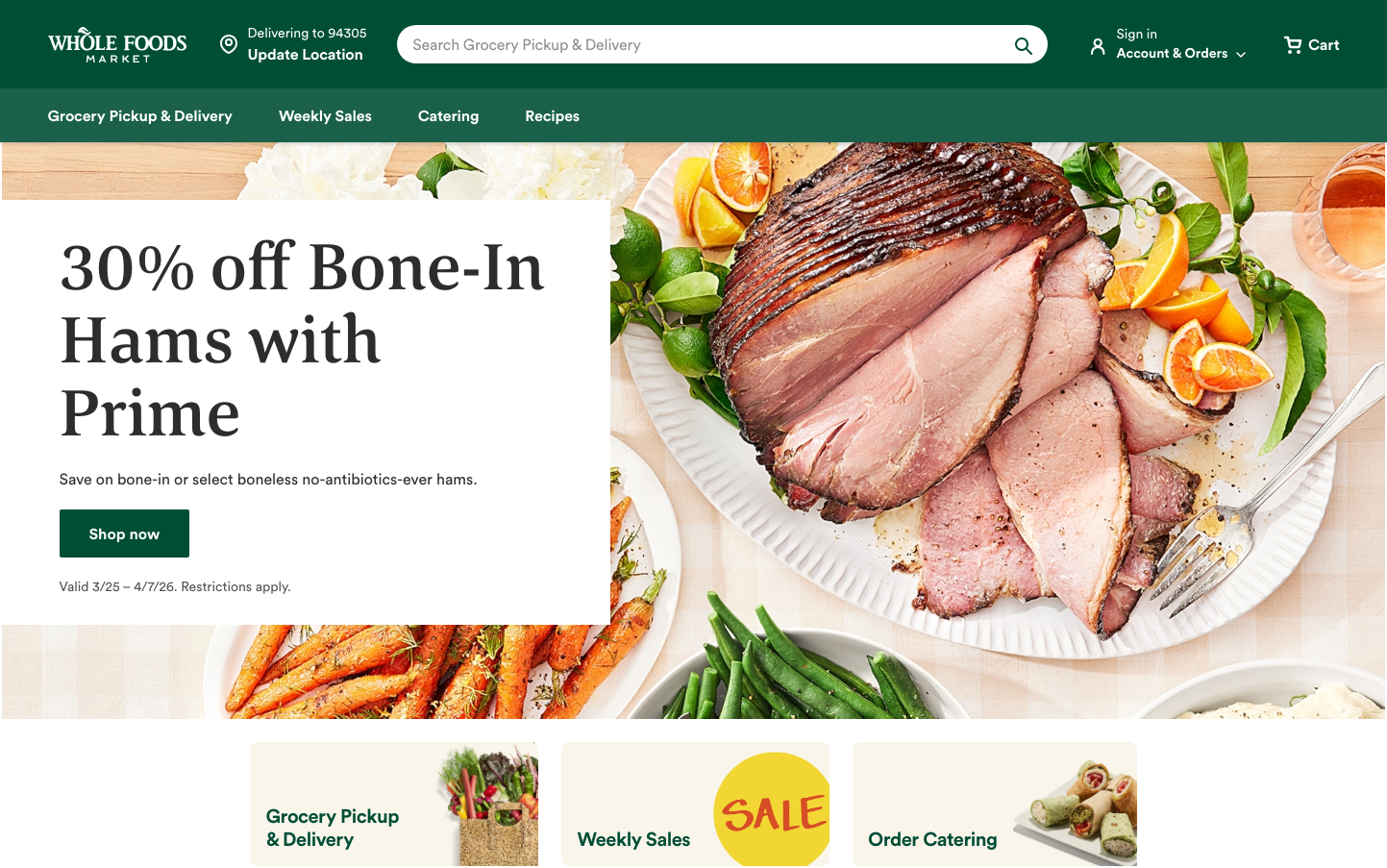
Whole Foods
RetailWhole Foods establishes premium organic sophistication through its signature forest green paired with warm, earthy food photography and refined typography mixing serif elegance with sans-serif accessibility. The design feels like a curated farmers market - natural, trustworthy, and consciously upscale.
Design Identity
Signature Color
Whole Foods Forest
#2d5a3d
organic authenticity and premium natural quality
Visual Identity
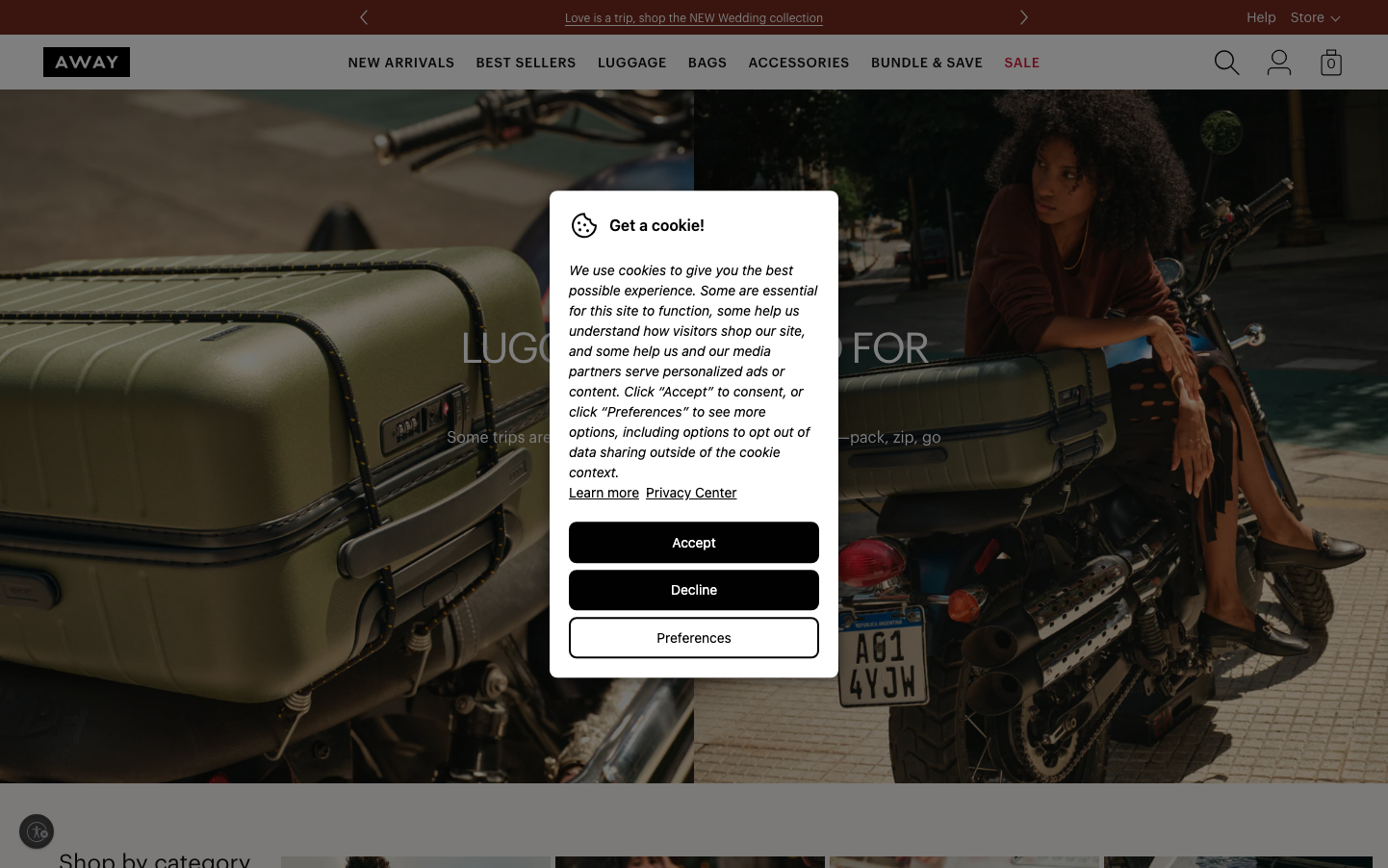
Lush food photography with natural lighting fills generous space, always accompanied by that distinctive deep forest green header - creating an immediately recognizable premium grocery aesthetic that feels more like editorial content than e-commerce.
Component Style
Buttons are clean rectangles with minimal 4-6px border radius, using solid fills without shadows. Everything feels grounded and substantial rather than floating - cards sit directly on backgrounds, inputs have subtle borders, maintaining that natural, unprocessed aesthetic.
Spacing Philosophy
Breathing room dominates with 30-60px section gaps that let hero food imagery command attention. Internal component padding stays modest at 16-20px, creating hierarchy where food photography gets maximum real estate while UI elements remain quietly functional.
Design Principles
- Food photography always takes 60%+ of hero sections
- Forest green appears in headers and primary actions only
- Border radius never exceeds 8px - keeping things natural, not trendy
- White space uses 30px, 60px, or 120px gaps - nothing in between
- Typography mixing serif headlines with sans-serif body creates editorial feel
Target Audience
Health-conscious families and cooking enthusiasts who value ingredient quality over convenience, willing to pay premium for organic and sustainable food options
Mood
Design descriptions are AI-generated based on visual analysis and may not fully reflect the brand's official design guidelines.
Design System
Typography Scale
| Element | Font | Size | Weight | Line Height |
|---|---|---|---|---|
| body | 16px | 400 | 24px | |
| h1 | 16px | 400 | 56px | |
| h2 | 16px | 400 | 48px | |
| h3 | 22px | 700 | 28px | |
| p | 16px | 350 | 24px | |
| a | 16px | 700 | 24px | |
| button | 16px | 400 | 24px | |
| input | 16px | 350 | 24px | |
| nav | 16px | 400 | 24px | |
| header | 16px | 400 | 24px |
Color Palette
#3b82f6#ffffff