Help us build this. Leave comments, suggest improvements, and help create better design documentation for agents.
Carrefour
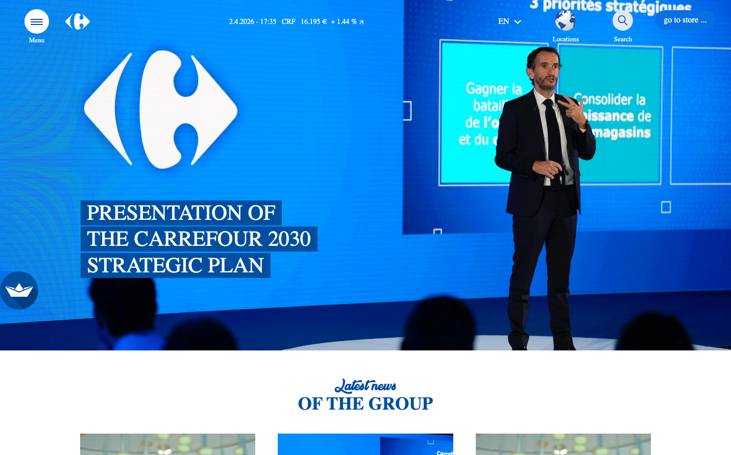
RetailCarrefour's brand identity combines deep corporate blues with strategic turquoise accents to project institutional confidence and retail accessibility. The Ubuntu typography creates a friendly, humanistic counterpoint to the formal presentation setting, while the bold geometric diamond logo anchors a professional yet approachable aesthetic.
Design Identity
Signature Color
Carrefour Corporate Blue
#0066CC
retail authority and strategic vision - conveying both corporate reliability and consumer trust
Visual Identity
The distinctive white diamond logo set against gradient blue backgrounds, paired with strategic cyan/turquoise content blocks that break up corporate formality with retail energy.
Component Style
Clean, minimal components with subtle rounded corners and no heavy shadows - buttons feel approachable with moderate padding, while content cards use bright accent colors to maintain engagement in an otherwise corporate environment.
Spacing Philosophy
Generous whitespace dominates the presentation layout with large 80px+ gaps between major sections, while UI elements maintain intimate 16-24px spacing to keep navigation accessible and human-scaled.
Design Principles
- Ubuntu font family exclusively at 14-32px sizes for human accessibility
- Blue gradients anchor authority while cyan blocks inject retail energy
- Typography weights stay conservative: 400 regular, 500 medium, 700 bold maximum
- Component borders use subtle rounding, never exceeding 8px radius
- 50.4px line-height on buttons creates substantial click targets
Target Audience
Corporate stakeholders, investors, and retail executives who need to see both strategic vision and consumer-friendly execution in equal measure.
Mood
Design descriptions are AI-generated based on visual analysis and may not fully reflect the brand's official design guidelines.
Design System
Typography Scale
| Element | Font | Size | Weight | Line Height |
|---|---|---|---|---|
| main | 16px | 400 | 24px | |
| body | 16px | 400 | 24px | |
| h1 | 16px | 400 | 24px | |
| h2 | 16px | 400 | 24px | |
| p | 14px | 400 | 22.75px | |
| a | 16px | 700 | 24px | |
| button | 18px | 400 | 50.4px | |
| input | 32px | 500 | 48px | |
| nav | 16px | 400 | 24px | |
| header | 16px | 400 | 24px |
Color Palette
No colors extracted