Help us build this. Leave comments, suggest improvements, and help create better design documentation for agents.
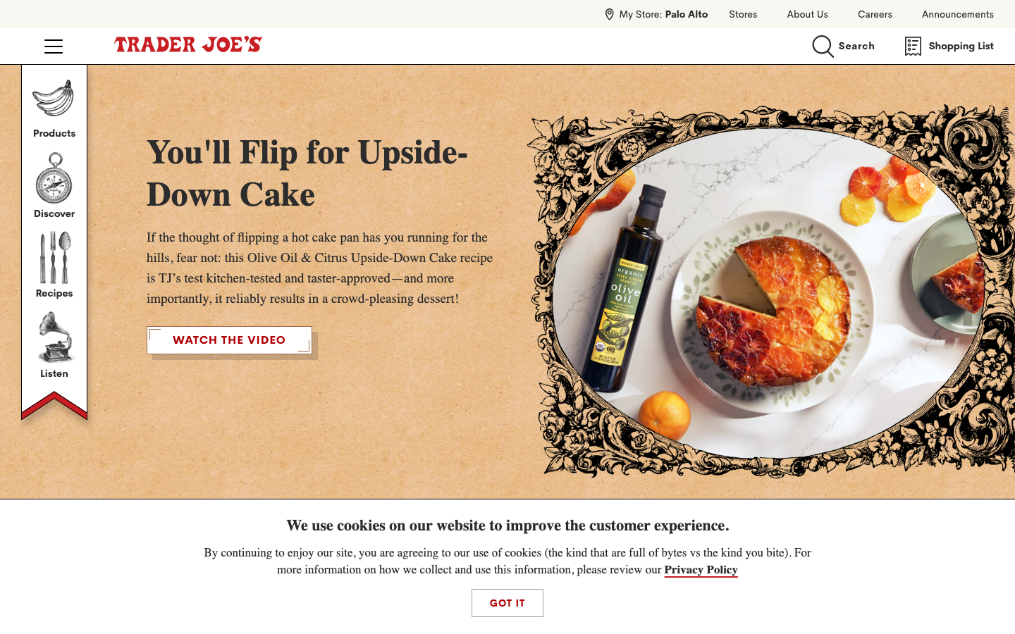
Trader Joe's
RetailTrader Joe's creates a warm, approachable aesthetic that feels like browsing a charming neighborhood market. The serif typography evokes artisanal craftsmanship while the ornate decorative frames and warm amber tones communicate comfort, authenticity, and culinary adventure.
Design Identity
Signature Color
Trader Joe's Harvest Orange
#D2691E
Warm culinary comfort and accessible gourmet experiences
Visual Identity
Ornate decorative flourishes and botanical frames combined with editorial-style food photography create an unmistakable 'artisanal market' aesthetic that feels both curated and approachable.
Component Style
Clean rectangular buttons with subtle borders, minimal shadows, and serif typography. Everything feels approachable rather than corporate - rounded enough to be friendly but structured enough to be trustworthy.
Spacing Philosophy
Generous whitespace around hero content creates breathing room, while asymmetrical layouts feel organic rather than grid-locked. Content flows naturally like browsing market aisles.
Design Principles
- Headlines always use freight-text-pro serif at 48px for major headings
- Body copy stays at 17px serif for readability and warmth
- Decorative elements frame content without overwhelming
- Warm earth tones dominate with strategic pops of brighter colors
- Navigation uses sans-serif while content uses serif for editorial feel
Target Audience
Food-curious families and urban professionals who value quality ingredients and unique discoveries without pretentious fine-dining intimidation
Mood
Design descriptions are AI-generated based on visual analysis and may not fully reflect the brand's official design guidelines.
Design System
Typography Scale
| Element | Font | Size | Weight | Line Height |
|---|---|---|---|---|
| body | 16px | 400 | 24px | |
| h1 | 48px | 700 | 60px | |
| h2 | 48px | 700 | 60px | |
| h3 | 35px | 700 | 48px | |
| h4 | 22px | 700 | 27px | |
| p | 17px | 400 | 24px | |
| a | 17px | 700 | 24px | |
| button | 14px | 700 | 18px | |
| nav | 16px | 400 | 24px | |
| header | 16px | 400 | 24px |
Color Palette
No colors extracted