Help us build this. Leave comments, suggest improvements, and help create better design documentation for agents.
Wells Fargo
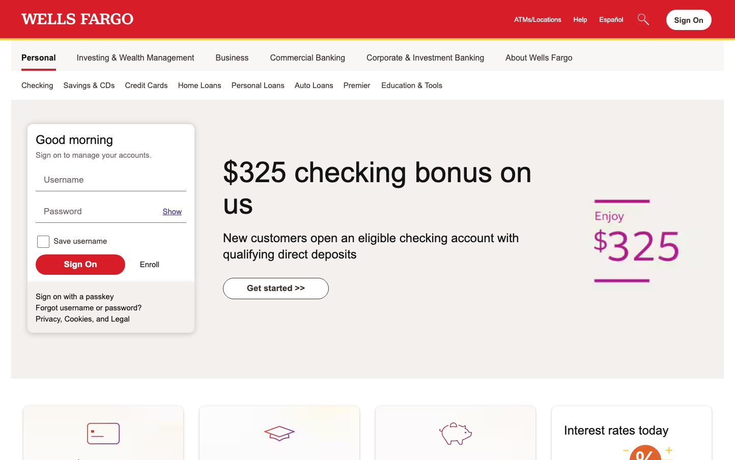
FinanceWells Fargo presents traditional banking authority through its signature red header and proprietary typeface, creating a deliberately conservative aesthetic that prioritizes trust over trendiness. The design balances corporate gravitas with accessible functionality, using stark contrasts and generous whitespace to guide users through financial tasks with confidence.
Design Identity
Signature Color
Wells Fargo Red
#D71E2B
institutional banking authority and American financial heritage
Visual Identity
The distinctive red header bar spanning the full width combined with the custom Wells Fargo Sans typeface creates an unmistakable corporate banking presence that feels deliberately institutional.
Component Style
Rounded rectangular buttons with subtle corner radius and solid fills, clean-lined input fields with minimal borders, and card components that use generous padding and soft shadows for a approachable yet professional feel.
Spacing Philosophy
Generous breathing room between major sections creates a sense of order and reduces cognitive load, while tighter spacing within components maintains functional efficiency - reflecting the balance between comfort and business productivity.
Design Principles
- Red brand color dominates the header for instant recognition
- Wells Fargo Sans typeface used exclusively across all text elements
- Input fields use larger 20px font size for accessibility
- Button text remains at standard 17px for consistency
- Moderate corner radius on interactive elements for approachable professionalism
Target Audience
Traditional banking customers who value institutional stability and prefer familiar, trustworthy interfaces over cutting-edge design trends
Mood
Design descriptions are AI-generated based on visual analysis and may not fully reflect the brand's official design guidelines.
Design System
Typography Scale
| Element | Font | Size | Weight | Line Height |
|---|---|---|---|---|
| body | 17px | 400 | 21.998px | |
| h1 | 34px | 400 | 0px | |
| h2 | 24px | 600 | 30px | |
| h3 | 13px | 600 | 16.25px | |
| p | 15px | 400 | 21.998px | |
| a | 17px | 400 | 0px | |
| button | 17px | 400 | normal | |
| input | 20px | 400 | 25px | |
| nav | 17px | 400 | 21.998px | |
| header | 17px | 400 | 21.998px |
Color Palette
No colors extracted