Help us build this. Leave comments, suggest improvements, and help create better design documentation for agents.
Goldman Sachs
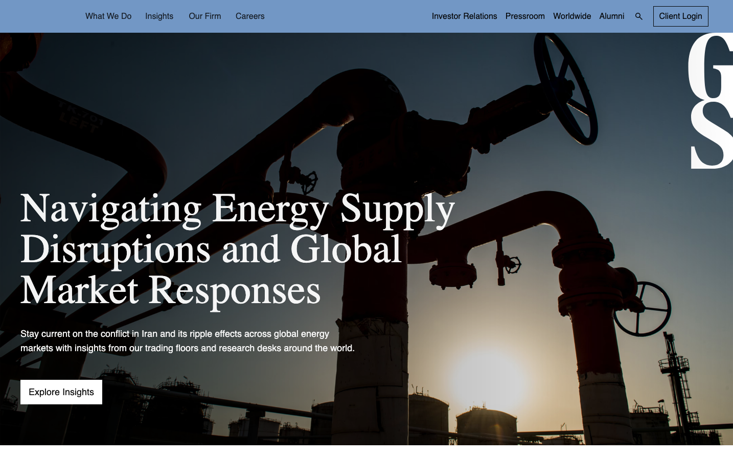
FinanceGoldman Sachs projects institutional gravitas through dramatic industrial imagery overlaid with sophisticated serif headlines and crisp sans-serif body text. The brand balances Wall Street authority with accessible expertise, using stark photography and generous whitespace to command attention.
Design Identity
Signature Color
Goldman Navy
#1E3A5F
institutional trust and financial expertise - the deep blue of established Wall Street authority
Visual Identity
Dramatic silhouetted industrial photography with bold serif headlines in massive 80px type, creating an unmistakable contrast between human scale and global infrastructure
Component Style
Clean, minimal buttons with subtle borders and generous padding. Typography-driven design with sharp, geometric containers that feel authoritative but approachable. No heavy shadows - everything relies on typography hierarchy and whitespace for impact.
Spacing Philosophy
Generous breathing room around hero content with dramatic full-bleed imagery. Large 80px headlines demand significant vertical space, while body text uses comfortable 28px line-height for readability across financial content.
Design Principles
- Headlines always use GS Serif at 80px with 300 weight for maximum impact
- Body copy maintains 18px/28px ratio for optimal financial document readability
- Navigation stays minimal at 16px to never compete with content hierarchy
- Buttons use 18px/22px with 500 weight for clear call-to-action distinction
- Industrial photography always uses high-contrast silhouettes against dramatic skies
Target Audience
C-suite executives, institutional investors, and sophisticated individual clients who expect Wall Street-caliber expertise with accessible communication
Mood
Design descriptions are AI-generated based on visual analysis and may not fully reflect the brand's official design guidelines.
Design System
Typography Scale
| Element | Font | Size | Weight | Line Height |
|---|---|---|---|---|
| body | 16px | 400 | normal | |
| h1 | 80px | 300 | 80px | |
| p | 18px | 400 | 28px | |
| a | 16px | 400 | 20px | |
| button | 18px | 500 | 22px | |
| nav | 16px | 400 | normal | |
| header | 16px | 400 | normal | |
| footer | 16px | 400 | normal |
Color Palette
No colors extracted