Help us build this. Leave comments, suggest improvements, and help create better design documentation for agents.
Uber
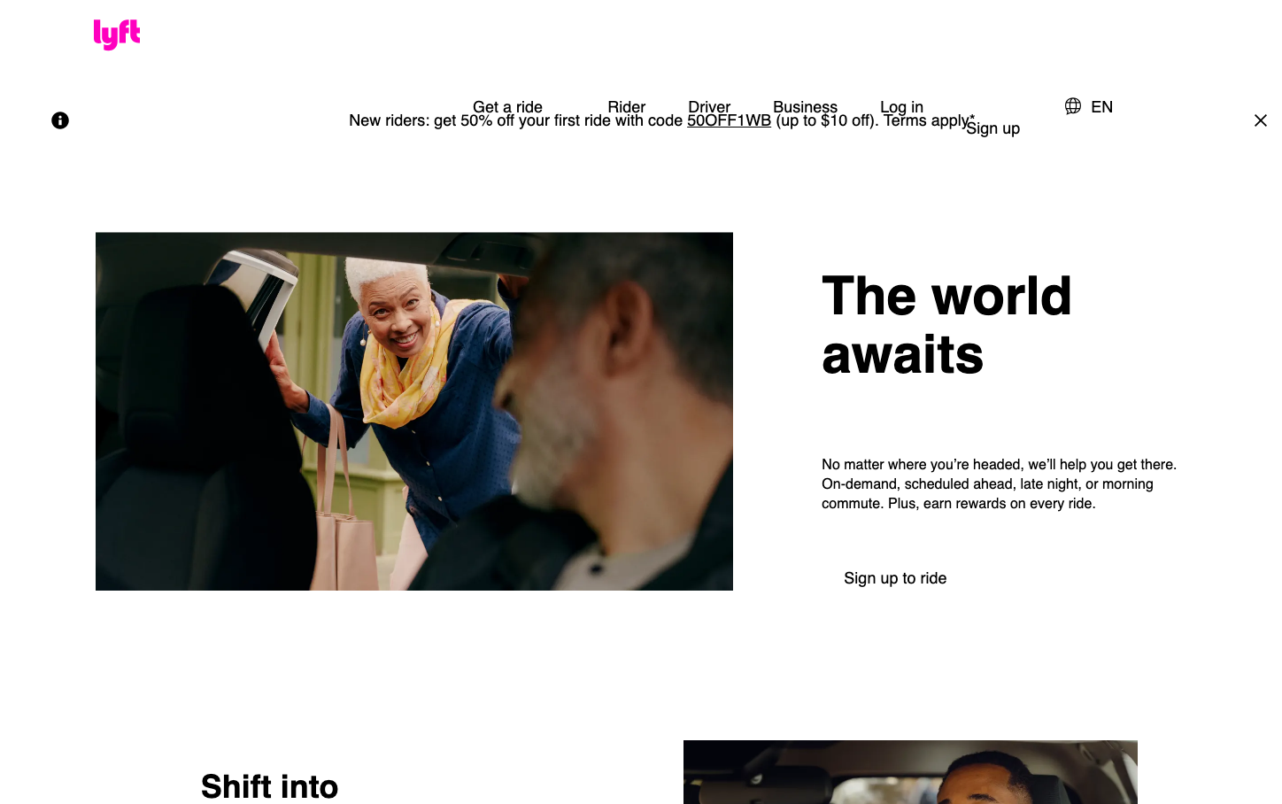
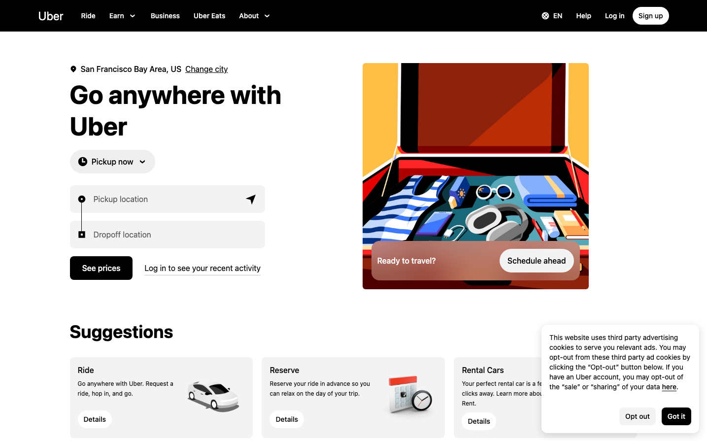
TransportationUber's brand radiates urban energy through bold, chunky headlines that command attention while maintaining accessibility. The black-and-white foundation with strategic color pops creates a metropolitan confidence that's both inviting and authoritative, like a reliable city navigator.
Design Identity
Signature Color
Uber Black
#000000
Premium urban sophistication and reliability - the color of professional transportation
Visual Identity
Chunky, heavy typography that takes up significant real estate paired with vibrant, lifestyle-focused illustrations that show movement and journey anticipation
Component Style
Rounded buttons with substantial padding that feel finger-friendly and approachable. Clean rectangular input fields with subtle borders. Everything has soft, welcoming corners around 8-12px radius with generous click targets.
Spacing Philosophy
Generous whitespace creates breathing room between major sections, while compact internal spacing keeps interactive elements tight and scannable. The layout uses asymmetrical balance with illustration taking up significant visual weight.
Design Principles
- Headlines use 700 weight UberMove at 52px for maximum impact
- Border radius stays between 8-12px for friendly accessibility
- Black dominates the palette with selective color for illustrations only
- Button text uses 500 weight at 14px for clarity
- Large clickable areas prioritize mobile-first interaction
Target Audience
Urban commuters and travelers who value convenience over complexity - people making quick transportation decisions on mobile devices
Mood
Design descriptions are AI-generated based on visual analysis and may not fully reflect the brand's official design guidelines.
Design System
Typography Scale
| Element | Font | Size | Weight | Line Height |
|---|---|---|---|---|
| body | 16px | 400 | normal | |
| h1 | 52px | 700 | 64px | |
| h2 | 36px | 700 | 44px | |
| h3 | 20px | 700 | 28px | |
| p | 16px | 400 | 24px | |
| a | 16px | 400 | normal | |
| button | 14px | 500 | 16px | |
| input | 16px | 400 | 24px | |
| nav | 16px | 400 | 24px | |
| footer | 16px | 400 | normal |
Color Palette
No colors extracted