Help us build this. Leave comments, suggest improvements, and help create better design documentation for agents.
Lyft
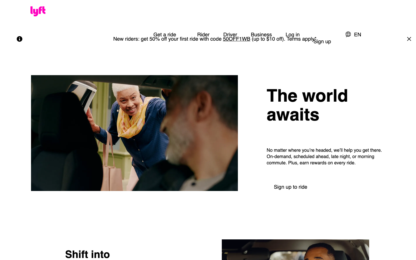
TransportationLyft's brand radiates warmth and approachability through its signature hot pink that pulses with energy and movement. The custom Rebel Sans typography creates a friendly yet confident voice that feels distinctly human in the tech landscape, while generous whitespace and lifestyle photography emphasize connection over cold efficiency.
Design Identity
Signature Color
Lyft Magenta
#FF00BF
Human-centered mobility that's bold, accessible, and emotionally engaging - breaking away from corporate blue tech tropes
Visual Identity
The electric magenta paired with lifestyle photography showing genuine human moments and emotions - you'd recognize it by the warm, people-first aesthetic that feels more like a community brand than a tech platform
Component Style
Soft, rounded components with generous padding that feel touchable and friendly. Buttons appear pill-shaped with smooth curves, cards have subtle rounded corners, and everything has a tactile, approachable quality with minimal harsh edges or stark contrasts
Spacing Philosophy
Breathing room prioritized over density - large gaps between sections create calm, while asymmetrical layouts with substantial whitespace make the interface feel uncontrived and human-scaled rather than grid-locked
Design Principles
- Magenta pink dominates as the primary brand color across all CTAs
- Rebel Sans custom typography for all headings and body text creates brand consistency
- Lifestyle photography shows real people in authentic moments
- Rounded corners on all interactive elements, never sharp edges
- Generous whitespace ratios favor readability over information density
Target Audience
Urban millennials and Gen Z who value experience over ownership, prioritizing convenience and community connection in their transportation choices
Mood
Design descriptions are AI-generated based on visual analysis and may not fully reflect the brand's official design guidelines.
Design System
Typography Scale
| Element | Font | Size | Weight | Line Height |
|---|---|---|---|---|
| body | 16px | 400 | normal | |
| h1 | 60px | 600 | 66px | |
| h2 | 36px | 600 | 45px | |
| p | 18px | 400 | 25px | |
| a | 16px | 400 | 0px | |
| button | 13.3333px | 400 | normal | |
| nav | 16px | 400 | normal | |
| header | 16px | 400 | normal | |
| footer | 16px | 400 | normal | |
| main | 16px | 400 | normal |
Color Palette
No colors extracted