Help us build this. Leave comments, suggest improvements, and help create better design documentation for agents.
Target
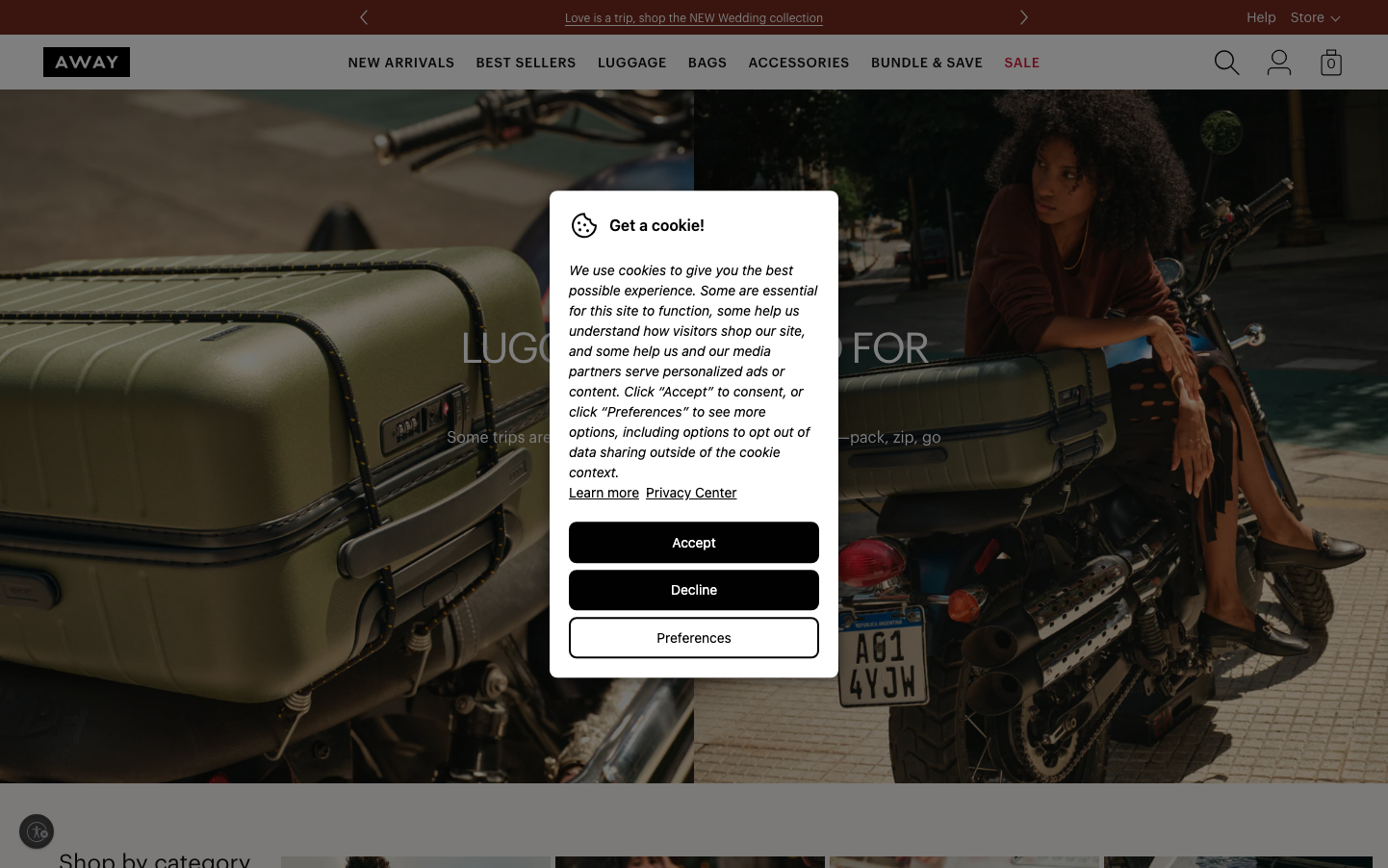
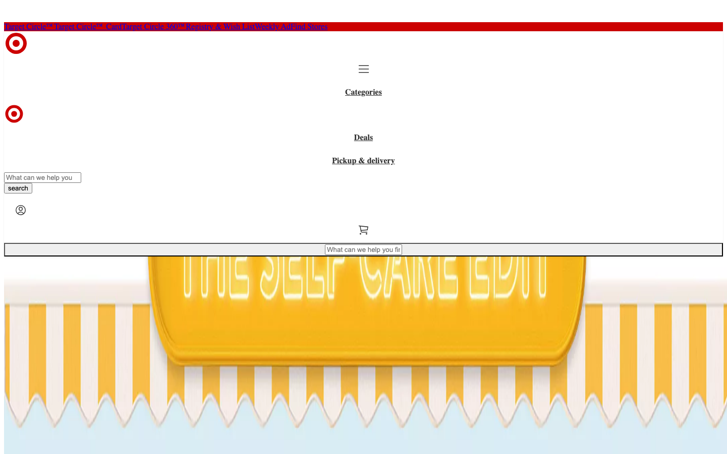
RetailTarget's brand radiates warm accessibility through its iconic red bullseye and playful yellow sunshine imagery, creating an inviting retail atmosphere that feels both familiar and cheerful. The design balances corporate functionality with friendly approachability, using bright colors and whimsical illustrations to transform mundane shopping into an optimistic experience.
Design Identity
Signature Color
Target Red
#CC0000
Bold retail confidence and accessible American optimism
Visual Identity
The distinctive red circular bullseye logo paired with bright yellow illustrated elements and clean sans-serif navigation creates an unmistakable retail-friendly aesthetic that prioritizes clarity and warmth over sophistication.
Component Style
Utilitarian components with minimal styling - basic input fields with simple borders, standard button treatments, and functional navigation elements that prioritize usability over visual flair. Everything feels approachable and unintimidating.
Spacing Philosophy
Generous whitespace around key brand elements with the prominent yellow banner dominating the hero area, while navigation and functional elements are compactly organized for efficient browsing and shopping workflows.
Design Principles
- Typography uses Times for content and Arial for interactive elements
- Bold red (#CC0000) serves as the primary brand anchor
- Yellow accent colors create warmth and energy
- Module gaps maintain 16px standard spacing
- Functional elements prioritize clarity over decoration
Target Audience
Mood
Design descriptions are AI-generated based on visual analysis and may not fully reflect the brand's official design guidelines.
Design System
Typography Scale
| Element | Font | Size | Weight | Line Height |
|---|---|---|---|---|
| body | 16px | 400 | normal | |
| h1 | 32px | 700 | normal | |
| h2 | 24px | 700 | normal | |
| h3 | 18.72px | 700 | normal | |
| p | 16px | 400 | normal | |
| a | 14px | 400 | normal | |
| button | 13.3333px | 400 | normal | |
| input | 13.3333px | 400 | normal | |
| main | 16px | 400 | normal |
Color Palette
No colors extracted