Help us build this. Leave comments, suggest improvements, and help create better design documentation for agents.
Sociolla
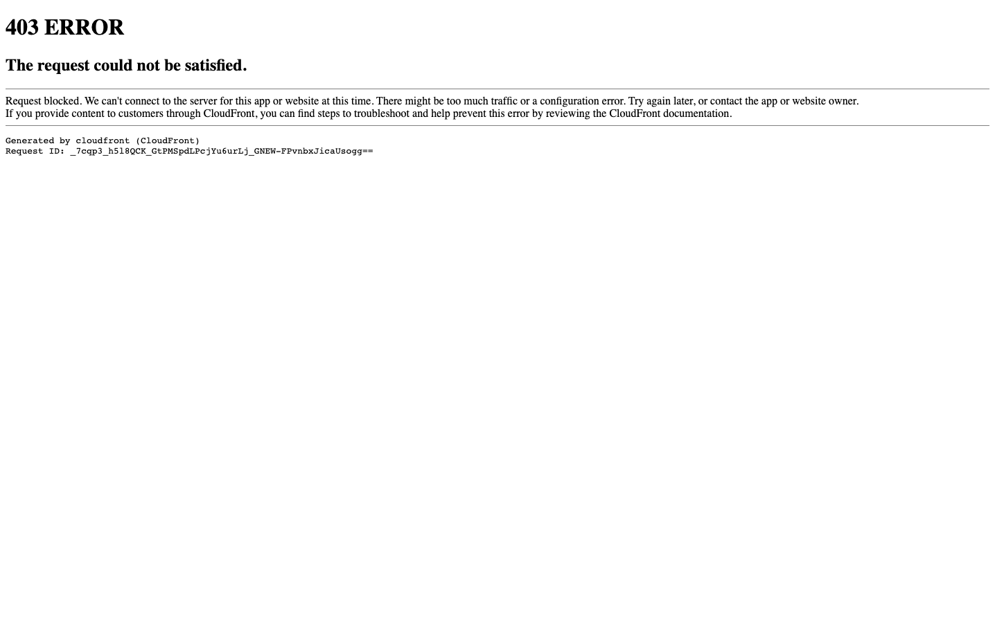
E-commerceThis is a stark, utilitarian error page that prioritizes clinical functionality over brand expression. The monospace typography and sparse layout create an atmosphere of technical transparency, while the abundant whitespace suggests systematic order rather than user comfort.
Design Identity
Signature Color
Technical Black
#000000
system authority and uncompromising functionality
Visual Identity
Extreme minimalism with technical monospace typography that feels more like server logs than consumer interface design
Component Style
No decorative UI components visible - purely text-based with sharp, unadorned typography. Everything feels raw and unpolished, like looking directly at system output
Spacing Philosophy
Generous whitespace dominates the layout with large gaps between sections, creating isolation rather than cohesion. The spacing feels more accidental than intentional
Design Principles
- Typography limited to basic serif and monospace fonts
- Zero visual decoration or styling elements
- High contrast black text on white background only
- Content hierarchy through font size alone
- Technical transparency over user experience polish
Target Audience
This appears to be a system error page not intended for end users - likely targeting developers or technical staff who need raw diagnostic information
Mood
Design descriptions are AI-generated based on visual analysis and may not fully reflect the brand's official design guidelines.
Design System
Typography Scale
| Element | Font | Size | Weight | Line Height |
|---|---|---|---|---|
| body | 16px | 400 | normal | |
| h1 | 32px | 700 | normal | |
| h2 | 24px | 700 | normal |
Color Palette
No colors extracted
UI Elements
No components detected