Help us build this. Leave comments, suggest improvements, and help create better design documentation for agents.
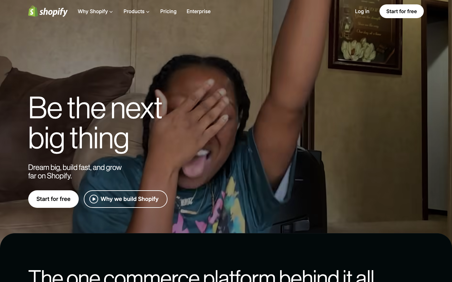
Shopify
E-commerceShopify embodies entrepreneurial optimism through warm sage green paired with ultra-clean typography that feels approachable yet ambitious. The NeueHaasGrotesk headlines create a distinctive geometric softness that balances aspiration with accessibility, while the emotional photography suggests genuine human triumph.
Design Identity
Signature Color
Shopify Green
#95bf47
entrepreneurial growth and accessible commerce success
Visual Identity
Massive 96px NeueHaasGrotesk headlines with unconventional 330-400 font weights that create a uniquely soft yet confident voice, paired with authentic emotional photography of real entrepreneurs celebrating milestones.
Component Style
Softly rounded buttons with generous padding and medium weight borders that feel substantial but inviting. Components have a pillow-soft aesthetic with subtle shadows and warm undertones that suggest comfort over corporate sterility.
Spacing Philosophy
Generous breathing room around hero elements with asymmetrical layouts that feel organic. Large typography dominates the vertical space while horizontal padding creates intimate conversation zones rather than formal presentation areas.
Design Principles
- Headlines use 96px NeueHaasGrotesk at 330-400 weight for approachable authority
- Body text switches to Inter-Variable for enhanced readability
- Border radius stays between 6-12px for friendly professionalism
- Photography always shows genuine emotion over staged commerce
- Green appears as accent color, not dominant background
Target Audience
First-time entrepreneurs and side-hustlers who need confidence-building tools to transform creative passion into sustainable businesses
Mood
Design descriptions are AI-generated based on visual analysis and may not fully reflect the brand's official design guidelines.
Design System
Typography Scale
| Element | Font | Size | Weight | Line Height |
|---|---|---|---|---|
| body | 16px | 400 | 24px | |
| h1 | 96px | 400 | 96px | |
| h2 | 96px | 400 | 96px | |
| h3 | 55px | 330 | 64px | |
| h4 | 20px | 400 | 28px | |
| p | 16px | 400 | 24px | |
| a | 16px | 550 | 24px | |
| button | 16px | 400 | 24px | |
| input | 16px | 400 | 24px | |
| nav | 16px | 400 | 24px |
Color Palette
#000000#18181b#a1a1aa#c1fbd4#d4d4d8#ffffff#d4f9e0#3f3f46#f4f4f5#71717a#9797a2#52525b