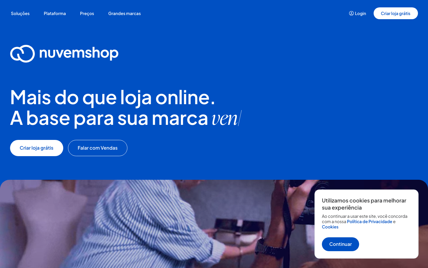
Help us build this. Leave comments, suggest improvements, and help create better design documentation for agents.
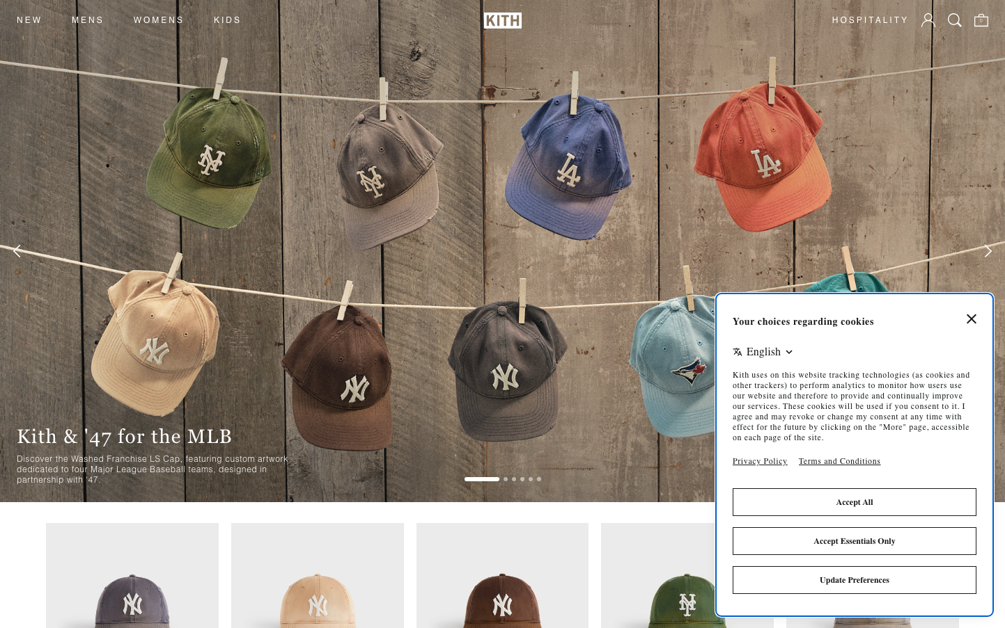
KITH
E-commerceKITH's brand aesthetic merges streetwear authenticity with premium retail sophistication, using raw wooden textures and weathered baseball caps hung on clotheslines to evoke nostalgic Americana. The typography combines modern sans-serif precision (Proxima Nova) with classical editorial elegance (Georgia serifs), creating a tension between contemporary streetwear culture and timeless craftsmanship.
Design Identity
Signature Color
Pure White
#ffffff
Premium minimalism and streetwear authenticity - allows product colors and textures to be the hero while maintaining luxury retail cleanliness
Visual Identity
Rustic wooden backdrops with clothesline product displays - creating an authentic, handcrafted presentation that transforms premium streetwear into collectible art pieces. The juxtaposition of weathered textures with pristine typography creates instant recognition.
Component Style
Minimal, borderless elements that fade into the background. Navigation and UI components use ultra-light font weights (300) creating whisper-thin text that doesn't compete with product imagery. No visible shadows, borders, or decorative elements - everything serves the product.
Spacing Philosophy
Generous negative space allows products to breathe and feel gallery-like. The clothesline layout creates organic, asymmetrical spacing that feels curated rather than systematically designed, mimicking how collectibles are naturally displayed.
Design Principles
- Typography never exceeds 300 font weight for UI elements
- Product imagery always dominates over interface design
- Serif headings (Georgia) only for editorial hierarchy
- 12px base font size maintains subtle, non-intrusive presence
- Zero decorative UI elements - pure content focus
Target Audience
Streetwear collectors and fashion enthusiasts who view limited releases as cultural artifacts, valuing authenticity and craftsmanship over mass market appeal
Mood
Design descriptions are AI-generated based on visual analysis and may not fully reflect the brand's official design guidelines.
Design System
Typography Scale
| Element | Font | Size | Weight | Line Height |
|---|---|---|---|---|
| body | 12px | 300 | 15px | |
| h2 | 28px | 400 | 37.324px | |
| h3 | 18px | 400 | 23.994px | |
| p | 14px | 400 | normal | |
| a | 12px | 300 | 15px | |
| button | 12px | 300 | 15px | |
| input | 16px | 300 | 15px | |
| nav | 12px | 300 | 15px | |
| footer | 12px | 300 | 15px | |
| main | 12px | 300 | 15px |
Color Palette
#007aff#e9e9eb#ffffff