Help us build this. Leave comments, suggest improvements, and help create better design documentation for agents.
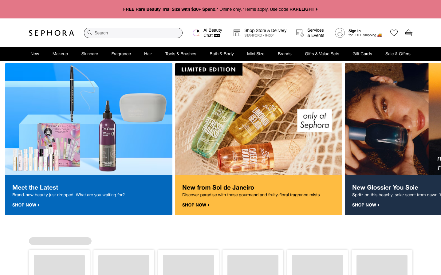
Sephora
BeautySephora's brand identity radiates beauty-forward confidence through bold product imagery paired with clean navigation, creating an aspirational yet approachable shopping experience. The design balances dramatic editorial photography with subtle UI elements, letting products take center stage while maintaining sophisticated restraint.
Design Identity
Signature Color
Sephora Black
#000000
Premium beauty authority and timeless sophistication that frames colorful products without competing
Visual Identity
Dramatic product photography with editorial lighting against clean white backgrounds, creating gallery-like presentation where beauty products are treated as art objects
Component Style
Minimal UI components with clean lines and subtle typography that disappear into the background. Buttons and navigation elements use understated styling with thin fonts and plenty of breathing room, ensuring products remain the visual focus.
Spacing Philosophy
Generous whitespace creates a luxurious gallery atmosphere, with tight internal component spacing (8-16px) but expansive section gaps that let hero imagery breathe and command attention.
Design Principles
- Typography never exceeds 20px to maintain hierarchy below product imagery
- Navigation uses subtle gray tones (#666666) to avoid competing with colorful products
- Product cards get maximum real estate with minimal text overlay
- White backgrounds dominate to create clean product showcase
- Interactive elements use 4px base spacing increments
Target Audience
Beauty enthusiasts aged 18-45 who view cosmetics as self-expression and seek both trending and classic products from a trusted authority
Mood
Design descriptions are AI-generated based on visual analysis and may not fully reflect the brand's official design guidelines.
Design System
Typography Scale
| Element | Font | Size | Weight | Line Height |
|---|---|---|---|---|
| body | 14px | 400 | 21px | |
| h1 | 14px | 400 | 21px | |
| h2 | 16px | 700 | 24px | |
| h3 | 20px | 700 | 25px | |
| p | 14px | 400 | 21px | |
| a | 14px | 400 | 21px | |
| button | 14px | 400 | 21px | |
| input | 14px | 400 | 21px | |
| nav | 14px | 400 | 21px | |
| header | 14px | 400 | 21px |
Color Palette
#000000#ffffff#fcecec#cf112c#e2030f#008048#ffc003#136bea#e5f2fd#666666#3f3f3f#888888