Help us build this. Leave comments, suggest improvements, and help create better design documentation for agents.
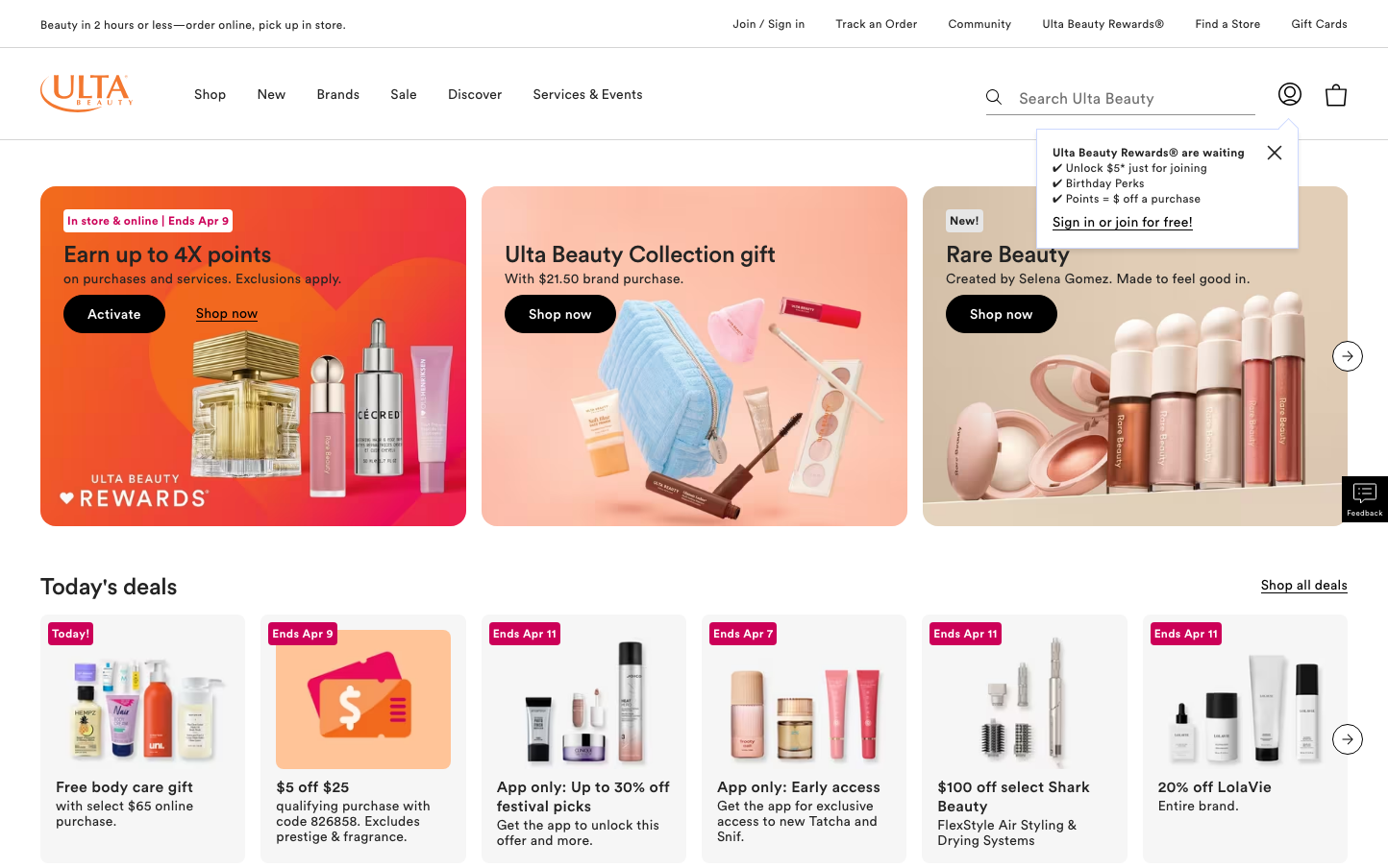
Ulta
BeautyUlta's brand aesthetic balances high-energy retail excitement with sophisticated beauty expertise through vibrant gradient hero sections and refined typography. The orange-to-pink promotional gradients create an optimistic, accessible energy while maintaining premium beauty positioning through careful spacing and elegant product photography.
Design Identity
Signature Color
Ulta Orange
#fa4d30
energetic beauty enthusiasm and accessible luxury
Visual Identity
Bold gradient hero cards with rounded corners (approximately 12-16px radius) that transition from warm oranges to soft pinks, creating an instantly recognizable modular layout system that feels both premium and approachable.
Component Style
Soft rounded buttons (24px+ border radius) with generous padding, elevated cards with subtle shadows, and pill-shaped CTAs that feel friendly and touchable rather than sharp or corporate.
Spacing Philosophy
Generous 24-32px gaps between major content blocks create breathing room, while hero sections use full-bleed imagery with 40-48px internal padding to balance density with luxury.
Design Principles
- All primary buttons use pill-shaped 24px+ border radius
- Hero sections always feature warm-to-cool gradient backgrounds
- Typography hierarchy uses Circular font with distinct weight jumps: 300, 500, 700
- Cards maintain 12-16px corner radius consistently
- Product imagery always includes lifestyle context, never pure white backgrounds
Target Audience
Beauty enthusiasts aged 25-45 who want accessible luxury and discovery-driven shopping experiences, valuing both trendy and established brands
Mood
Design descriptions are AI-generated based on visual analysis and may not fully reflect the brand's official design guidelines.
Design System
Typography Scale
| Element | Font | Size | Weight | Line Height |
|---|---|---|---|---|
| body | 16px | 300 | 24px | |
| h1 | 32px | 700 | 48px | |
| h2 | 24px | 500 | 28px | |
| h3 | 24px | 500 | 28px | |
| p | 12px | 300 | 16px | |
| a | 16px | 500 | 20px | |
| button | 12px | 300 | 16px | |
| input | 16px | 300 | 20px | |
| nav | 16px | 300 | 24px | |
| header | 16px | 300 | 24px |
Color Palette
#000000#ffffff#d9e5fc#f6f6f6#292b32#636878#898e9e#a5a9b5#ebecef#6e6e6e#f9f9fa#fa4d30