Help us build this. Leave comments, suggest improvements, and help create better design documentation for agents.
Sansan
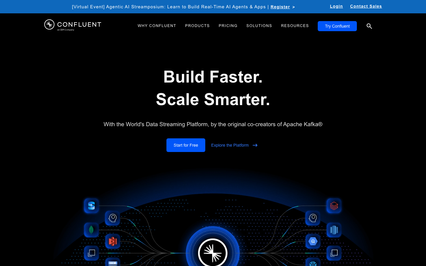
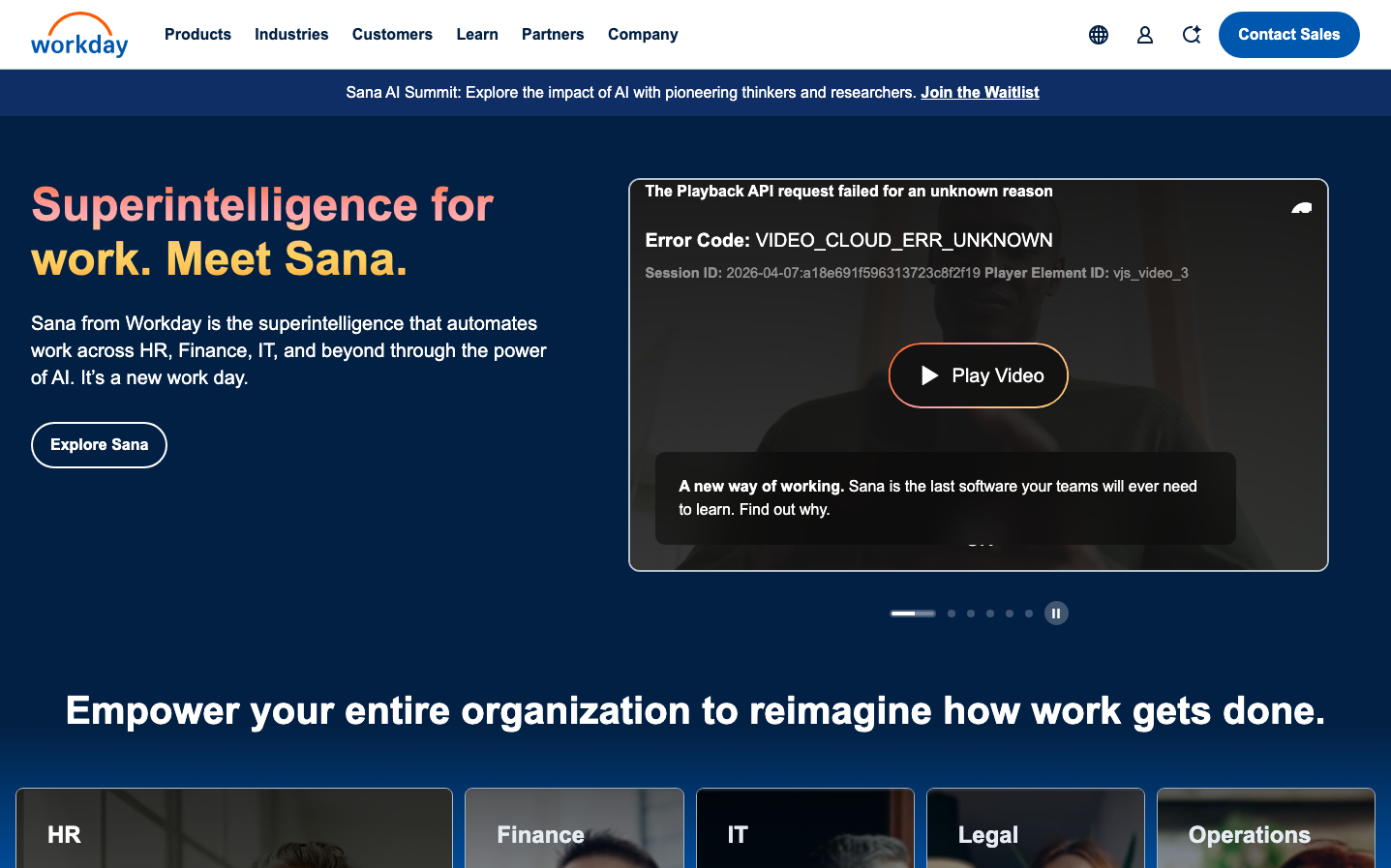
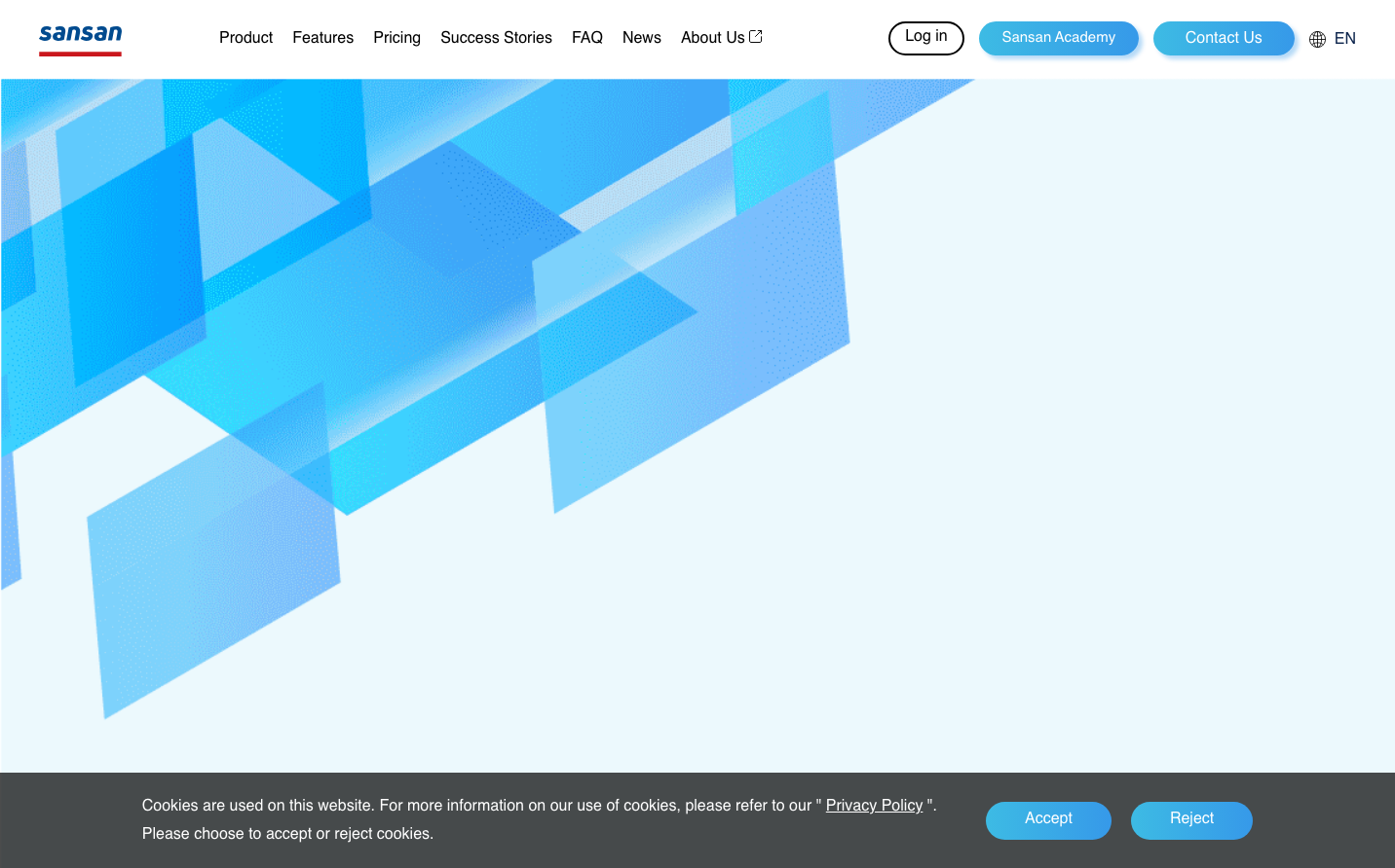
EnterpriseSansan's brand aesthetic radiates sophisticated energy through dynamic geometric compositions rendered in crystalline blues and turquoise tones. The layered, architectural abstractions create a sense of dimensional movement and technological precision, while the generous whitespace and light atmosphere convey premium accessibility rather than intimidating complexity.
Design Identity
Signature Color
Sansan Electric Blue
#007aff
technological innovation with human approachability - bridging digital precision and business trust
Visual Identity
Dynamic layered geometric abstractions that create dimensional depth through overlapping translucent shapes in blue tones, always positioned asymmetrically with abundant breathing room.
Component Style
Softly rounded corners with gentle radius, clean typography in moderate weights, minimal shadows creating subtle elevation rather than dramatic depth - everything feels approachable yet professional.
Spacing Philosophy
Expansive whitespace dominates the composition, with the geometric pattern confined to roughly 50% of the viewport, creating luxurious breathing room that suggests premium positioning without overwhelming users.
Design Principles
- Typography uses Sofia Pro exclusively across all elements
- Button radius appears consistently around 24px for pill-like feel
- Blue palette dominates with #007aff as primary accent
- Geometric patterns always maintain translucent overlays
- Shadows are subtle (6px offsets) never dramatic
- Navigation remains minimal and unobtrusive
Target Audience
Enterprise professionals and business leaders who need sophisticated B2B solutions but value intuitive, human-centered design over complex technical interfaces.
Mood
Design descriptions are AI-generated based on visual analysis and may not fully reflect the brand's official design guidelines.
Design System
Typography Scale
| Element | Font | Size | Weight | Line Height |
|---|---|---|---|---|
| body | 16px | 400 | 16px | |
| h1 | 65px | 400 | 78px | |
| h2 | 16px | 400 | 16px | |
| h5 | 16px | 700 | 20px | |
| p | 21px | 400 | 35.7px | |
| a | 16px | 400 | 16px | |
| button | 16px | 400 | 28.8px | |
| nav | 16px | 400 | 16px | |
| header | 16px | 400 | 16px | |
| footer | 16px | 400 | 16px |
Color Palette
#007aff#000000#abb8c3#ffffff#f78da7#cf2e2e#ff6900#fcb900#7bdcb5#00d084#8ed1fc#0693e3