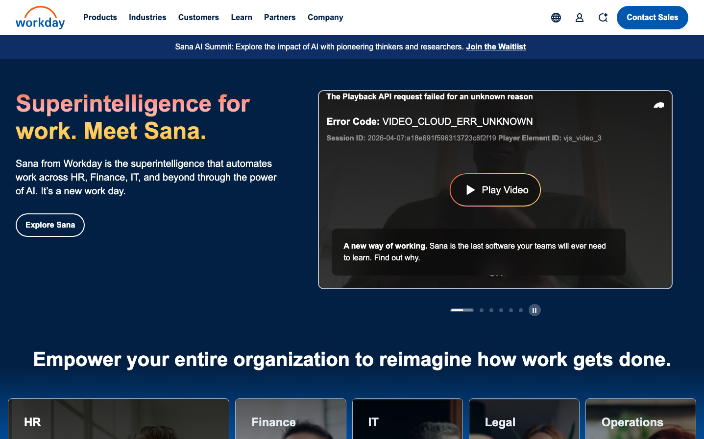
Help us build this. Leave comments, suggest improvements, and help create better design documentation for agents.
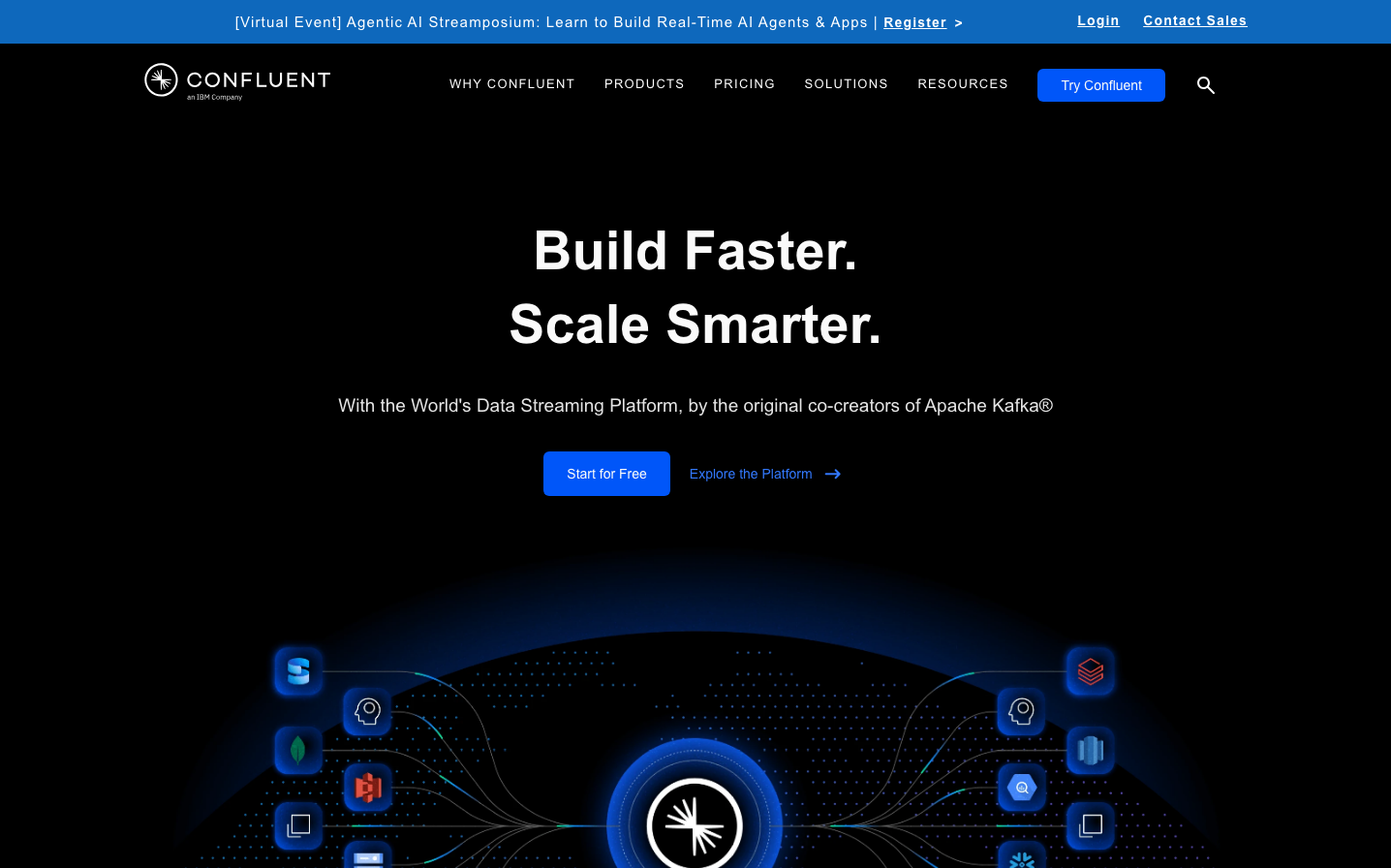
Confluent
EnterpriseConfluent's brand evokes a cosmic data universe with its deep space-like background punctuated by electric blue nodes and flowing connection lines. The typography is confident and substantial, using Poppins' friendly geometry to make enterprise-scale data streaming feel approachable and human.
Design Identity
Signature Color
Confluent Electric Blue
#1E90FF
Data flow vitality - represents the constant stream of information and the electric energy of real-time processing
Visual Identity
The cosmic network visualization with glowing blue connection nodes against a dark void - it transforms abstract data concepts into a tangible, flowing universe that feels both technical and magical.
Component Style
Clean geometric buttons with moderate 6-8px border radius, no heavy shadows but subtle glows on interactive elements. Components feel weightless and illuminated rather than solid, matching the cosmic theme.
Spacing Philosophy
Generous vertical breathing room creates a sense of infinite space, with the hero content floating in the center. Tight clustering of related elements contrasts with expansive whitespace to reinforce the 'data points in space' metaphor.
Design Principles
- Typography uses Poppins exclusively for its approachable geometry
- Heading weights stay at 600 for consistent authority
- Background remains pure black to emphasize the cosmic theme
- Blue accents are reserved for interactive and data flow elements
- Connection lines and nodes use subtle animations to suggest live data
Target Audience
Enterprise architects and senior engineers who need to make complex data infrastructure decisions but want tools that don't feel intimidatingly corporate
Mood
Design descriptions are AI-generated based on visual analysis and may not fully reflect the brand's official design guidelines.
Design System
Typography Scale
| Element | Font | Size | Weight | Line Height |
|---|---|---|---|---|
| body | 16px | 400 | 22.4px | |
| h1 | 55.9684px | 600 | 75.5573px | |
| h2 | 39.97px | 600 | 53.9595px | |
| h3 | 27.9416px | 600 | 37.7212px | |
| h4 | 18.9208px | 600 | 25.5431px | |
| p | 15px | 400 | 23.25px | |
| a | 14px | 600 | 20px | |
| button | 12px | 500 | 18px | |
| input | 16px | 400 | 19.2px | |
| nav | 16px | 400 | 22.4px |
Color Palette
No colors extracted