Help us build this. Leave comments, suggest improvements, and help create better design documentation for agents.
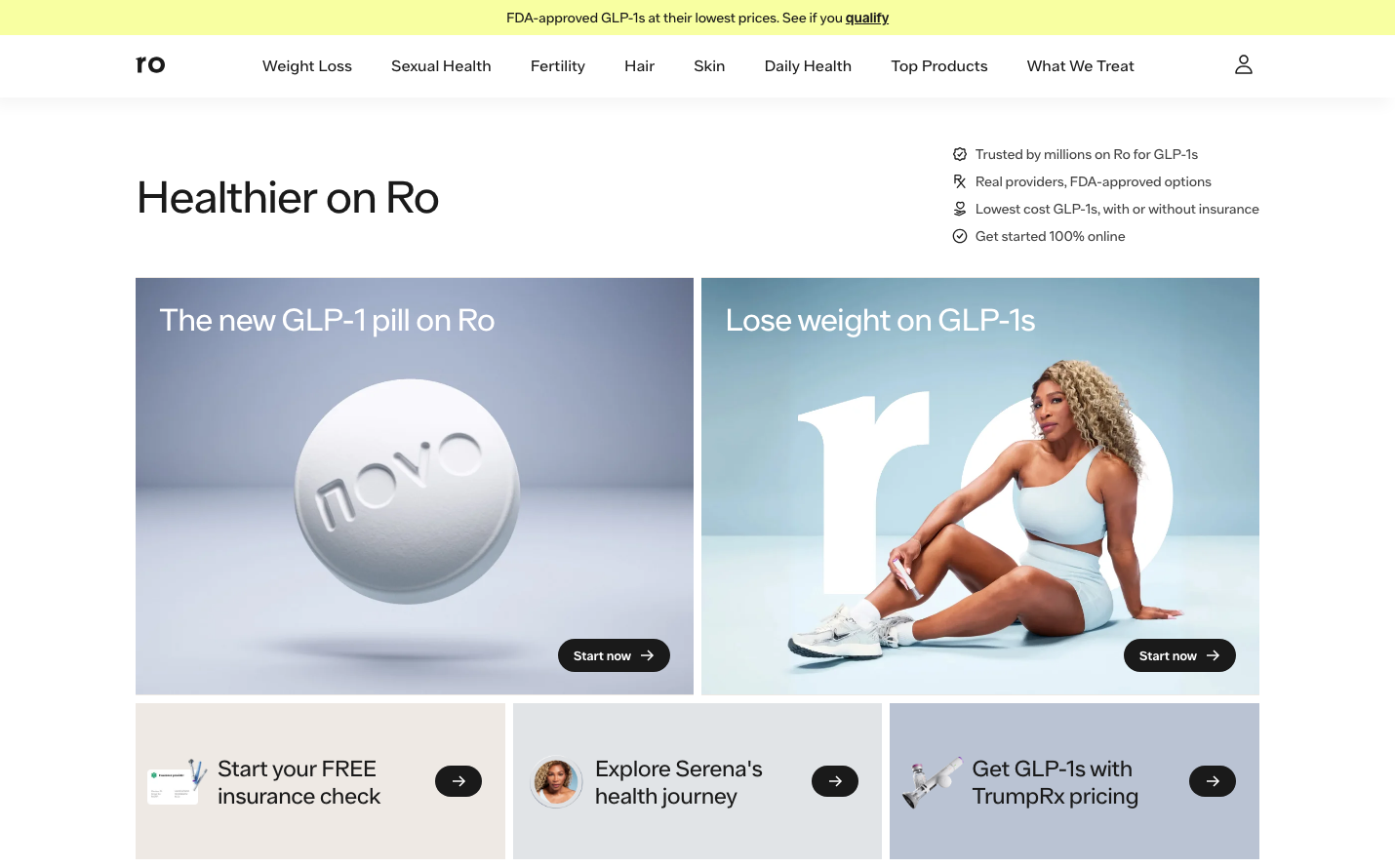
Ro
HealthcareRo's brand radiates calm medical authority through gradient transitions from cool grays to warm teals, creating a soothing yet confident healthcare atmosphere. The custom 'Ro Sans' typography maintains consistent 400 weight across all elements, establishing approachable professionalism rather than clinical sterility.
Design Identity
Signature Color
Ro Teal
#add8d5
Healthcare trust meets wellness optimism - bridging clinical reliability with accessible modern medicine
Visual Identity
Gradient card overlays that transition from muted grays to soft teals, combined with large-scale lifestyle photography and the distinctive 'ro' lowercase wordmark creates immediate recognition through color-story storytelling.
Component Style
Buttons feature generous 24px horizontal padding with subtle rounded corners (4-8px), no harsh shadows or borders. Cards use soft gradients as backgrounds rather than solid colors, creating depth through color rather than elevation. Everything feels pillowy and approachable.
Spacing Philosophy
Breathing room defines the experience - large hero sections with ample whitespace, 50-72px top margins create separation, while components maintain intimate 12px vertical padding. The rhythm alternates between expansive storytelling areas and focused interaction zones.
Design Principles
- Border radius stays minimal at 4-8px maximum, except pill buttons at 27px
- Typography weight remains consistently 400 across all elements - no bold hierarchy
- Gradients replace solid backgrounds on primary surfaces
- Button padding follows 12px vertical, 24px horizontal standard
- Transition timing uses .3s normal duration for most interactions
Target Audience
Health-conscious millennials and Gen X who prioritize convenience and discretion in healthcare, seeking medical solutions that feel more like wellness brands than clinical institutions
Mood
Design descriptions are AI-generated based on visual analysis and may not fully reflect the brand's official design guidelines.
Design System
Typography Scale
| Element | Font | Size | Weight | Line Height |
|---|---|---|---|---|
| body | 16px | 400 | 18.4px | |
| h2 | 32px | 400 | 38px | |
| h3 | 23px | 400 | 28px | |
| h4 | 26px | 400 | 31px | |
| p | 14px | 400 | 20px | |
| a | 16px | 400 | 18.4px | |
| button | 16px | 400 | 18.4px | |
| nav | 16px | 400 | 18.4px | |
| header | 16px | 400 | 18.4px | |
| footer | 16px | 400 | 18.4px |
Color Palette
#d70f0f#ffdbc7#e5f2f2#add8d5#f3f5f6#e1e4e7#bac3d3#f4f4ef#f8ffa1#ffa674#ffe6e4#ff6554