Help us build this. Leave comments, suggest improvements, and help create better design documentation for agents.
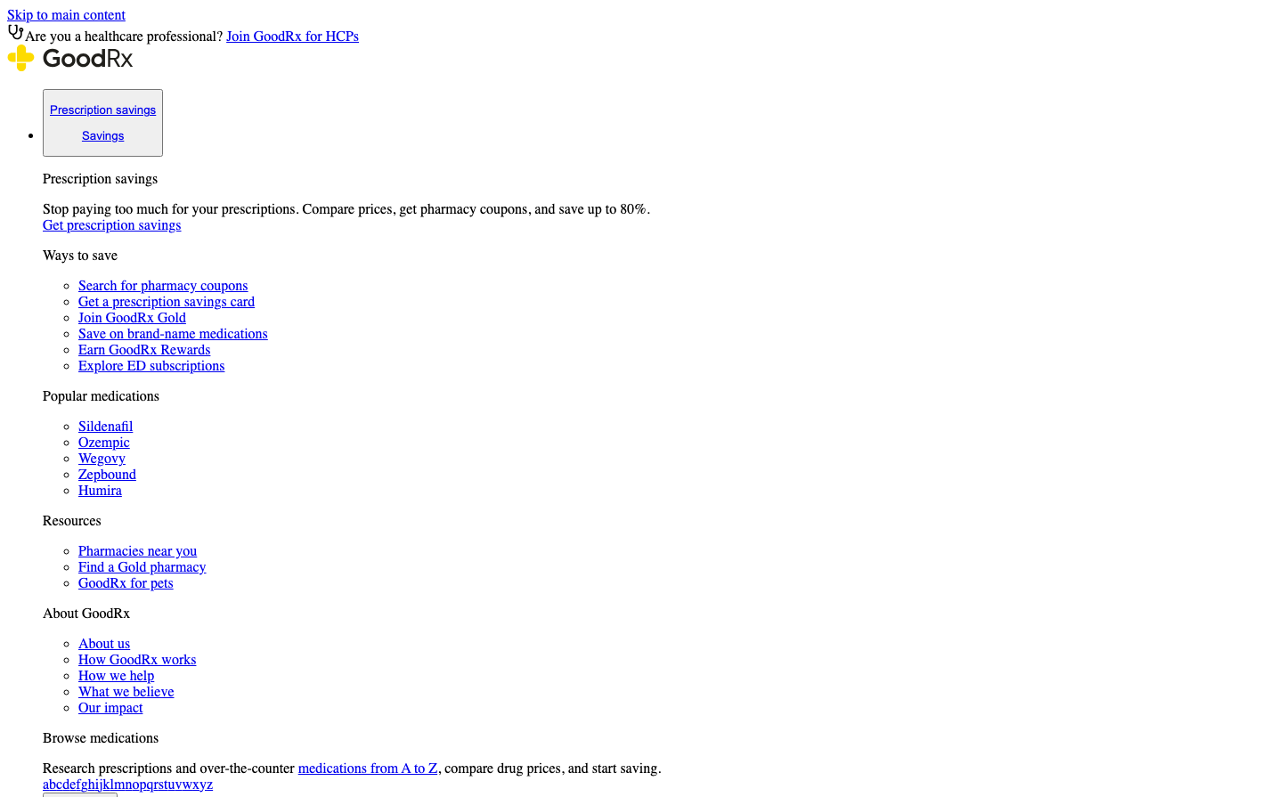
GoodRx
HealthcareGoodRx embraces a deliberately utilitarian aesthetic using browser-default Times and Arial fonts that prioritizes accessibility and trust over visual polish. The sparse, text-heavy layout with minimal styling creates an authoritative, medical-directory feel that suggests serious healthcare information over flashy marketing.
Design Identity
Signature Color
GoodRx Orange
#FF6B35
Healthcare accessibility and prescription affordability
Visual Identity
The distinctive yellow pill-shaped logo icon combined with ultra-minimal styling and heavy reliance on basic browser fonts creates an instantly recognizable 'medical utility' aesthetic that feels more like a healthcare directory than a consumer app.
Component Style
Borderless, unstyled components that rely entirely on browser defaults - links are standard blue underlined text, buttons appear to have minimal styling, and everything feels intentionally basic and functional rather than designed.
Spacing Philosophy
Dense, information-heavy layout with tight vertical spacing between list items and sections, prioritizing maximum content visibility over visual breathing room - feels like a medical reference guide.
Design Principles
- Always use browser-default fonts (Times for headings, Arial for UI)
- Minimize visual styling to focus on content hierarchy
- Maintain accessible blue link colors for navigation
- Use simple bullet lists for easy scanning
- Keep the yellow pill logo as the primary brand accent
Target Audience
Budget-conscious patients and families seeking prescription savings who value straightforward information over polished interfaces
Mood
Design descriptions are AI-generated based on visual analysis and may not fully reflect the brand's official design guidelines.
Design System
Typography Scale
| Element | Font | Size | Weight | Line Height |
|---|---|---|---|---|
| body | 16px | 400 | normal | |
| h2 | 24px | 700 | normal | |
| h3 | 18.72px | 700 | normal | |
| h4 | 16px | 700 | normal | |
| p | 13.3333px | 400 | normal | |
| a | 16px | 400 | normal | |
| button | 13.3333px | 400 | normal | |
| input | 13.3333px | 400 | normal | |
| nav | 16px | 400 | normal | |
| header | 16px | 400 | normal |
Color Palette
No colors extracted