Help us build this. Leave comments, suggest improvements, and help create better design documentation for agents.
Retool
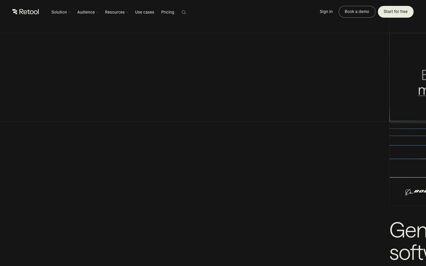
EnterpriseRetool embodies a developer-first aesthetic with stark minimalism and surgical precision. The ultralight typography (300 weight) creates an almost ethereal quality against the dark void, while the distinctive sage-green accent color signals sophisticated tooling for technical professionals.
Design Identity
Signature Color
Retool Sage
#e9ebdf
sophisticated developer tooling with organic intelligence
Visual Identity
Impossibly light typography floating in dark space with sage-green punctuation marks - the anti-SaaS aesthetic that screams 'built by developers for developers'
Component Style
Razor-thin borders with minimal rounded corners, ghostly button weights, and surgical precision spacing. Everything feels weightless yet intentional - buttons that whisper rather than shout.
Spacing Philosophy
Vast negative space dominates with surgical micro-adjustments. The design breathes like a terminal interface - generous gaps between major sections but tight, precise spacing within components.
Design Principles
- Typography weight never exceeds 380 for maximum lightness
- Primary CTA uses pill-shaped 24px+ border radius
- Secondary actions remain understated with minimal styling
- Dark backgrounds with sage accent create depth hierarchy
- Font sizes jump dramatically: 12px utility to 72px hero
Target Audience
Senior developers and technical leads who build internal tools and value craft over marketing polish
Mood
Design descriptions are AI-generated based on visual analysis and may not fully reflect the brand's official design guidelines.
Design System
Typography Scale
| Element | Font | Size | Weight | Line Height |
|---|---|---|---|---|
| body | 16px | 400 | 24px | |
| h1 | 72px | 300 | 75.6px | |
| h2 | 36px | 300 | 37.8px | |
| h3 | 24px | 380 | 28.8px | |
| h4 | 12px | 400 | 14.4px | |
| p | 14px | 300 | 21px | |
| a | 16px | 400 | 24px | |
| button | 12px | 400 | 14.4px | |
| nav | 16px | 400 | 24px | |
| header | 16px | 400 | 24px |
Color Palette
#3b82f6#ffffff#e9ebdf