Help us build this. Leave comments, suggest improvements, and help create better design documentation for agents.
Relex
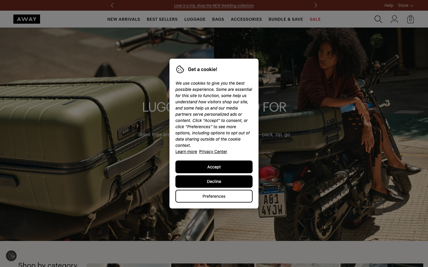
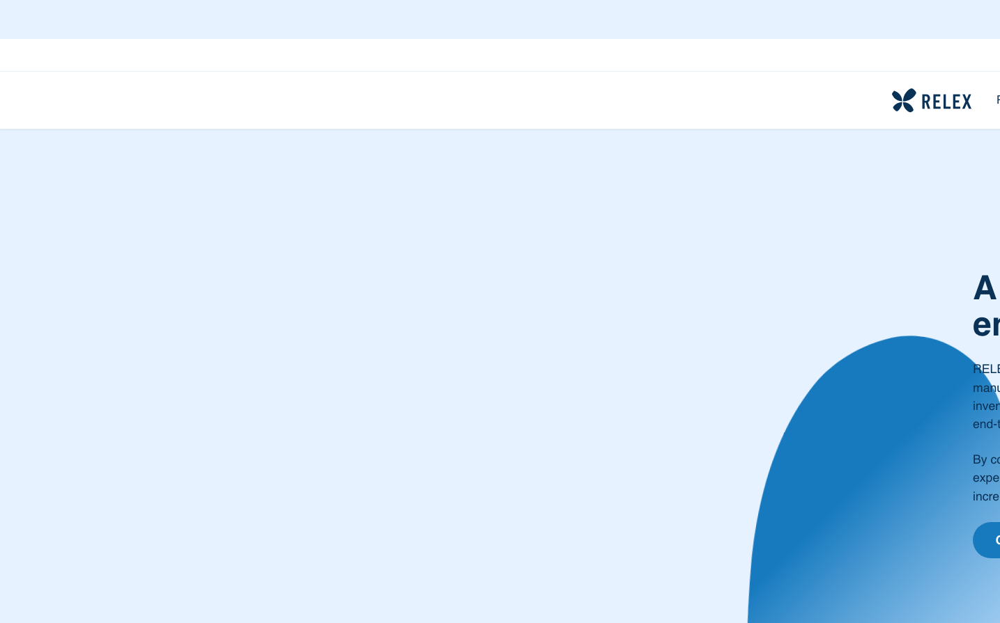
RetailRelex employs a sophisticated atmospheric approach with strategic use of geometric floating elements and dramatic diagonal shadows that create depth and movement. The soft pastel blue background (#e6f2ff) paired with vibrant orange accents evokes trust and energy, while the Figtree typography brings warmth to enterprise-grade reliability.
Design Identity
Signature Color
Relex Vivid Orange
#ff7110
Dynamic innovation and operational excellence in enterprise retail technology
Visual Identity
Distinctive floating geometric shapes with cross-directional shadows (6px -6px, -6px 6px) creating a unique dimensional layering effect that feels both technical and approachable.
Component Style
Soft rounded elements with sophisticated dual-directional shadows that create floating effects. Components feel weightless yet substantial, with gentle curves and atmospheric depth rather than sharp edges.
Spacing Philosophy
Generous breathing room with 24px base block gaps creating an airy, confident layout. Large geometric elements use dramatic spacing to establish visual hierarchy and create focal tension points.
Design Principles
- Cross-directional shadows always use 6px -6px and -6px 6px pattern for dimensional consistency
- Pastel backgrounds (#e6f2ff, #e9f7df, #ece6ff) provide atmospheric foundation
- Typography scale jumps from 16px body to 48px headlines with 700 weight for impact
- Orange accent (#ff7110) reserved for primary actions and key highlights
- 24px base spacing rhythm with generous whitespace for enterprise credibility
Target Audience
Enterprise retail technology decision-makers and supply chain professionals who value both innovation and operational stability
Mood
Design descriptions are AI-generated based on visual analysis and may not fully reflect the brand's official design guidelines.
Design System
Typography Scale
| Element | Font | Size | Weight | Line Height |
|---|---|---|---|---|
| body | 17.6px | 400 | 26.4px | |
| h1 | 48px | 700 | 52.8px | |
| h2 | 48px | 700 | 52.8px | |
| h3 | 24px | 700 | 28.8px | |
| p | 16px | 400 | 24px | |
| a | 16px | 700 | 24px | |
| button | 16px | 400 | normal | |
| input | 17.6px | 700 | 24.64px | |
| nav | 17.6px | 400 | 26.4px | |
| header | 17.6px | 400 | 26.4px |
Color Palette
#000000#abb8c3#ffffff#f78da7#cf2e2e#ff6900#fcb900#7bdcb5#00d084#8ed1fc#0693e3#9b51e0