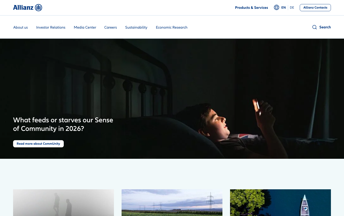
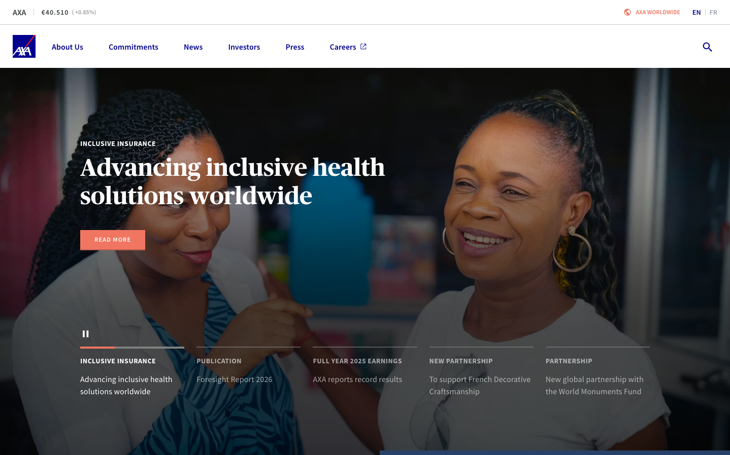
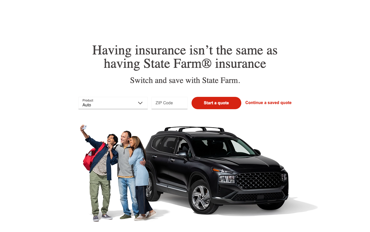
Help us build this. Leave comments, suggest improvements, and help create better design documentation for agents.
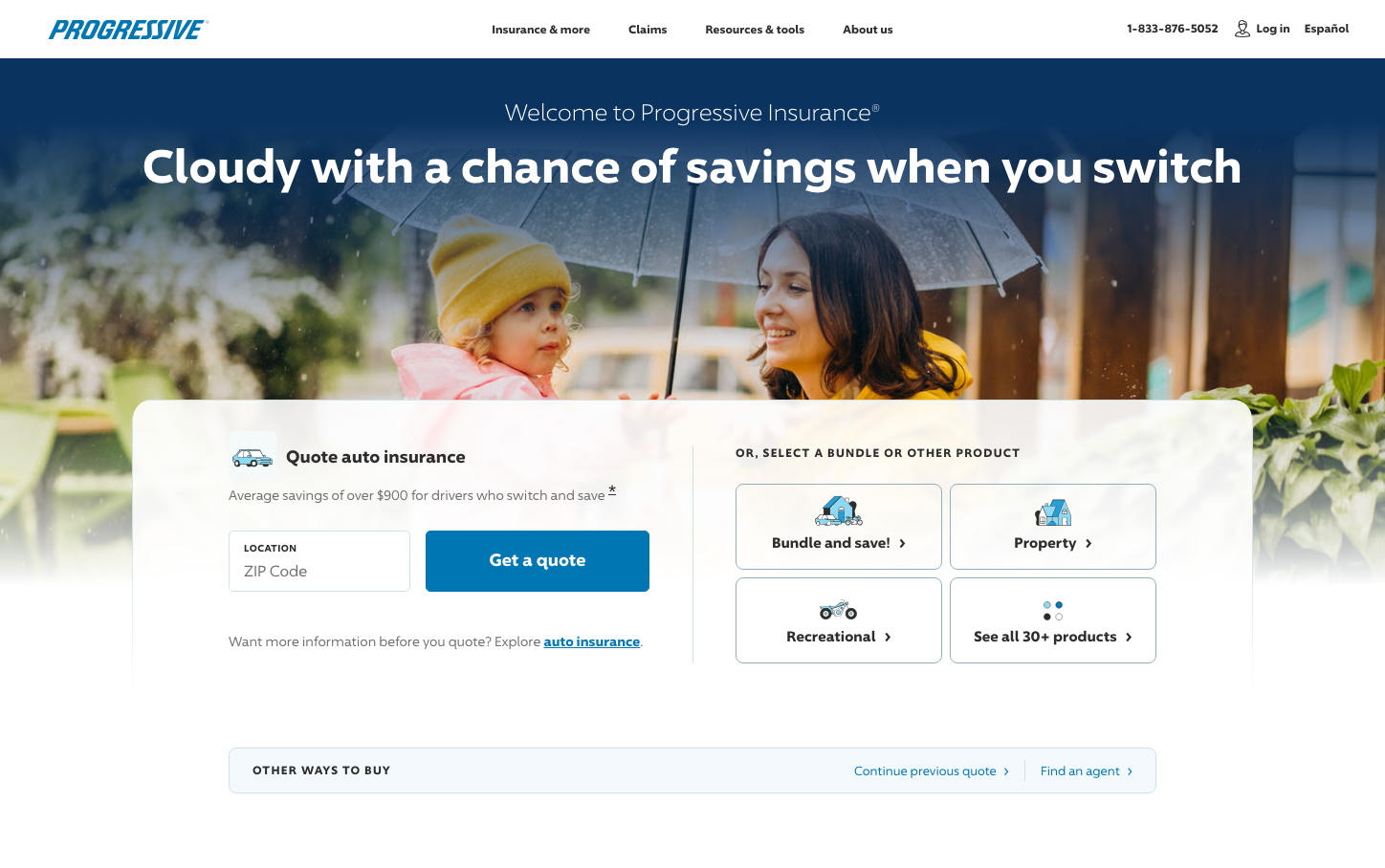
Progressive
InsurtechProgressive uses a reassuring, approachable aesthetic with '96 Sans' typography that feels both modern and trustworthy. The warm blue hero background creates a sense of security and reliability, while the clean card-based layout emphasizes clarity and ease of use - perfect for simplifying complex insurance decisions.
Design Identity
Signature Color
Progressive Blue
#1976D2
Insurance trust and reliability - a professional yet approachable blue that communicates security without being cold or corporate
Visual Identity
Clean white cards floating over atmospheric photography with generous rounded corners and subtle shadows - the contrast between human moments and structured information creates instant recognition
Component Style
Soft rounded corners (8-12px radius) with gentle drop shadows on white cards. Buttons are moderately rounded with solid fills, creating a friendly but professional feel. Everything has breathing room with substantial padding.
Spacing Philosophy
Generous whitespace around cards and sections creates a calm, uncluttered feeling. Large padding within components (16-24px) makes everything feel approachable rather than dense or overwhelming.
Design Principles
- Cards always have 8-12px border radius with subtle shadows
- Typography uses only '96 Sans' family for consistency
- White backgrounds on functional elements over photographic heroes
- Button padding maintains 12-16px vertical, 24-32px horizontal
- Icons are simple line-style with consistent stroke weight
Target Audience
Everyday families and individuals seeking straightforward insurance solutions without complexity - people who value transparency and want to feel confident about their coverage decisions
Mood
Design descriptions are AI-generated based on visual analysis and may not fully reflect the brand's official design guidelines.
Design System
Typography Scale
| Element | Font | Size | Weight | Line Height |
|---|---|---|---|---|
| body | 10px | 400 | 17.5px | |
| h1 | 24px | 300 | 32px | |
| h2 | 18px | 700 | 23.9999px | |
| h3 | 12px | 700 | 21px | |
| h4 | 18px | 700 | 25.2px | |
| p | 48px | 700 | 56px | |
| a | 12px | 400 | 21px | |
| button | 14px | 400 | 24.5px | |
| input | 13.3333px | 400 | normal | |
| nav | 10px | 400 | 17.5px |
Color Palette
No colors extracted