Help us build this. Leave comments, suggest improvements, and help create better design documentation for agents.
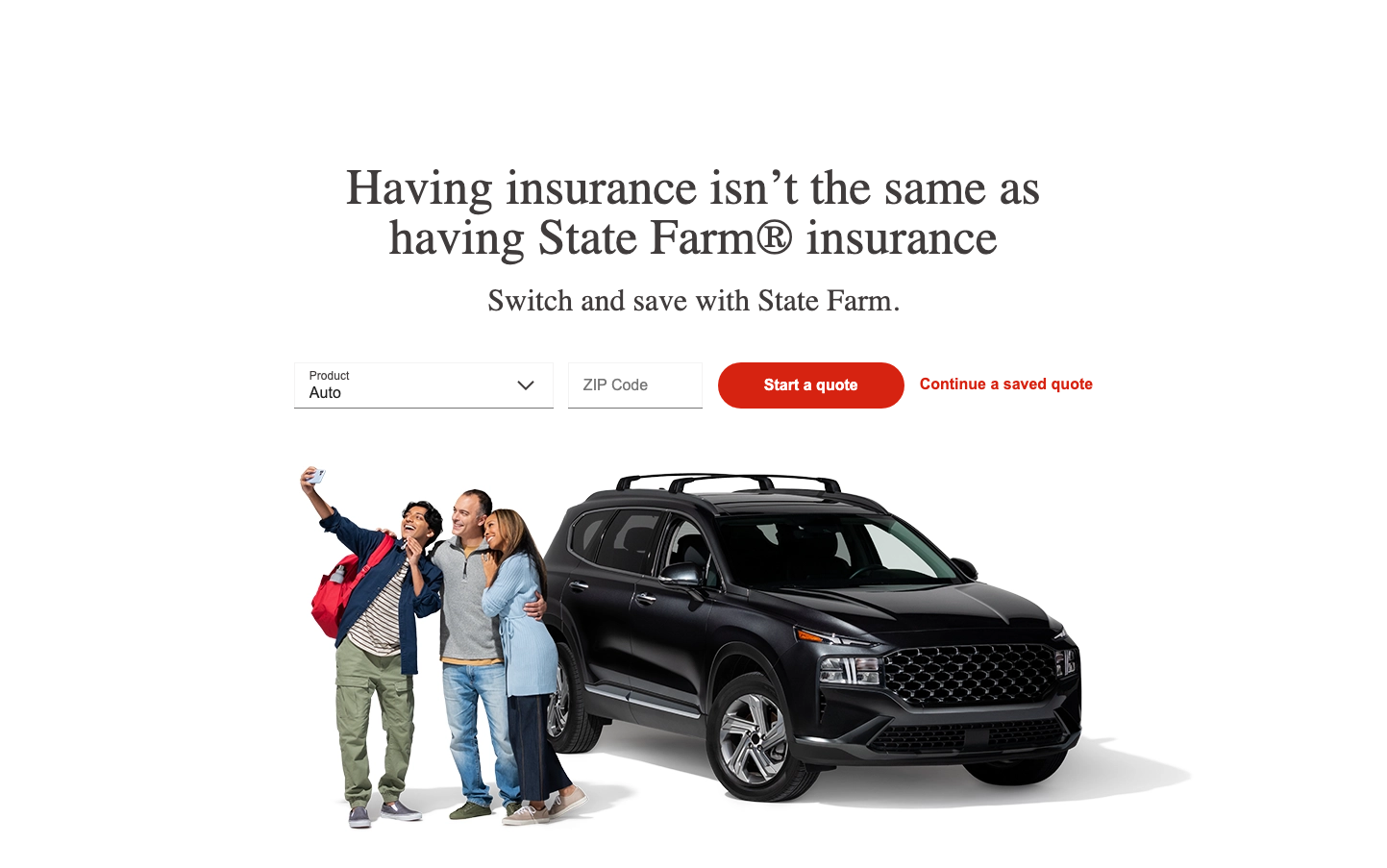
State Farm
InsurtechState Farm presents a reassuring, middle-American aesthetic that prioritizes approachability over sophistication. The custom MecherleSans typography feels distinctly corporate-friendly, while the warm red creates immediate trust and recognition in the insurance landscape.
Design Identity
Signature Color
State Farm Red
#D32F2F
reliability and trust in financial protection services
Visual Identity
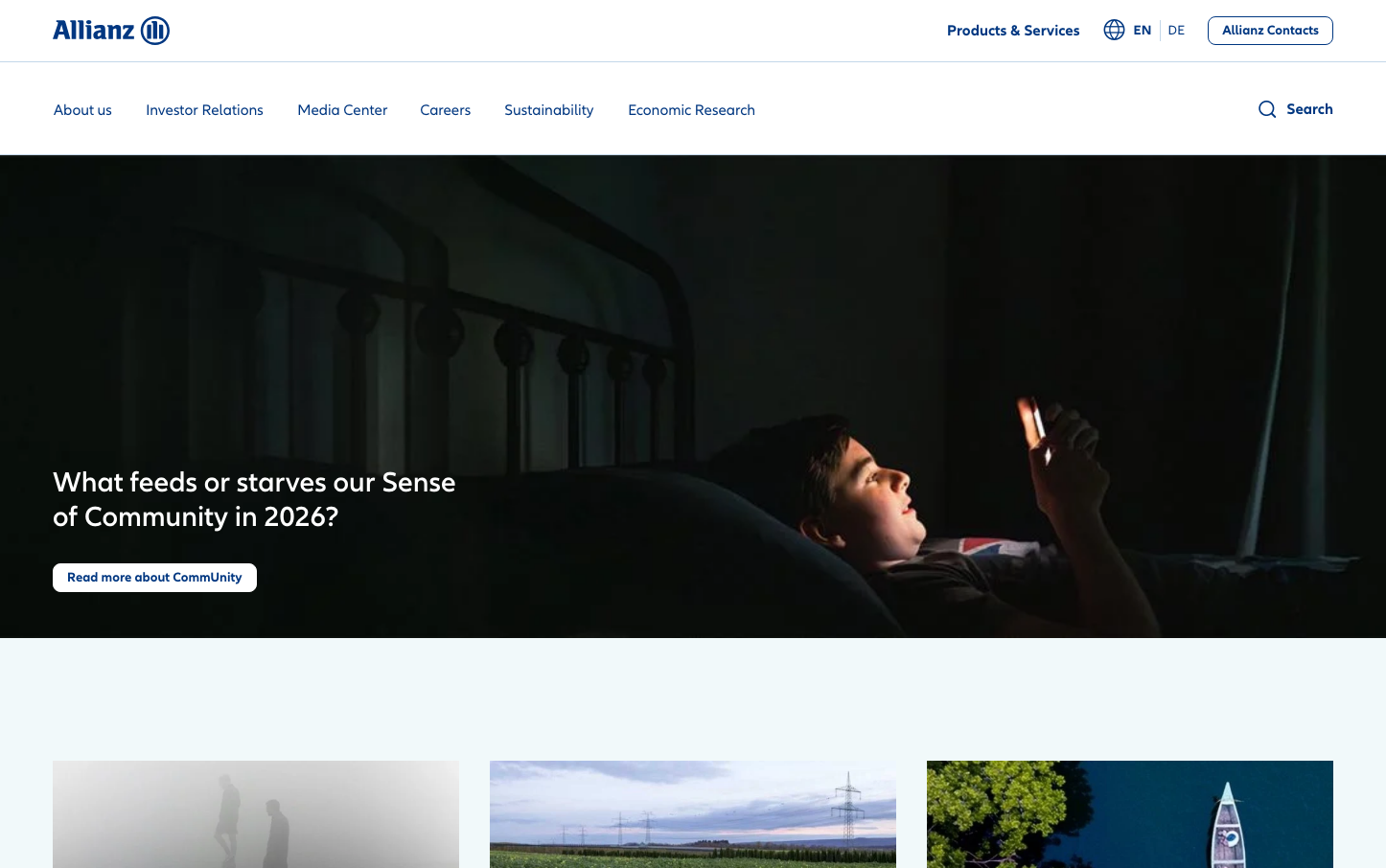
The signature State Farm red combined with generous whitespace and friendly lifestyle photography creates an instantly recognizable 'neighborhood insurance agent' aesthetic that feels both corporate and personal.
Component Style
Softly rounded corners with moderate border radius, solid fill buttons without harsh shadows. Components feel substantial and clickable with friendly, approachable proportions that prioritize usability over visual flair.
Spacing Philosophy
Generous breathing room with large whitespace sections that create a sense of calm and trust. Wide margins and comfortable padding suggest reliability rather than urgency, with ample space between interactive elements.
Design Principles
- Typography uses only MecherleSans custom font for brand consistency
- Border radius consistently moderate, never sharp or overly rounded
- Red color reserved for primary actions and brand moments only
- Line heights match font sizes for clean, readable typography
- Lifestyle photography always includes diverse, happy families
Target Audience
Middle-class American families and homeowners aged 25-55 who prioritize stability and personal relationships over digital innovation
Mood
Design descriptions are AI-generated based on visual analysis and may not fully reflect the brand's official design guidelines.
Design System
Typography Scale
| Element | Font | Size | Weight | Line Height |
|---|---|---|---|---|
| body | 16px | 400 | 21px | |
| h1 | 52px | 500 | 52px | |
| h2 | 32px | 400 | 32px | |
| h3 | 31.008px | 500 | 31px | |
| h4 | 25.008px | 500 | 25px | |
| h5 | 20px | 500 | 20px | |
| h6 | 16px | 500 | 16px | |
| p | 19px | 400 | 26px | |
| a | 16px | 600 | 21px | |
| button | 16px | 600 | 18px |
Color Palette
No colors extracted