Help us build this. Leave comments, suggest improvements, and help create better design documentation for agents.
Procurify
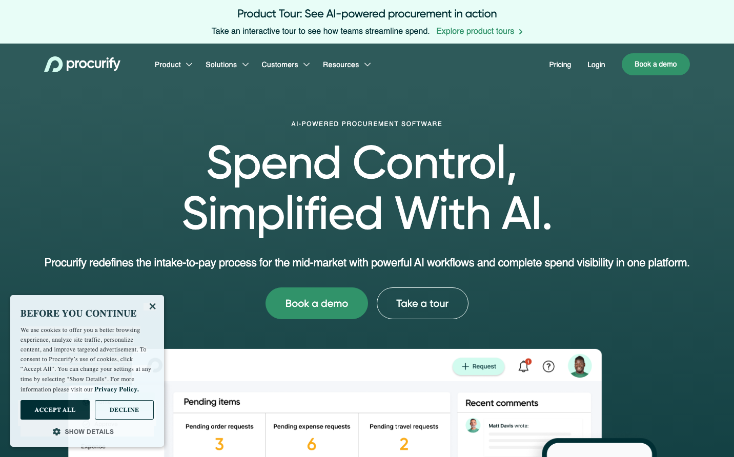
SaaS ManagementProcurify embodies sophisticated fintech gravitas through its deep forest teal signature color that dominates the hero section with dramatic internal shadows and glows. The oversized Gilroy typography creates executive presence while the restrained color palette whispers enterprise-grade reliability.
Design Identity
Signature Color
Procurify Deep Teal
#002e33
Enterprise procurement authority - sophisticated enough for C-suite, technical enough for ops teams
Visual Identity
The dramatic teal hero section with complex internal shadows and the stark contrast between oversized white headlines and the dark background creates an unmistakable executive dashboard aesthetic.
Component Style
Generously rounded buttons (60px pill shapes) with substantial padding create approachable executive tools. The complex shadow system ranges from subtle cards (20px blur) to dramatic hero glows with multi-layered internal shadows - everything feels premium and substantial.
Spacing Philosophy
Executive breathing room with massive hero sections and generous whitespace around key CTAs. The layout prioritizes impact over information density, with substantial gaps that let each element command attention.
Design Principles
- Headlines use Gilroy Medium at massive scales (90px h1, 56px h2) for executive presence
- Border radius follows clear hierarchy: 6px cards, 10px inputs, 60px buttons, 500px pills
- Complex layered shadows create depth without being playful
- Deep teal (#002e33) anchors all primary interactions
- Interface chrome stays minimal to highlight the procurement dashboard
Target Audience
Mid-market procurement managers and CFOs who need enterprise-grade tools but want approachable interfaces - people making $100k+ purchasing decisions
Mood
Design descriptions are AI-generated based on visual analysis and may not fully reflect the brand's official design guidelines.
Design System
Typography Scale
| Element | Font | Size | Weight | Line Height |
|---|---|---|---|---|
| body | 16px | 400 | 24px | |
| h1 | 90px | 500 | 99px | |
| h2 | 56px | 500 | 67.2px | |
| h3 | 32px | 500 | 38.4px | |
| p | 22px | 500 | 28.6px | |
| a | 16px | 400 | 24px | |
| button | 16px | 400 | 46px | |
| input | 16px | 400 | 24px | |
| nav | 16px | 400 | 24px | |
| header | 16px | 400 | 24px |
Color Palette
#000000#abb8c3#ffffff#002e33#406266#f4fefb#e8fdf7#f78da7#cf2e2e#ff6900#fcb900#7bdcb5