Help us build this. Leave comments, suggest improvements, and help create better design documentation for agents.
Zip
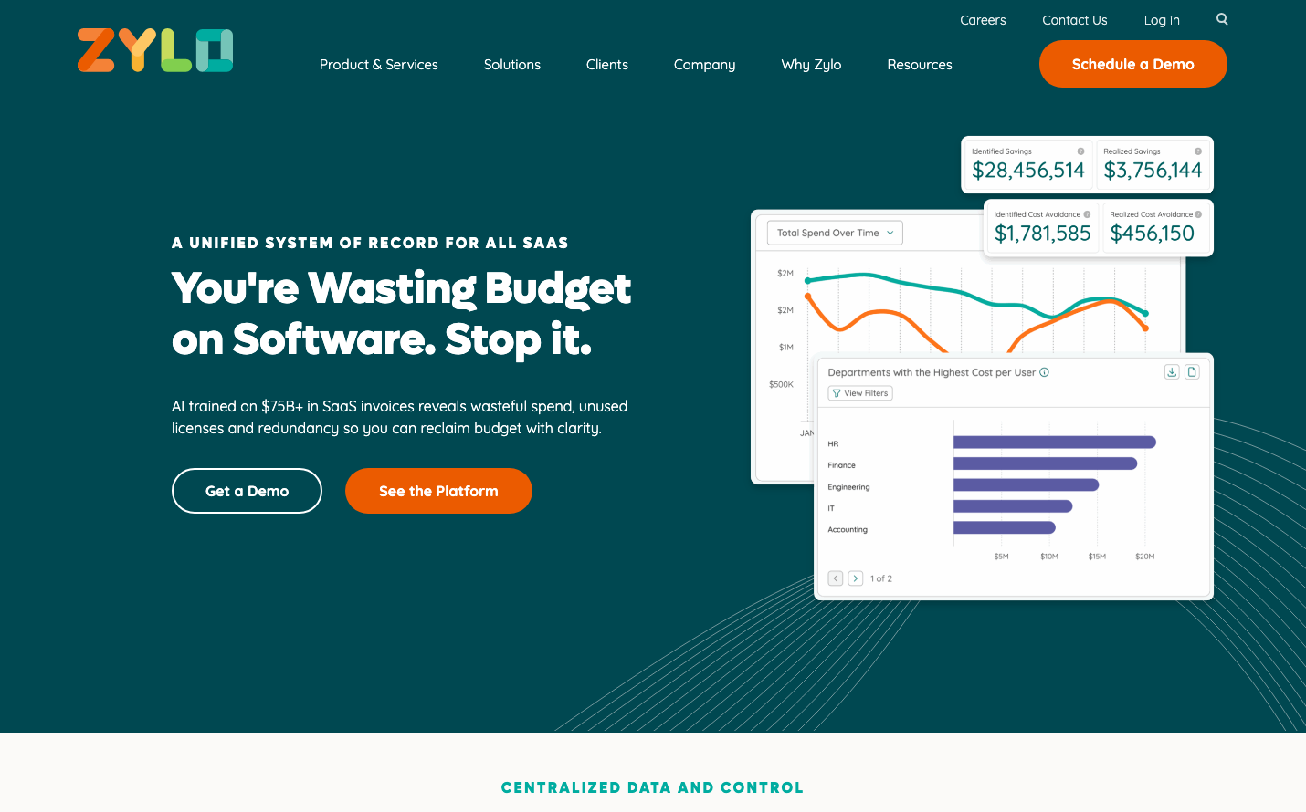
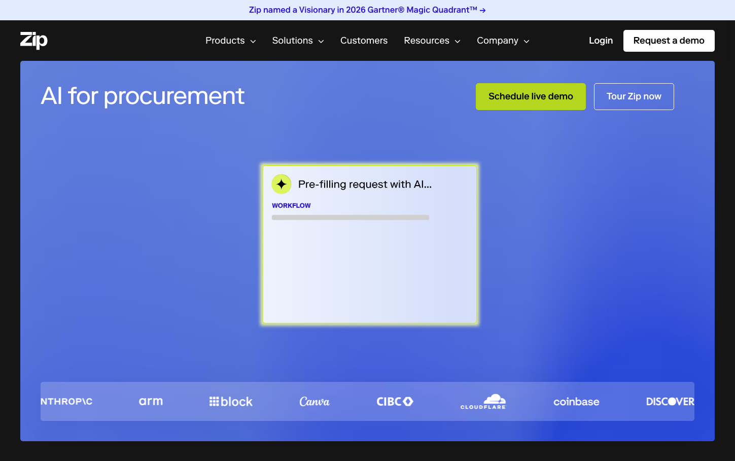
SaaS ManagementZip employs a bold, AI-forward aesthetic that balances enterprise sophistication with approachable innovation. The signature indigo-to-purple gradient backdrop creates an immersive, almost cinematic environment that positions procurement as strategic and intelligent rather than mundane back-office work.
Design Identity
Signature Color
Zip Indigo
#2f15c9
Enterprise intelligence and procurement sophistication
Visual Identity
The dramatic indigo gradient background that fills the entire viewport, creating an immersive brand environment rather than traditional white space - it's unmistakably tech-forward and AI-centric.
Component Style
Soft, approachable buttons with generous rounded corners (~8-12px) and substantial padding. Cards feature clean edges with subtle borders and organized content hierarchy. Everything feels substantial but not heavy - professional yet accessible.
Spacing Philosophy
Generous macro spacing with the hero section taking full viewport height, creating breathing room that feels premium. The centered layout with ample whitespace around the AI workflow preview suggests confidence in simplicity.
Design Principles
- Full-viewport gradient backgrounds create immersive brand moments
- Typography uses single font family (Riformall) across all weights for cohesion
- Primary CTAs use high-contrast chartreuse (#b5d61e) against dark backgrounds
- Components favor 8-12px border radius for friendly approachability
- Logo parade on brand background maintains visual hierarchy
Target Audience
Enterprise procurement professionals and CFOs who want to modernize purchasing operations with AI-powered efficiency
Mood
Design descriptions are AI-generated based on visual analysis and may not fully reflect the brand's official design guidelines.
Design System
Typography Scale
| Element | Font | Size | Weight | Line Height |
|---|---|---|---|---|
| body | 16px | 400 | 24px | |
| h1 | 48px | 400 | 56.64px | |
| h2 | 38px | 400 | 44px | |
| h3 | 38px | 400 | 44px | |
| h5 | 32px | 500 | 36px | |
| a | 16px | 500 | 24px | |
| button | 18px | 500 | 22px | |
| input | 18px | 400 | 22px | |
| nav | 16px | 400 | 24px | |
| main | 16px | 400 | 24px |
Color Palette
#f4f3f2#2f15c9#cccccc#e8f0a7#6285e7#b5d61e#210f8d#c7d9fb#97baff#788413#180a64#3c3c3c