Help us build this. Leave comments, suggest improvements, and help create better design documentation for agents.
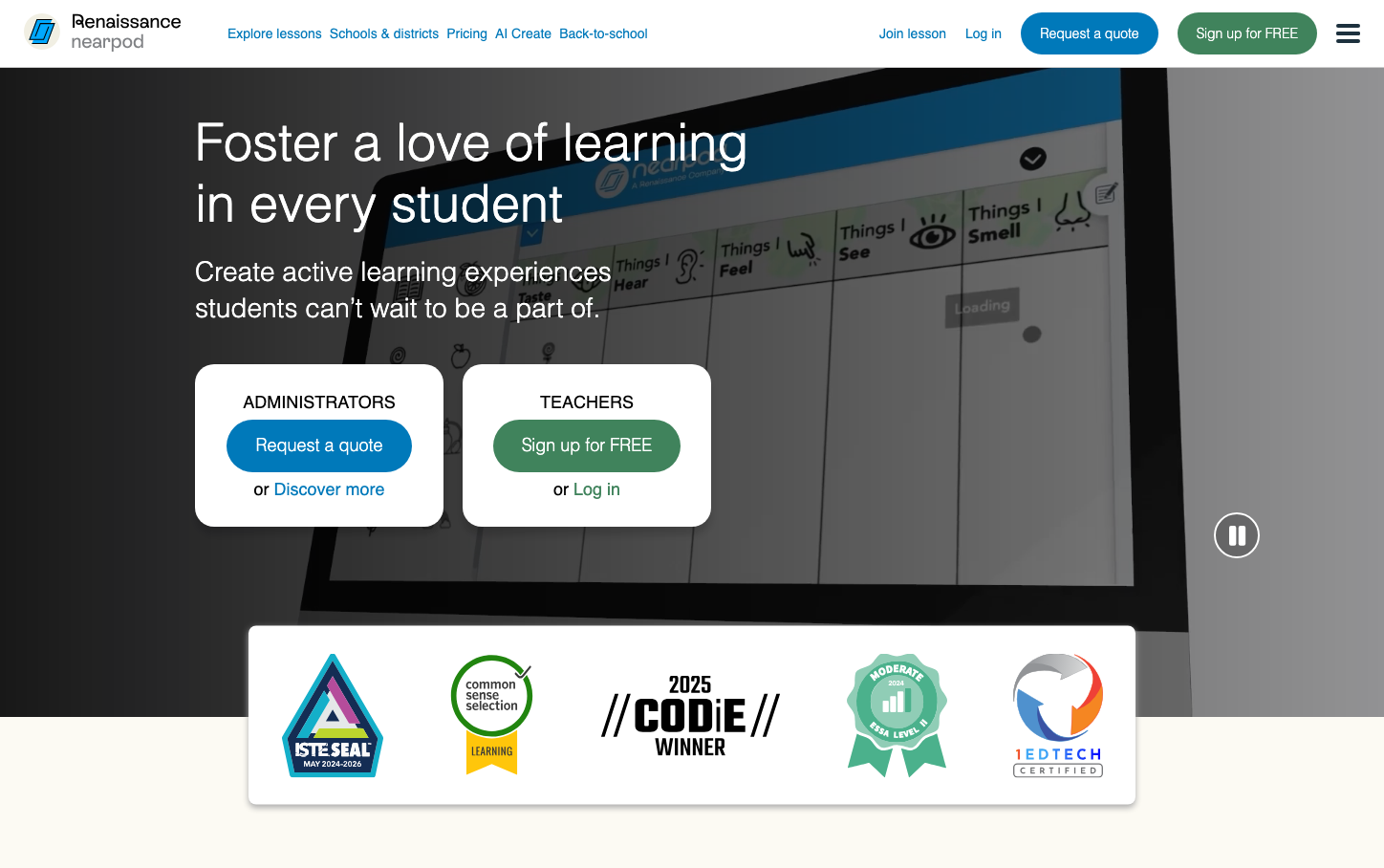
Nearpod
EdTechNearpod creates an educational sanctuary with warm, welcoming typography that feels approachable yet authoritative. The dual-audience split (administrators vs teachers) with contrasting blue and green CTAs suggests a platform that understands education's hierarchical complexity while maintaining accessibility for all users.
Design Identity
Signature Color
Education Blue
#1E88E5
trustworthy institutional authority balanced with approachable learning
Visual Identity
Clean dual-column card layout with contrasting CTA colors that immediately communicate different user pathways - the visual segregation of administrator and teacher journeys is unmistakably Nearpod's approach to education hierarchy.
Component Style
Rounded buttons with generous padding feel friendly and approachable rather than corporate. White cards with soft shadows create safe learning spaces, while the contrasting blue/green button pair suggests thoughtful UX consideration for different user types.
Spacing Philosophy
Generous whitespace around hero content creates breathing room for focus, while tight card layouts keep related actions grouped. The centered composition with ample margins suggests classroom-like organization - structured but not cramped.
Design Principles
- Typography uses light weights (300) for headlines to feel approachable not intimidating
- Dual CTA colors (blue for admin, green for teacher) maintain user pathway clarity
- 18px body text ensures accessibility for diverse educator age ranges
- Rounded corners on buttons create friendly, non-threatening interactions
- White overlay cards on dark backgrounds create focus zones
Target Audience
K-12 educators and administrators who need intuitive technology that doesn't require extensive training - busy teachers who value simplicity over feature complexity.
Mood
Design descriptions are AI-generated based on visual analysis and may not fully reflect the brand's official design guidelines.
Design System
Typography Scale
| Element | Font | Size | Weight | Line Height |
|---|---|---|---|---|
| body | 16px | 400 | 16px | |
| h1 | 54px | 300 | 64px | |
| h2 | 28px | 300 | 38px | |
| h3 | 18px | 400 | 26px | |
| p | 18px | 400 | 26px | |
| a | 18px | 400 | 26px | |
| button | 13.3333px | 400 | normal | |
| nav | 16px | 400 | 16px | |
| footer | 16px | 400 | 16px | |
| main | 16px | 400 | 16px |
Color Palette
No colors extracted