Help us build this. Leave comments, suggest improvements, and help create better design documentation for agents.
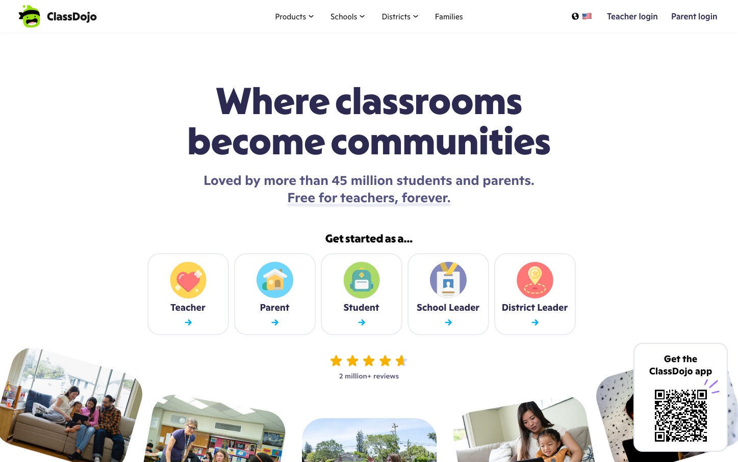
ClassDojo
EdTechClassDojo embodies playful professionalism with its signature vivid purple paired with chunky, friendly typography that builds trust with educators while remaining approachable for families. The brand radiates educational warmth through generous spacing and colorful iconography that transforms classroom management into community building.
Design Identity
Signature Color
ClassDojo Purple
#7d40ff
educational innovation and trusted learning community
Visual Identity
Colorful circular icons with playful illustrations representing different user roles, arranged in a clean grid pattern with ample white space that creates an approachable yet organized educational ecosystem.
Component Style
Gentle rounded corners with subtle shadows and vibrant accent colors. Interactive elements feel soft and approachable rather than sharp or corporate - designed to welcome both teachers and parents into the educational journey.
Spacing Philosophy
Generous vertical breathing room between sections creates a calm, uncluttered learning environment, while the centered layout and wide margins emphasize focus and accessibility for busy educators and families.
Design Principles
- Typography mixes custom Melun headlines with readable Ginto body text
- Purple accent color (#7d40ff) anchors all interactive elements
- Circular icons with bright colors represent different user personas
- Shadows are subtle (1-4px) maintaining approachable softness
- Spacing follows even increments from 2px to 24px for consistent rhythm
Target Audience
K-12 teachers and school administrators seeking intuitive classroom management tools that engage both students and parents in the learning process
Mood
Design descriptions are AI-generated based on visual analysis and may not fully reflect the brand's official design guidelines.
Design System
Typography Scale
| Element | Font | Size | Weight | Line Height |
|---|---|---|---|---|
| body | 16px | 400 | 24px | |
| h1 | 66px | 600 | 79.2px | |
| h2 | 26px | 600 | 31.2px | |
| h3 | 20px | 600 | 24px | |
| p | 26px | 600 | 33.8px | |
| a | 16px | 400 | 24px | |
| button | 15px | 400 | 21px | |
| nav | 16px | 400 | 24px | |
| header | 16px | 400 | 24px | |
| footer | 16px | 400 | 24px |
Color Palette
#ffffff#171717#7d40ff