Help us build this. Leave comments, suggest improvements, and help create better design documentation for agents.
ManoMano
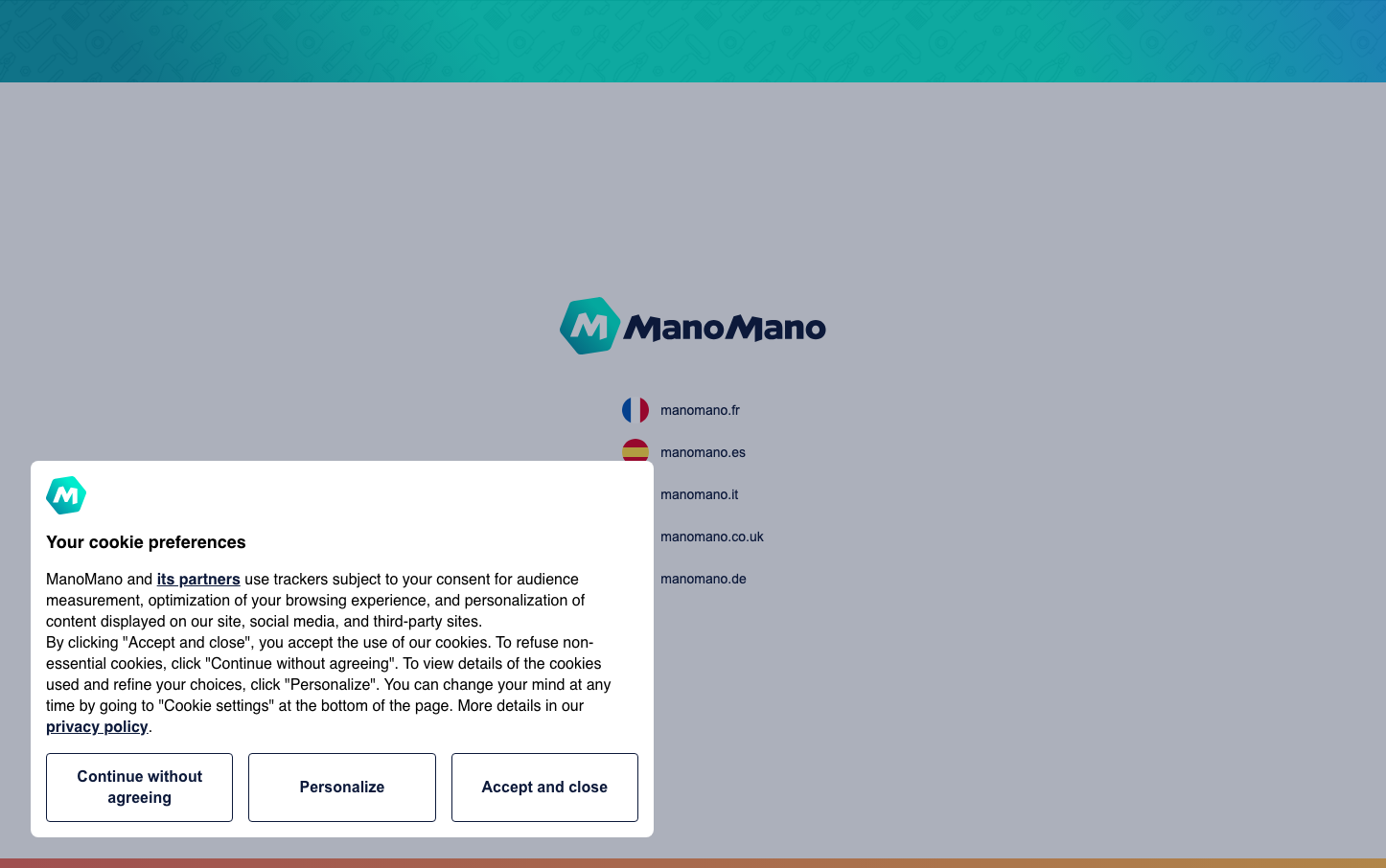
E-commerceManoMano presents a sophisticated, internationalized brand identity built around a vibrant teal gradient that conveys global accessibility and DIY empowerment. The clean, centered layout with generous whitespace creates a premium yet approachable atmosphere, while the hexagonal logo mark suggests precision and craft - perfect for a home improvement marketplace.
Design Identity
Signature Color
ManoMano Teal
#00B5A5
DIY empowerment and global marketplace trust - energetic enough for makers, professional enough for contractors
Visual Identity
The distinctive teal-to-blue gradient header combined with the geometric hexagonal 'M' logo creates an unmistakable technical-meets-accessible aesthetic that balances European sophistication with DIY practicality.
Component Style
Clean, minimal components with subtle shadows and gentle corner rounding. Buttons feel substantial but approachable, with medium weight typography and comfortable padding that suggests reliability without intimidation.
Spacing Philosophy
Generous vertical breathing room with centralized, compact content blocks. The design uses expansive whitespace to create focus, with tight internal spacing that keeps interface elements digestible and scannable.
Design Principles
- Teal gradient headers establish brand presence on every screen
- Open Sans at 16px base size ensures international readability
- Hexagonal logo geometry reinforces precision and craft values
- Centered layouts with ample whitespace create premium positioning
- Country flags as visual navigation maintain European marketplace identity
Target Audience
European DIY enthusiasts and home improvement professionals who value both craft precision and marketplace convenience across multiple countries
Mood
Design descriptions are AI-generated based on visual analysis and may not fully reflect the brand's official design guidelines.
Design System
Typography Scale
| Element | Font | Size | Weight | Line Height |
|---|---|---|---|---|
| body | 16px | 400 | normal | |
| h2 | 18px | 700 | 24px | |
| p | 16px | 400 | 22px | |
| a | 16px | 600 | 22px | |
| button | 16px | 600 | 22px |
Color Palette
No colors extracted