Help us build this. Leave comments, suggest improvements, and help create better design documentation for agents.
Lightspeed
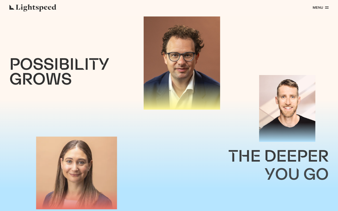
FinanceLightspeed projects human-centered optimism through warm gradient overlays that transform professional portraits into approachable brand ambassadors. The ultra-light GoodSans typography creates an ethereal, almost weightless feeling that suggests effortless growth and infinite possibility.
Design Identity
Signature Color
Possibility Orange
#FFB366
Human warmth and accessible innovation - suggesting growth that feels natural rather than aggressive
Visual Identity
Gradient-masked portrait photography with color transitions that flow from warm amber to cool blue, creating a distinctive 'human meets digital' aesthetic that's instantly recognizable
Component Style
Invisible UI philosophy - no visible buttons, cards, or form elements in the main experience. The interface dissolves into pure content and imagery, letting typography and gradients carry the entire visual weight
Spacing Philosophy
Asymmetrical breathing room with massive negative space on the left balancing clustered portrait compositions on the right. Creates a sense of expansion and forward movement rather than static balance
Design Principles
- Typography weight never exceeds 500 - everything feels lighter than air
- All imagery uses gradient overlays transitioning warm to cool
- Text positioning uses dramatic asymmetry rather than centered layouts
- Color saturation builds from neutral backgrounds to vivid portrait treatments
- Portrait photography always shows genuine expressions, never corporate poses
Target Audience
Growth-focused business leaders who value human connection over corporate formality - people building companies that prioritize culture and possibility
Mood
Design descriptions are AI-generated based on visual analysis and may not fully reflect the brand's official design guidelines.
Design System
Typography Scale
| Element | Font | Size | Weight | Line Height |
|---|---|---|---|---|
| body | 18px | 200 | 25.2px | |
| h1 | 42px | 400 | 58.8px | |
| h2 | 72px | 300 | 72px | |
| h3 | 25px | 200 | 32.5px | |
| p | 20px | 300 | 28px | |
| a | 0px | 200 | 0px | |
| button | 12px | 500 | 16.8px | |
| input | 18px | 200 | normal | |
| nav | 18px | 200 | 25.2px | |
| header | 18px | 200 | 25.2px |
Color Palette
#007cba#006ba1#005a87#7a00df#007aff