Help us build this. Leave comments, suggest improvements, and help create better design documentation for agents.
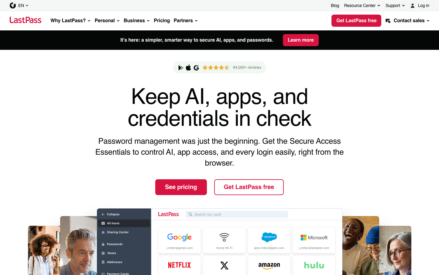
LastPass
CybersecurityLastPass embodies cybersecurity confidence with its striking crimson red primary color that commands attention and conveys urgency around digital protection. The Source Sans 3 typography feels approachable yet authoritative, while the generous spacing and pill-shaped buttons create a modern, consumer-friendly interface that makes enterprise-grade security feel accessible to everyday users.
Design Identity
Signature Color
LastPass Crimson
#d32d27
Security urgency and digital protection authority - a bold red that signals both warning and trust in cybersecurity
Visual Identity
The combination of bold crimson call-to-action elements against clean white backgrounds with highly rounded (28px) pill-shaped buttons creates an instantly recognizable security-focused interface that feels both urgent and trustworthy.
Component Style
Distinctly rounded pill-shaped buttons (28px border radius) with clean edges and subtle shadows (0 2px 8px rgba(0,0,0,.1)). Form inputs use gentle inset shadows and moderate 8px corner radius. Everything feels soft yet secure with a consumer-friendly approachability.
Spacing Philosophy
Generous vertical breathing room between major sections creates a sense of clarity and trust, while the interface maintains clean organization with purposeful whitespace that doesn't feel sparse - balancing approachability with professional credibility.
Design Principles
- Button border radius is always 28px for pill-shaped CTAs
- Primary actions use #d32d27 crimson for maximum visibility
- Typography hierarchy uses Source Sans 3 exclusively with weights 400-700
- Box shadows never exceed 8px blur for subtle depth
- Form elements use 8px border radius for friendly accessibility
Target Audience
Privacy-conscious consumers and small business owners who need enterprise-grade security but want consumer-friendly simplicity - people who understand digital threats but aren't technical experts
Mood
Design descriptions are AI-generated based on visual analysis and may not fully reflect the brand's official design guidelines.
Design System
Typography Scale
| Element | Font | Size | Weight | Line Height |
|---|---|---|---|---|
| body | 16px | 400 | normal | |
| h1 | 72px | 500 | 72px | |
| h2 | 48px | 500 | 52px | |
| h3 | 22px | 500 | 28px | |
| h4 | 28px | 500 | 36px | |
| h5 | 14px | 700 | 20px | |
| p | 14px | 400 | 20px | |
| a | 16px | 700 | 24px | |
| button | 16px | 700 | 24px | |
| input | 16px | 400 | normal |
Color Palette
#00855f#3b70d4#f19b2b#b7c9ef#e2e4e6#0073e6#565656#d32d27#bbddc2#333f48#bac0ca#2c2a29