Help us build this. Leave comments, suggest improvements, and help create better design documentation for agents.
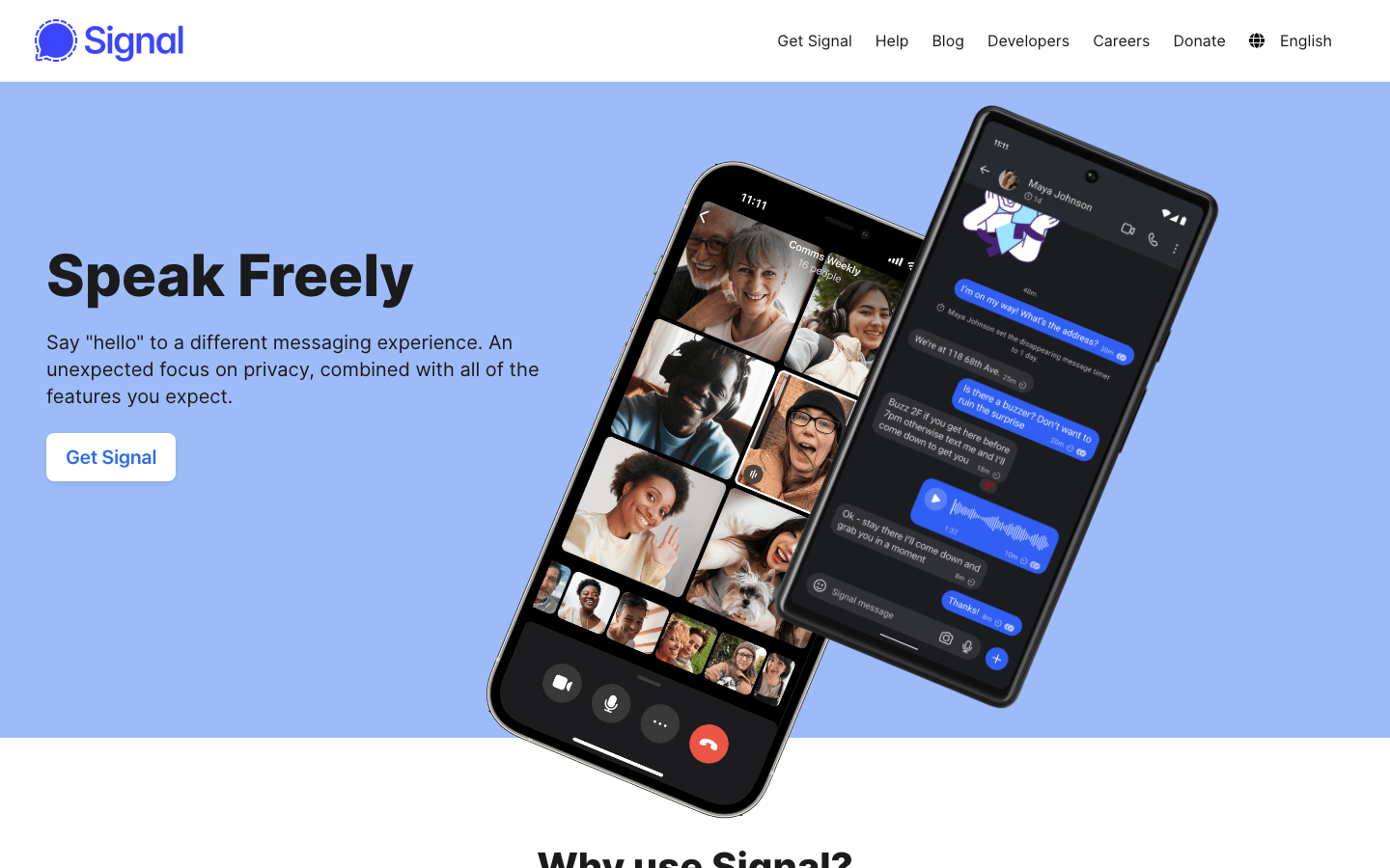
Signal
CybersecuritySignal projects a trustworthy, human-centered approach to digital communication through its calming periwinkle-blue gradient and ultra-heavy 800-weight Inter typography. The brand feels like a protective sanctuary - serious about privacy but warm in execution, with smartphone mockups floating in ethereal space that suggests secure, elevated conversations.
Design Identity
Signature Color
Signal Blue
#4285F4
Trustworthy communication sanctuary - balancing tech credibility with human warmth
Visual Identity
Floating smartphone mockups against soft gradient backgrounds, with extremely bold 800-weight headlines that feel both protective and approachable - creating a sense of elevated, secure digital spaces.
Component Style
Soft, approachable buttons with generous rounded corners (approximately 8-12px radius), minimal shadows, and gentle hover states. Components feel cushioned and safe rather than sharp or aggressive - everything designed to reduce friction and anxiety around privacy tools.
Spacing Philosophy
Generous breathing room around hero elements with large 40-60px gaps, while maintaining intimate clustering of related content. The spacing creates a sense of calm professionalism - never cramped, always considered.
Design Principles
- Ultra-heavy 800-weight headlines for authority and trustworthiness
- Gradient backgrounds create depth without shadows
- Smartphone mockups always shown at human angles, never perfectly straight
- Blue dominates but never overwhelms - always balanced with white space
- Rounded corners on all interactive elements for approachability
Target Audience
Privacy-conscious individuals who want secure messaging without sacrificing usability - people who care about digital rights but aren't necessarily technical experts
Mood
Design descriptions are AI-generated based on visual analysis and may not fully reflect the brand's official design guidelines.
Design System
Typography Scale
| Element | Font | Size | Weight | Line Height |
|---|---|---|---|---|
| body | 16px | 400 | 24px | |
| h1 | 60px | 800 | 64px | |
| h2 | 40px | 800 | 44px | |
| h3 | 28px | 800 | 32px | |
| p | 24px | 400 | 24px | |
| a | 16px | 400 | 24px | |
| button | 24px | 400 | normal | |
| nav | 16px | 400 | 24px | |
| header | 16px | 400 | 24px | |
| footer | 16px | 400 | 24px |
Color Palette
No colors extracted