Help us build this. Leave comments, suggest improvements, and help create better design documentation for agents.
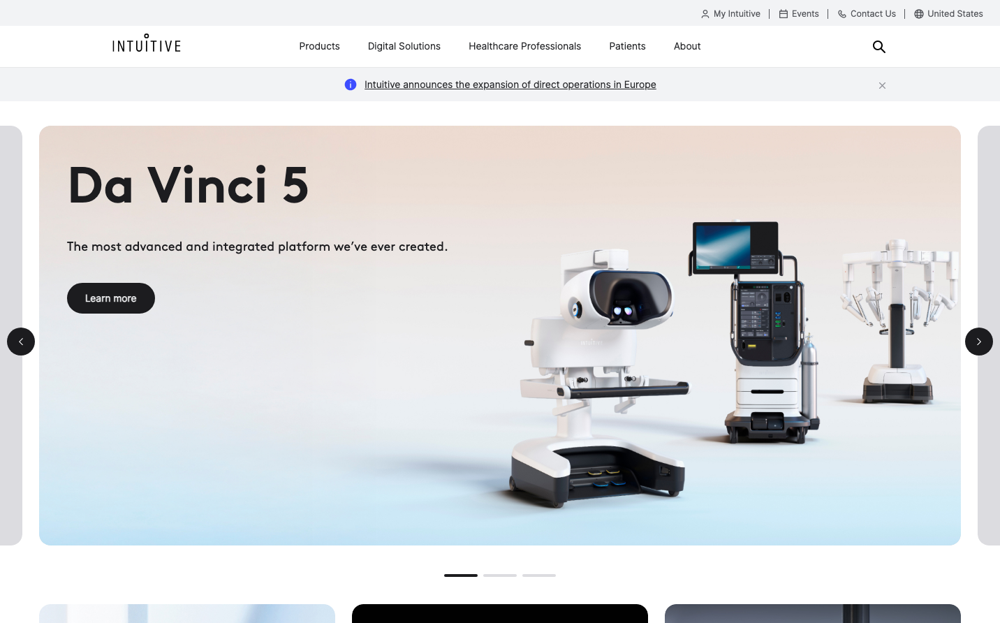
Intuitive
HealthcareIntuitive presents surgical-grade sophistication through a whisper-quiet aesthetic that lets revolutionary medical technology take center stage. The brand radiates cathedral-like spaciousness with museum-quality precision, where every element feels orchestrated with life-saving intentionality.
Design Identity
Signature Color
Surgical Silence
#F5F3F0
sterile confidence and premium medical precision - the calming neutrality that surgeons trust
Visual Identity
Cathedral-scale whitespace surrounding hero typography that dominates 40% of the viewport, with robotic surgical equipment floating in ethereal negative space like precious artifacts in a medical museum.
Component Style
Minimal geometric buttons with subtle rounded corners and invisible borders - everything feels weightless and pristine, like surgical instruments designed to disappear until needed.
Spacing Philosophy
Monumental breathing room with 100px+ gaps between major sections creates a sense of surgical precision, while tight component spacing maintains focus on the life-saving technology.
Design Principles
- Hero headlines consume 30-40% of viewport height with 72px BrownProBold
- Medical equipment photography floats in negative space without hard boundaries
- Navigation remains whisper-quiet at 16px InterUI to never compete with products
- Button text uses 16px InterUI at 600 weight for confident but unassuming CTAs
- Color palette stays surgical - whites, soft grays, and single accent blues
Target Audience
Chief medical officers and surgical department heads who make million-dollar equipment decisions based on precision, reliability, and patient outcomes over flashy features.
Mood
Design descriptions are AI-generated based on visual analysis and may not fully reflect the brand's official design guidelines.
Design System
Typography Scale
| Element | Font | Size | Weight | Line Height |
|---|---|---|---|---|
| body | 16px | 400 | 24px | |
| h1 | 72px | 500 | 90px | |
| h2 | 14px | 700 | 21px | |
| p | 14px | 400 | 20px | |
| a | 12.64px | 400 | 20.5px | |
| button | 16px | 600 | 24px | |
| input | 14px | 400 | 24px | |
| nav | 16px | 400 | 24px | |
| footer | 11px | 400 | 16.5px |
Color Palette
#007aff