Help us build this. Leave comments, suggest improvements, and help create better design documentation for agents.
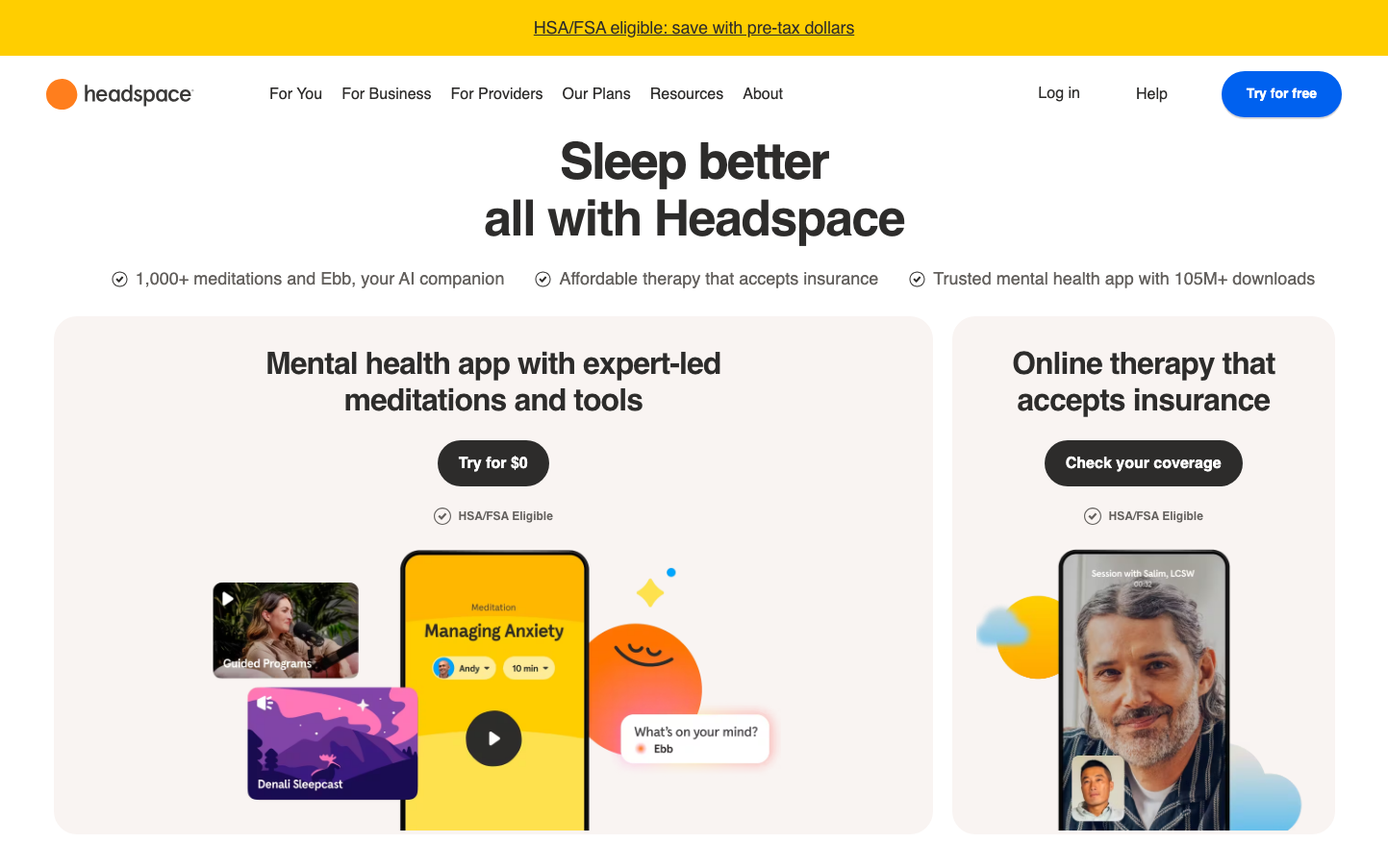
Headspace
HealthcareHeadspace creates a playful, approachable wellness sanctuary through whimsical illustrated UI elements and soft, organic shapes that feel like friendly companions rather than clinical tools. The warm amber-orange signature color radiates optimism and energy, while the custom Apercu typography strikes a balance between trustworthy professionalism and gentle accessibility.
Design Identity
Signature Color
Headspace Amber
#F68E2E
Mindful optimism and accessible wellness - warm enough to feel inviting, bold enough to cut through digital noise
Visual Identity
Illustrated, character-driven interface elements with rounded, organic shapes and a distinctive split-screen layout that separates app previews from therapy sessions, creating visual breathing room that mirrors the brand's mindfulness philosophy.
Component Style
Generously rounded buttons (24px+ radius) with soft shadows and substantial padding that feel like gentle touches rather than sharp clicks. Cards have organic, pillow-like qualities with subtle depth and breathing room between elements.
Spacing Philosophy
Asymmetrical, organic spacing that mimics natural rhythms rather than rigid grids. Large 80px+ gaps between major sections create meditative pauses, while UI elements cluster in comfortable, conversation-like groupings.
Design Principles
- Typography uses only Headspace Apercu across all elements for cohesive personality
- Border radius always exceeds 20px on interactive elements for softness
- Illustrations integrate directly into UI rather than decorative sidebars
- Yellow/orange accents appear in 60-80% saturation range for warmth without aggression
- Split-screen layouts separate different service offerings clearly
Target Audience
Wellness-conscious millennials and Gen-Z who want mental health tools that feel supportive rather than clinical, valuing approachable design over corporate sterility
Mood
Design descriptions are AI-generated based on visual analysis and may not fully reflect the brand's official design guidelines.
Design System
Typography Scale
| Element | Font | Size | Weight | Line Height |
|---|---|---|---|---|
| body | 16px | 400 | 18.4px | |
| h2 | 40px | 700 | 44px | |
| h3 | 40px | 700 | 46px | |
| h4 | 24px | 700 | 32px | |
| h5 | 32px | 700 | 38.4px | |
| h6 | 16px | 700 | 18.4px | |
| p | 18px | 500 | 26px | |
| a | 16px | 500 | 22px | |
| button | 16px | 700 | 17.6px | |
| input | 16px | 400 | 18.4px |
Color Palette
No colors extracted