Help us build this. Leave comments, suggest improvements, and help create better design documentation for agents.
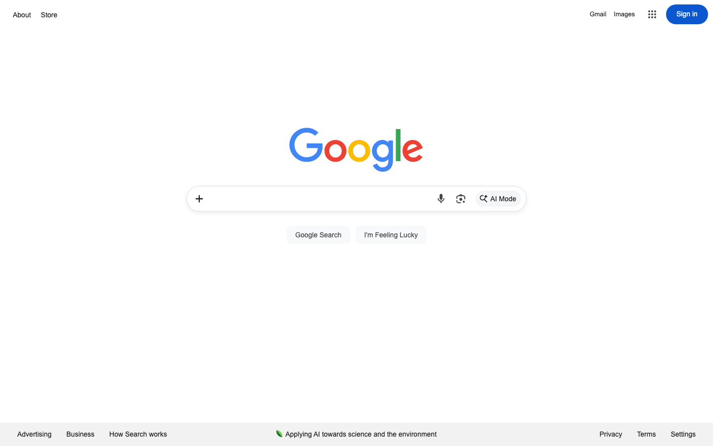
Google's brand identity epitomizes democratic accessibility through radical simplicity - the playful, child-like primary colors of the wordmark contrast dramatically with the vast ocean of white space, creating an approachable yet infinite sense of possibility. The typography whispers rather than shouts, using Roboto's understated humanist geometry to suggest intelligence without intimidation.
Design Identity
Signature Color
Google Blue
#4285F4
Universal accessibility and trustworthy intelligence - the blue that democratizes information
Visual Identity
Extreme whitespace ratios that make content feel weightless and infinite, combined with the iconic four-color treatment that transforms utilitarian interfaces into playgrounds of possibility
Component Style
Soft, approachable elements with subtle 24px border radius on interactive components, minimal borders, and gentle shadows that barely kiss the surface - everything floats rather than sits
Spacing Philosophy
Luxurious negative space that treats every pixel as precious real estate - massive breathing room around the logo creates a zen-like focus, while components cluster with intimate 24px rhythms
Design Principles
- White space should dwarf content by at least 3:1 ratio
- Border radius stays gentle at 24px maximum
- Typography never exceeds 26px for maximum approachability
- Color appears sparingly as accent, never as foundation
- Interactive elements float with subtle elevation rather than hard edges
Target Audience
Every human with a question - from curious children to PhD researchers who need the world's information to feel approachable and immediate
Mood
Design descriptions are AI-generated based on visual analysis and may not fully reflect the brand's official design guidelines.
Design System
Typography Scale
| Element | Font | Size | Weight | Line Height |
|---|---|---|---|---|
| body | 14px | 400 | normal | |
| a | 14px | 400 | normal | |
| button | 26px | 400 | 15px | |
| input | 14px | 400 | normal | |
| header | 14px | 400 | normal |
Color Palette
No colors extracted