Help us build this. Leave comments, suggest improvements, and help create better design documentation for agents.
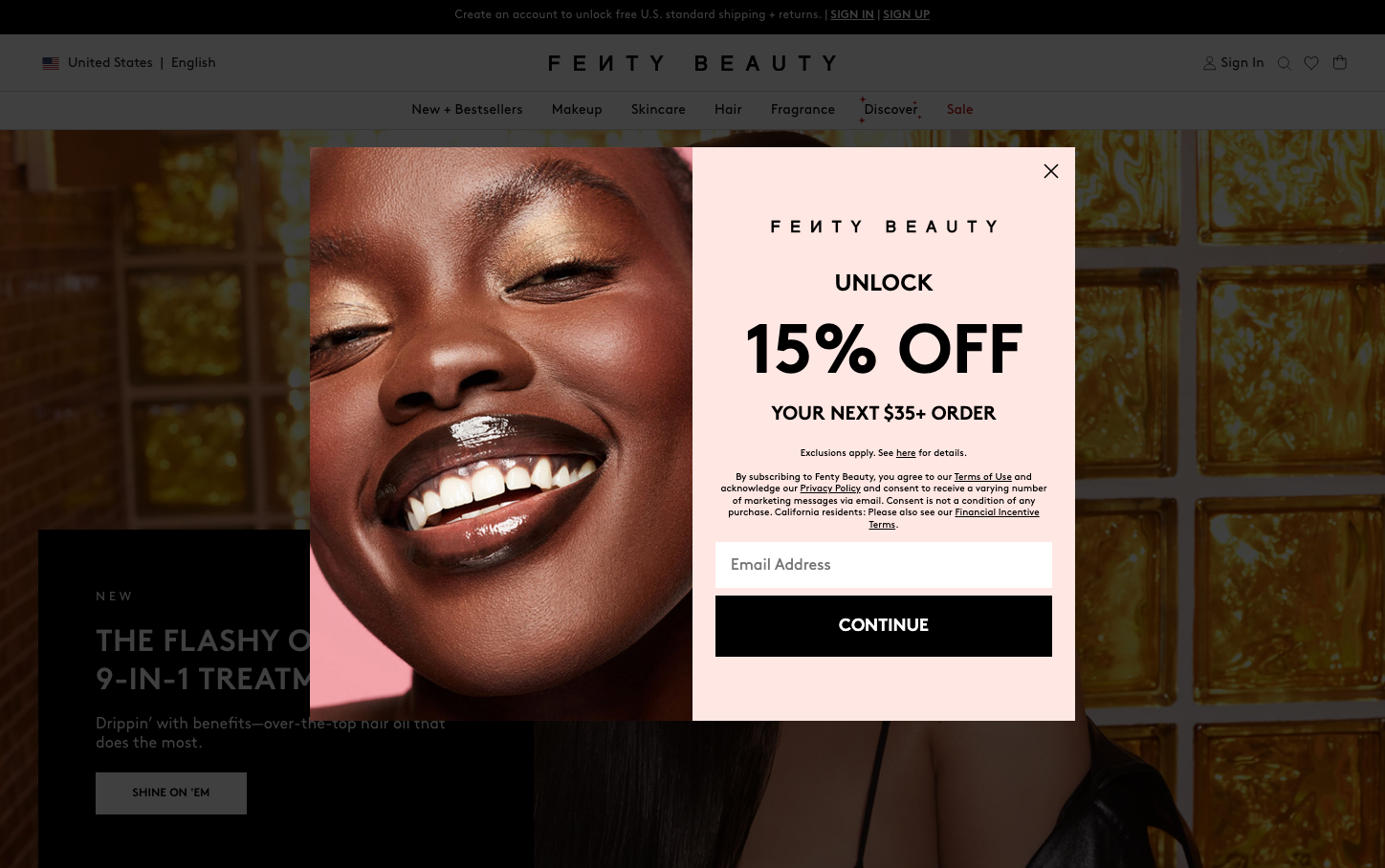
Fenty Beauty
BeautyFenty Beauty projects inclusive luxury through a bold pink and black color palette with strong editorial photography. The Brown typeface creates warmth and approachability while maintaining sophistication, telling a story of premium beauty that celebrates diversity.
Design Identity
Signature Color
Fenty Black
#000000
Bold confidence and inclusive luxury that stands out in the colorful beauty industry
Visual Identity
The combination of high-contrast editorial photography featuring diverse models with bold pink accent overlays and confident black typography creates an unmistakably inclusive luxury aesthetic.
Component Style
Buttons are clean rectangles with sharp corners and solid fills, no visible shadows or borders. The CONTINUE button uses maximum contrast with white text on black background, emphasizing directness and confidence over subtle design flourishes.
Spacing Philosophy
Generous whitespace around key elements creates breathing room that feels premium, while the modal uses centered alignment with substantial padding to focus attention on the discount offer.
Design Principles
- Typography uses only Brown font family across all elements for consistency
- High contrast ratios with pure black (#000000) and white for maximum impact
- Editorial photography always features diverse representation
- Modal overlays use pink backgrounds to soften the bold black/white contrast
- Text hierarchy relies on weight and size rather than color variation
Target Audience
Beauty enthusiasts aged 18-35 who value inclusivity and bold self-expression, particularly those underserved by traditional beauty brands
Mood
Design descriptions are AI-generated based on visual analysis and may not fully reflect the brand's official design guidelines.
Design System
Typography Scale
| Element | Font | Size | Weight | Line Height |
|---|---|---|---|---|
| body | 16px | 400 | 19.2px | |
| h1 | 32px | 700 | 40px | |
| h2 | 14px | 700 | 16px | |
| h3 | 16px | 700 | 20px | |
| h4 | 24px | 700 | 26px | |
| p | 12px | 400 | 18px | |
| a | 12px | 700 | 16px | |
| button | 14px | 400 | 18px | |
| input | 12px | 400 | 18px | |
| nav | 16px | 400 | 19.2px |
Color Palette
#000000#ffffff#171722#6d7278#e0e0e0#f7f7f7#303030#c70000#4b556c#9ebadc