Help us build this. Leave comments, suggest improvements, and help create better design documentation for agents.
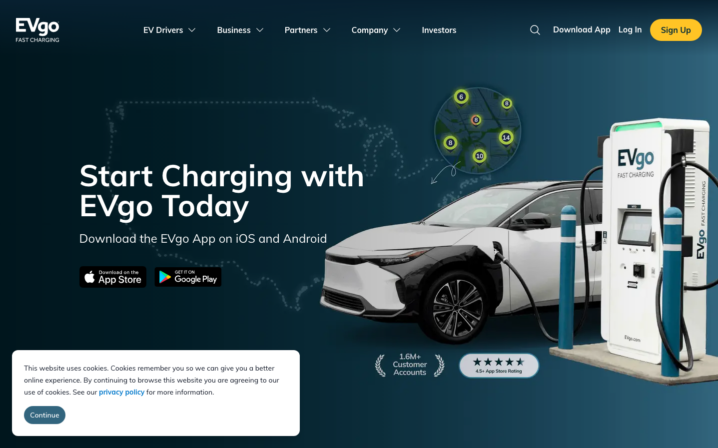
EVgo
Climate TechEVgo's brand exudes nocturnal sophistication through a deep teal-to-navy gradient backdrop that feels like twilight charging stations. The Muli typography brings friendly approachability to the high-tech EV space, while the composition balances industrial charging equipment with organic map visualizations, creating trust through technological prowess.
Design Identity
Signature Color
EVgo Electric Amber
#FDB82F
energetic optimism and electric innovation - the warm counterpoint to cool charging technology
Visual Identity
The distinctive dotted world map overlay combined with numbered location pins creates an immediately recognizable 'network visualization' aesthetic that no other EV charging brand uses.
Component Style
Buttons feature generous rounded corners (approximately 24px radius) with solid fills and no visible borders or shadows. The primary CTA uses the signature amber with clean, pill-like proportions that feel approachable rather than corporate.
Spacing Philosophy
Expansive breathing room dominates the layout with the hero content occupying roughly 40% of the left side, leaving the charging station imagery to breathe. Generous 32px+ gaps between elements create a premium, uncluttered charging experience.
Design Principles
- Typography never exceeds 60px for headlines, maintaining readability over impact
- All buttons use pill-shaped 24px+ border radius for friendly approachability
- Color palette limited to deep teals, whites, and signature amber for focus
- Dotted patterns and organic map elements soften industrial charging imagery
- Left-aligned text blocks with generous right margins create scannable hierarchy
Target Audience
Tech-forward EV early adopters who value network reliability and want charging to feel as seamless as using a smartphone app
Mood
Design descriptions are AI-generated based on visual analysis and may not fully reflect the brand's official design guidelines.
Design System
Typography Scale
| Element | Font | Size | Weight | Line Height |
|---|---|---|---|---|
| body | 16px | 400 | 25.6px | |
| h1 | 60px | 700 | 60px | |
| h2 | 48px | 700 | 48px | |
| h3 | 36px | 700 | 40px | |
| h4 | 24px | 700 | 32px | |
| p | 24px | 400 | 32px | |
| a | 16px | 400 | 25.6px | |
| button | 16px | 400 | 25.6px | |
| input | 16px | 400 | 24px | |
| nav | 16px | 400 | 25.6px |
Color Palette
#3b82f6#ffffff