Help us build this. Leave comments, suggest improvements, and help create better design documentation for agents.
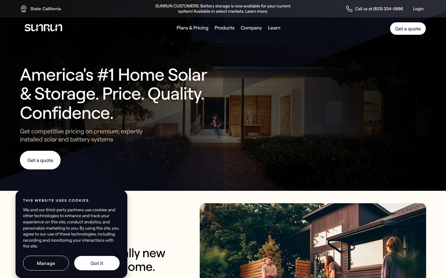
Sunrun
Climate TechSunrun employs a premium residential aesthetic with bold, architectural typography that conveys established authority in home solar. The dark overlay treatment creates intimate warmth while maintaining professional credibility, suggesting solar as a natural extension of modern home living.
Design Identity
Signature Color
Sunrun Pure White
#FFFFFF
Clean energy clarity and residential trust - the whiteness of solar panels and home safety
Visual Identity
Dramatic dark overlay photography with oversized white typography creates a cinematic, residential lifestyle feel that's more about home transformation than technology
Component Style
Soft pill-shaped buttons with generous padding feel approachable and residential-friendly. Clean white backgrounds with subtle rounded corners avoid industrial tech aesthetics in favor of home comfort
Spacing Philosophy
Luxurious breathing room with large text blocks and generous button padding creates a premium residential consultation experience rather than rushed online conversion
Design Principles
- Typography dominates at 56px for headlines with 500 weight for authority without aggression
- Roobert font family throughout maintains consistent residential sophistication
- White text over dark imagery creates dramatic contrast and premium positioning
- Pill-shaped buttons with 24px+ radius feel residential-friendly vs sharp tech edges
- 16px base font size with 24px line height prioritizes readability for homeowner audience
Target Audience
Homeowners aged 35-55 with disposable income who view solar as a premium home improvement investment rather than an environmental statement
Mood
Design descriptions are AI-generated based on visual analysis and may not fully reflect the brand's official design guidelines.
Design System
Typography Scale
| Element | Font | Size | Weight | Line Height |
|---|---|---|---|---|
| body | 16px | 400 | 24px | |
| h1 | 56px | 500 | 61.6px | |
| h2 | 40px | 500 | 44px | |
| h3 | 20px | 500 | 24px | |
| p | 16px | 500 | 24px | |
| a | 16px | 500 | 24px | |
| button | 16px | 500 | 24px | |
| input | 13.3333px | 400 | normal | |
| header | 16px | 400 | 24px | |
| footer | 16px | 400 | 24px |
Color Palette
#007aff