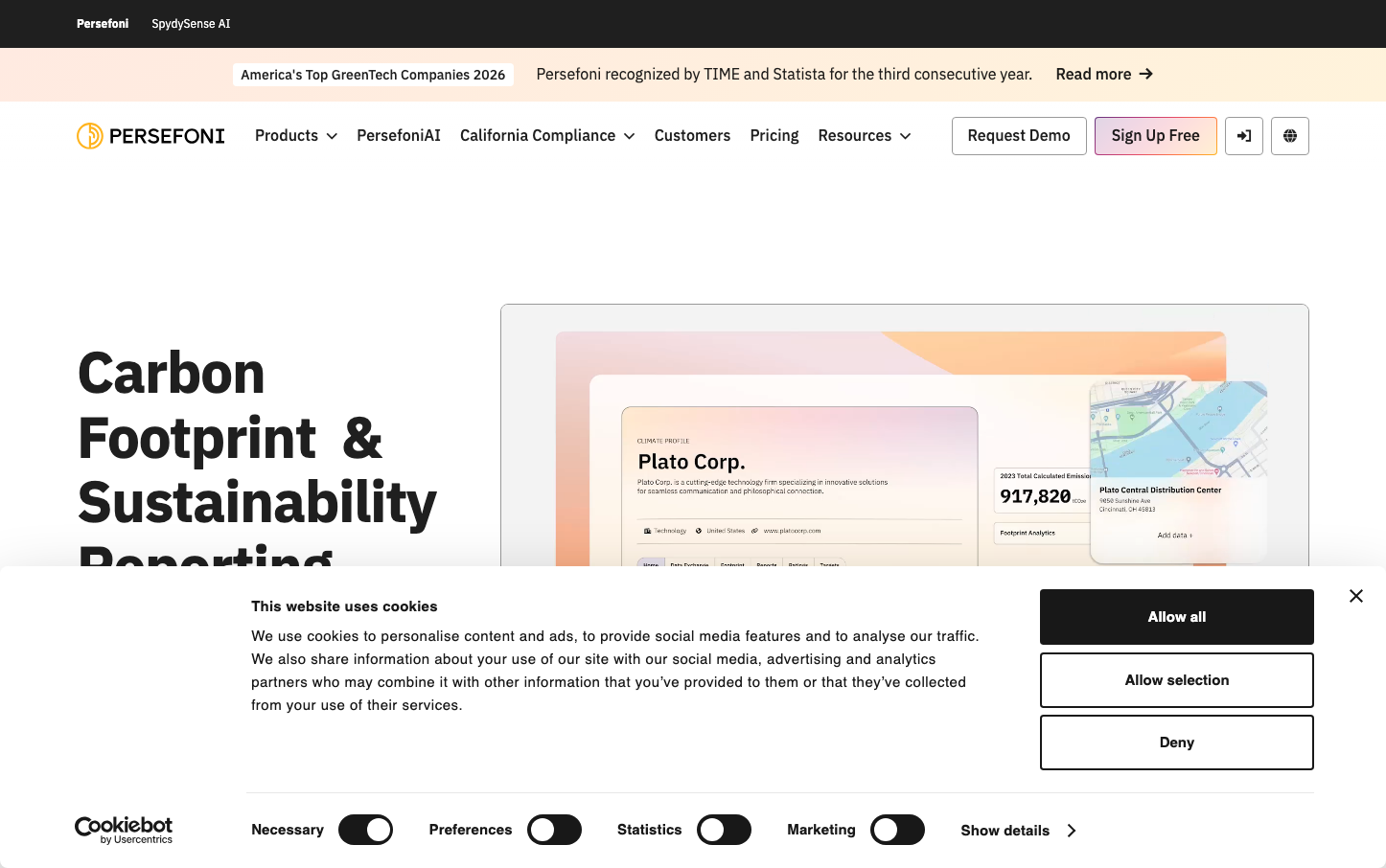
Help us build this. Leave comments, suggest improvements, and help create better design documentation for agents.
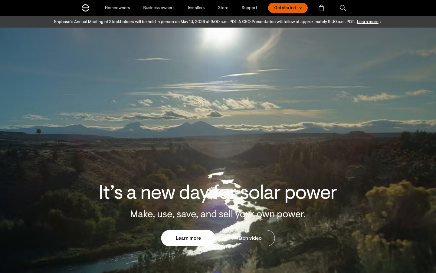
Enphase Energy
Climate TechEnphase Energy projects aspirational sustainability through cinematic landscape photography paired with confident, minimal typography. The warm orange primary button creates urgency against ethereal natural backdrops, while the custom Visuelt typeface feels approachable yet authoritative—speaking to homeowners ready to make the solar leap.
Design Identity
Signature Color
Enphase Solar Orange
#FF8C00
renewable energy optimism and call-to-action urgency
Visual Identity
Epic landscape photography with overlay typography—the brand uses nature as a canvas for bold messaging, creating an aspirational lifestyle narrative rather than technical product focus.
Component Style
Soft pill-shaped buttons with generous padding create approachability. The primary orange button has high contrast against natural backgrounds, while secondary buttons use transparent overlays that feel integrated with the photography.
Spacing Philosophy
Breathing room dominates—massive hero sections with centered content islands. Typography floats over imagery with ample negative space, creating a sense of openness that mirrors the vast landscapes shown.
Design Principles
- Hero typography always overlays landscape photography
- Primary buttons use 24px+ border radius for pill effect
- Body text never exceeds 20px to maintain readability over imagery
- Orange CTAs provide single focal point per screen section
- Enphase Visuelt font family used exclusively across all elements
Target Audience
Environmentally conscious homeowners aged 35-55 with disposable income who view solar as lifestyle upgrade, not just utility savings
Mood
Design descriptions are AI-generated based on visual analysis and may not fully reflect the brand's official design guidelines.
Design System
Typography Scale
| Element | Font | Size | Weight | Line Height |
|---|---|---|---|---|
| body | 16px | 400 | normal | |
| h1 | 64px | 400 | 76.8px | |
| h3 | 42px | 400 | 54.6px | |
| h4 | 32px | 400 | 41.6px | |
| h5 | 24px | 400 | 31.2px | |
| p | 20px | 400 | 32px | |
| a | 16px | 400 | normal | |
| button | 16px | 400 | normal | |
| input | 16px | 400 | 24px | |
| nav | 16px | 400 | normal |
Color Palette
#007aff#dcdcdc#757575#a8a8a8#616161#212121#ffffff#0c5ecb#940000#f9f9f9#0f70f0#fafafa