Help us build this. Leave comments, suggest improvements, and help create better design documentation for agents.
Domino's
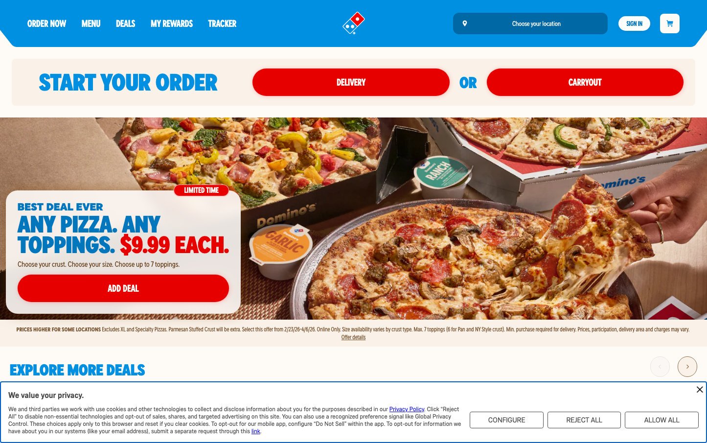
FoodDomino's combines aggressive red call-to-actions with approachable blue accents over warm cream backgrounds, creating a distinctly American fast-food energy that feels urgent yet friendly. The custom Dominos Sans typography reinforces brand ownership while maintaining high readability for quick ordering decisions.
Design Identity
Signature Color
Domino's Red
#e31837
urgent hunger satisfaction and bold American fast-food confidence
Visual Identity
Pill-shaped red buttons with stark white text create unmistakable urgency, while the warm cream background (#fefaf6) softens the aggressive sales approach with approachable comfort.
Component Style
Fully rounded pill buttons (24px+ radius) with bold backgrounds and no borders - designed for maximum finger-tap appeal on mobile. Cards and containers use subtle rounded corners with warm shadows, prioritizing accessibility over sophistication.
Spacing Philosophy
Dense, mobile-first layout with minimal whitespace between action items to accelerate ordering flow. Generous padding inside interactive elements (16px+) ensures easy touch targets while keeping overall page compact.
Design Principles
- Primary CTAs always use pill-shaped buttons with 24px+ border radius
- Red buttons reserved exclusively for purchase/order actions
- Typography limited to Dominos Sans family for brand consistency
- Warm cream backgrounds (#fefaf6) never pure white
- Blue accent color (#0090e2) only for secondary navigation and highlights
Target Audience
Busy families and young professionals who prioritize speed and convenience over gourmet experiences, expecting frictionless mobile ordering
Mood
Design descriptions are AI-generated based on visual analysis and may not fully reflect the brand's official design guidelines.
Design System
Typography Scale
| Element | Font | Size | Weight | Line Height |
|---|---|---|---|---|
| body | 16px | 400 | 24px | |
| h1 | 48px | 700 | 43.2px | |
| h2 | 16px | 400 | 20px | |
| h3 | 16px | 400 | 20px | |
| p | 48px | 700 | 43.2px | |
| a | 14px | 700 | 20px | |
| button | 18px | 400 | 28px | |
| nav | 18px | 400 | 28px | |
| header | 16px | 400 | 20px | |
| footer | 16px | 400 | 20px |
Color Palette
#d4d4d4#313131#fefaf6#0090e2#ccefff#bde9ff#7ac9f3#52b6ee#29a3e8#0083ce#0077bd#0069a5


