Help us build this. Leave comments, suggest improvements, and help create better design documentation for agents.
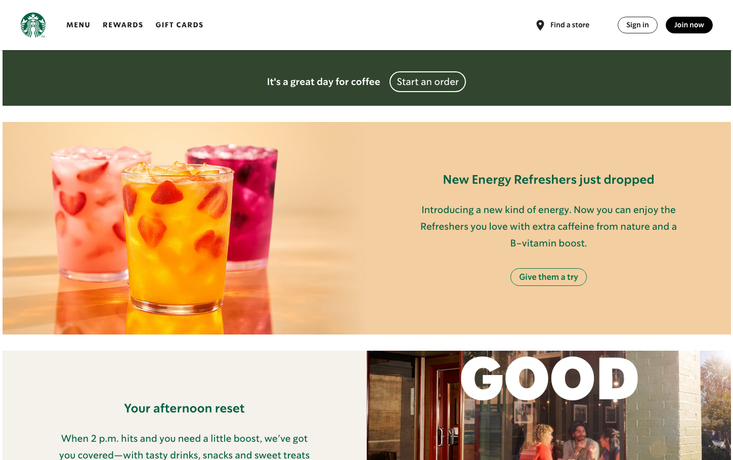
Starbucks
FoodStarbucks employs a warm, earth-toned aesthetic with deep forest green as the foundation and vibrant accent colors that evoke the energy of fresh fruit beverages. The SoDoSans typography feels approachable yet confident, while the pill-shaped buttons create a soft, inviting interaction pattern that mirrors the café experience.
Design Identity
Signature Color
Starbucks Forest Green
#006241
Heritage coffee craftsmanship and premium café culture authenticity
Visual Identity
The distinctive use of full-bleed color blocks with warm peach/cream backgrounds, combined with pill-shaped buttons (50px border radius) and the contrast between dark green headers and vibrant product imagery creates an unmistakable café-luxe aesthetic.
Component Style
Buttons are distinctly pill-shaped with 50px border radius, creating soft, welcoming interactions. Cards use subtle 12px radius with gentle shadows (0px 1px 1px rgba(0,0,0,0.24)). Everything feels rounded and approachable with smooth 0.2s ease transitions.
Spacing Philosophy
Generous breathing room between major sections creates a relaxed café atmosphere, while the layout balances dense product showcases with open white space to let hero imagery dominate the visual hierarchy.
Design Principles
- Button border radius is always 50px for pill-shaped CTAs
- Card border radius stays at 12px for subtle roundedness
- All transitions use 0.2s ease for consistent smoothness
- Color blocks span full-width for immersive section breaks
- Typography weights jump from 400 to 600 with no intermediates
Target Audience
Urban professionals and lifestyle-conscious consumers who view coffee as a daily ritual and premium experience, not just caffeine delivery
Mood
Design descriptions are AI-generated based on visual analysis and may not fully reflect the brand's official design guidelines.
Design System
Typography Scale
| Element | Font | Size | Weight | Line Height |
|---|---|---|---|---|
| body | 16px | 400 | 24px | |
| h1 | 24px | 600 | 36px | |
| h2 | 19px | 600 | 33.25px | |
| p | 19px | 600 | 33.25px | |
| a | 16px | 700 | 19.2px | |
| button | 24px | 400 | 36px | |
| nav | 16px | 400 | 24px | |
| header | 16px | 400 | 24px | |
| footer | 16px | 400 | 24px | |
| main | 16px | 400 | 24px |
Color Palette
#ffffff#f9f9f9#f2f0eb#edebe9#000000#006241#00754a#d4e9e2#2b5148#1e3932#cba258#dfc49d