Help us build this. Leave comments, suggest improvements, and help create better design documentation for agents.
Dialogue
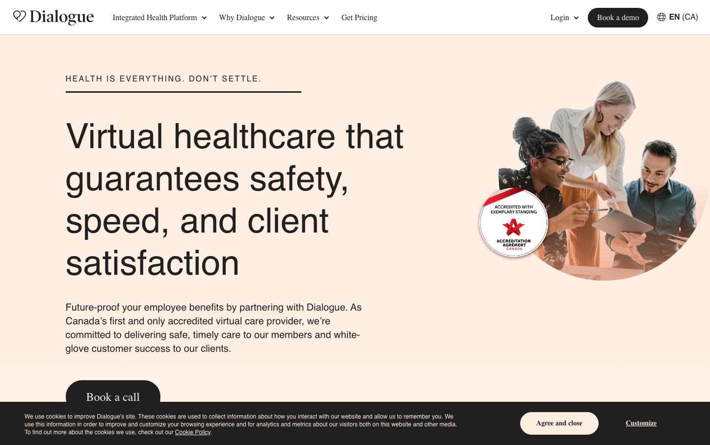
HealthcareDialogue creates a sophisticated healthcare identity through the dramatic contrast of editorial serif headlines with clean sans-serif body text, wrapped in warm peachy tones that humanize medical technology. The brand feels like a premium health magazine brought to life as a digital platform.
Design Identity
Signature Color
Healthcare Warmth
#F5E6D3
approachable medical care that removes clinical coldness while maintaining professional trust
Visual Identity
The distinctive use of Poynter Oldstyle Display for massive headlines creates an editorial, almost journalistic authority that's unexpected in healthcare tech - it's instantly recognizable by this publishing-meets-medicine aesthetic.
Component Style
Buttons have generous rounded corners (approximately 24px radius) with solid fills and no visible borders or shadows - they feel soft and approachable rather than sharp or clinical, matching the warm healthcare positioning.
Spacing Philosophy
Extremely generous vertical spacing creates a luxury magazine layout - large headline takes up significant real estate with ample breathing room, while the right side dedicates equal space to a single hero image, creating perfect visual balance.
Design Principles
- Headlines use Poynter Oldstyle Display at massive scale (71px) for editorial authority
- Body text stays at modest 16px Roboto for readability and approachability
- Warm peachy background (#F5E6D3) dominates over clinical whites
- 50/50 split layout between text and imagery for perfect balance
- Accreditation badges prominently displayed to build medical trust
Target Audience
HR benefits managers and employees at mid-to-large companies seeking premium virtual healthcare that feels personal rather than institutional
Mood
Design descriptions are AI-generated based on visual analysis and may not fully reflect the brand's official design guidelines.
Design System
Typography Scale
| Element | Font | Size | Weight | Line Height |
|---|---|---|---|---|
| body | 16px | 400 | 24px | |
| h1 | 71px | 400 | 86px | |
| h2 | 32px | 400 | 38px | |
| h3 | 16px | 400 | 20px | |
| h4 | 12px | 400 | 20px | |
| h6 | 30px | 400 | 37.5px | |
| p | 12px | 400 | 16px | |
| a | 12px | 400 | 16px | |
| button | 14px | 400 | 24.5px | |
| input | 14px | 400 | 24px |
Color Palette
#007aff