Help us build this. Leave comments, suggest improvements, and help create better design documentation for agents.
Coupa
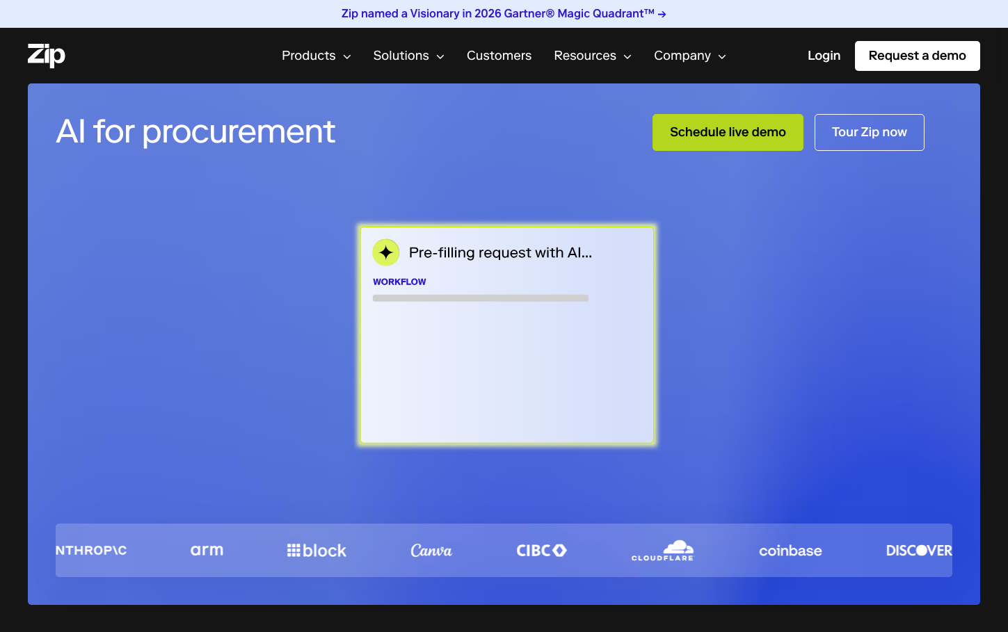
SaaS ManagementCoupa's brand radiates sophisticated enterprise AI confidence through deep navy foundations contrasted with energetic cyan accents and vibrant gradient flourishes. The bold Poppins typography creates authority while maintaining approachability, perfectly balancing corporate gravitas with innovation energy.

Design Identity
Signature Color
Coupa Cyan
#4DD0E7
AI-powered intelligence and digital transformation trust
Visual Identity
Dynamic gradient overlays on deep navy foundations with strategically placed cyan accent elements that create a sense of data flowing through intelligent systems.
Component Style
Smooth rounded corners with generous padding, bright cyan buttons with subtle depth, no harsh borders - everything feels fluid and intelligent with a premium SaaS confidence.
Spacing Philosophy
Generous breathing room with 40-60px section gaps that establish enterprise credibility, while compact 16-24px internal spacing keeps information dense yet digestible.
Design Principles
- Button radius consistently 24px for pill-shaped confidence
- Typography uses only Poppins with 3 core weights: 400, 500, 600
- Cyan accent appears in 20% of interactive elements for visual hierarchy
- Navy gradients overlay 80% of hero sections
- White text maintains 4.5:1 contrast on all dark backgrounds
Target Audience
CFOs and procurement executives at Fortune 500 companies who need AI-powered spend intelligence to transform their financial operations
Mood
Design descriptions are AI-generated based on visual analysis and may not fully reflect the brand's official design guidelines.
Design System
Typography Scale
| Element | Font | Size | Weight | Line Height |
|---|---|---|---|---|
| body | 16px | 400 | 24px | |
| h1 | 48px | 400 | 60px | |
| h2 | 40px | 500 | 48px | |
| h3 | 24px | 600 | 30px | |
| p | 13.12px | 600 | 17.056px | |
| a | 14.08px | 700 | 21.12px | |
| button | 18px | 400 | normal | |
| input | 16px | 600 | normal | |
| nav | 16px | 400 | 24px | |
| header | 16px | 400 | 24px |
Color Palette
#7a00df#007cba#006ba1#005a87#000000#abb8c3#ffffff#f78da7#cf2e2e#ff6900#fcb900#7bdcb5