Help us build this. Leave comments, suggest improvements, and help create better design documentation for agents.
Costco
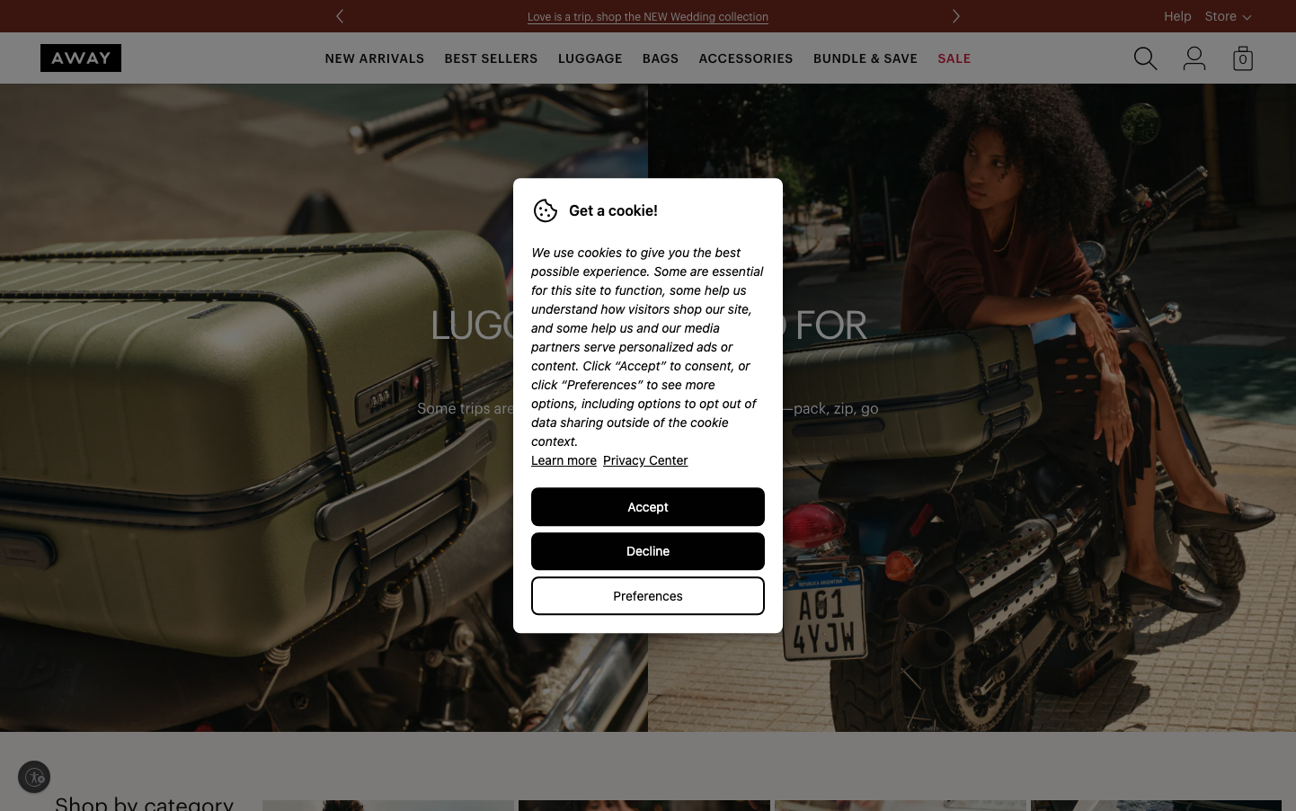
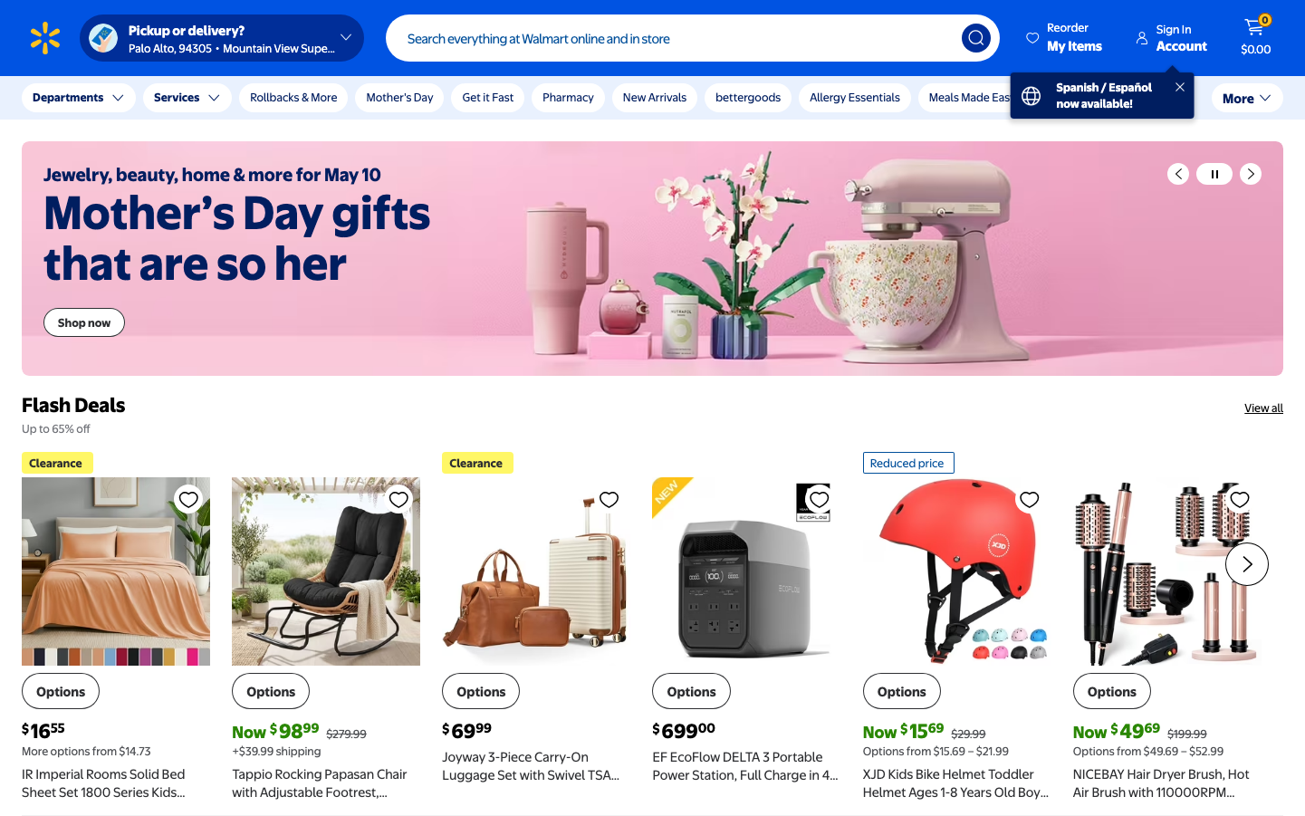
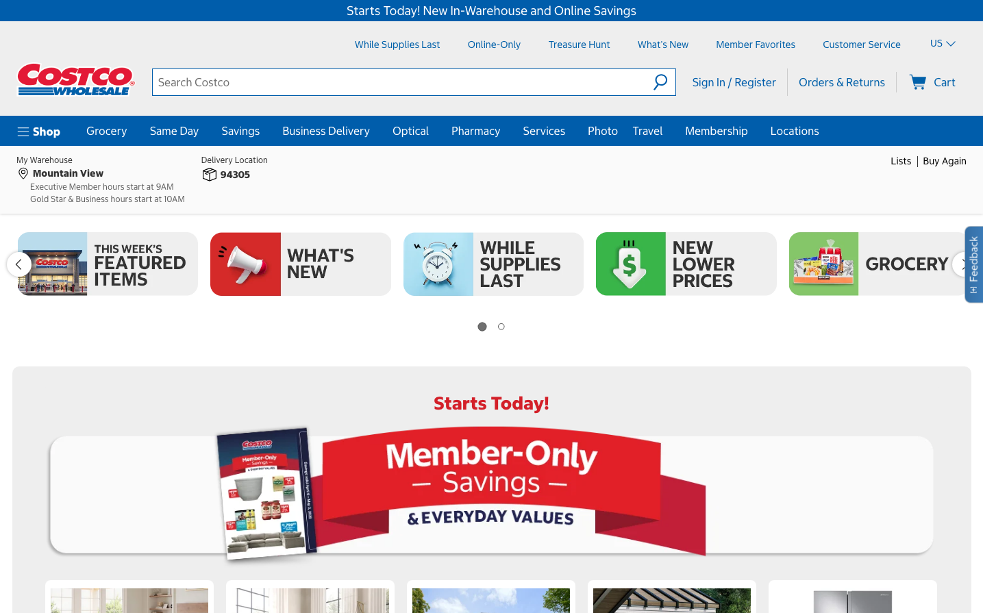
RetailCostco's design embodies warehouse-scale efficiency with a bold red-and-blue palette that screams American retail trust. The dense, information-heavy layout mirrors the packed warehouse experience - maximizing value and content per square inch without sacrificing functionality.
Design Identity
Signature Color
Costco Red
#E31837
Bulk savings urgency and wholesale accessibility - the color of member-exclusive deals
Visual Identity
High-density card-based layout with promotional badges and savings callouts scattered throughout, creating a 'treasure hunt' browsing experience that mimics walking through warehouse aisles
Component Style
Rectangular cards with subtle shadows and minimal border radius, featuring bold promotional overlays and bright accent colors. Everything feels substantial and clickable, like physical warehouse signage translated to digital.
Spacing Philosophy
Compact spacing that maximizes content density - tight 8-12px gaps between elements with generous 24px+ section breaks. The rhythm prioritizes information throughput over breathing room.
Design Principles
- Border radius stays minimal at 4-8px maximum for institutional feel
- Typography uses only Costco Sans Web at 14px, 16px, 24px, and 32px sizes
- Red promotional elements always use high contrast white text
- Card layouts maintain consistent rectangular proportions
- Navigation stays horizontally dense with 16px+ padding
Target Audience
Budget-conscious families and small business owners who prioritize bulk savings and practical value over premium shopping experiences
Mood
Design descriptions are AI-generated based on visual analysis and may not fully reflect the brand's official design guidelines.
Design System
Typography Scale
| Element | Font | Size | Weight | Line Height |
|---|---|---|---|---|
| body | 16px | 400 | normal | |
| h1 | 32px | 700 | normal | |
| h2 | 24px | 700 | normal | |
| h3 | 14px | 400 | 21px | |
| p | 24px | 700 | 28.8px | |
| a | 16px | 400 | normal | |
| button | 14px | 400 | 14px | |
| input | 16px | 400 | 23px | |
| nav | 16px | 400 | normal | |
| header | 16px | 400 | normal |
Color Palette
No colors extracted