Help us build this. Leave comments, suggest improvements, and help create better design documentation for agents.
Chipotle
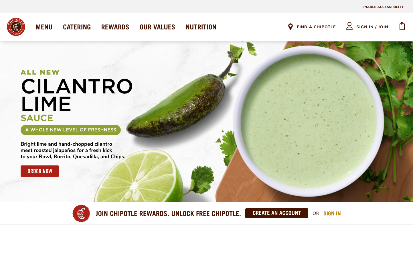
FoodChipotle's brand exudes bold, earthy warmth through its deep burgundy signature paired with natural browns and fresh greens. The typography mixing Trade Gothic's industrial strength with Nunito's approachable curves creates a balance of authentic craft and modern accessibility, perfectly embodying 'fast-casual' dining.
Design Identity
Signature Color
Chipotle Burgundy
#A81612
Bold authenticity and Mexican heritage - the color of dried chilies and rustic warmth that signals real food over processed alternatives
Visual Identity
The hero food photography with natural ingredients scattered around bowls/containers, combined with the distinctive burgundy-to-brown color story and mixed typography hierarchy of bold condensed headlines with friendly body text.
Component Style
Buttons are bold and rectangular with minimal border radius (2-4px), using the signature burgundy with strong contrast. Components feel substantial and grounded rather than floating - no subtle shadows, just solid presence with earthy color backgrounds.
Spacing Philosophy
Generous whitespace around hero imagery creates appetite appeal, while navigation and UI elements use tighter spacing for efficiency. The layout breathes around food but stays compact for functionality.
Design Principles
- Headlines use Trade Gothic Bold at large sizes (24px+) for impact
- Body text mixes Nunito and Times for warmth vs. readability
- Border radius stays minimal (under 4px) for authentic, no-nonsense feel
- Burgundy (#A81612) dominates CTAs and brand moments
- Natural ingredient photography always includes scattered fresh herbs/limes
Target Audience
Health-conscious millennials and Gen Z who want fast food that feels authentic and Instagram-worthy but don't want to sacrifice convenience or flavor
Mood
Design descriptions are AI-generated based on visual analysis and may not fully reflect the brand's official design guidelines.
Design System
Typography Scale
| Element | Font | Size | Weight | Line Height |
|---|---|---|---|---|
| body | 16px | 400 | normal | |
| h1 | 33.6px | 500 | 33.6px | |
| h2 | 24px | 500 | normal | |
| h3 | 18px | 500 | normal | |
| p | 16px | 400 | normal | |
| a | 11px | 700 | normal | |
| button | 16px | 700 | 32px | |
| header | 16px | 400 | normal | |
| footer | 16px | 400 | normal | |
| main | 16px | 400 | normal |
Color Palette
No colors extracted


