Help us build this. Leave comments, suggest improvements, and help create better design documentation for agents.
Bessemer
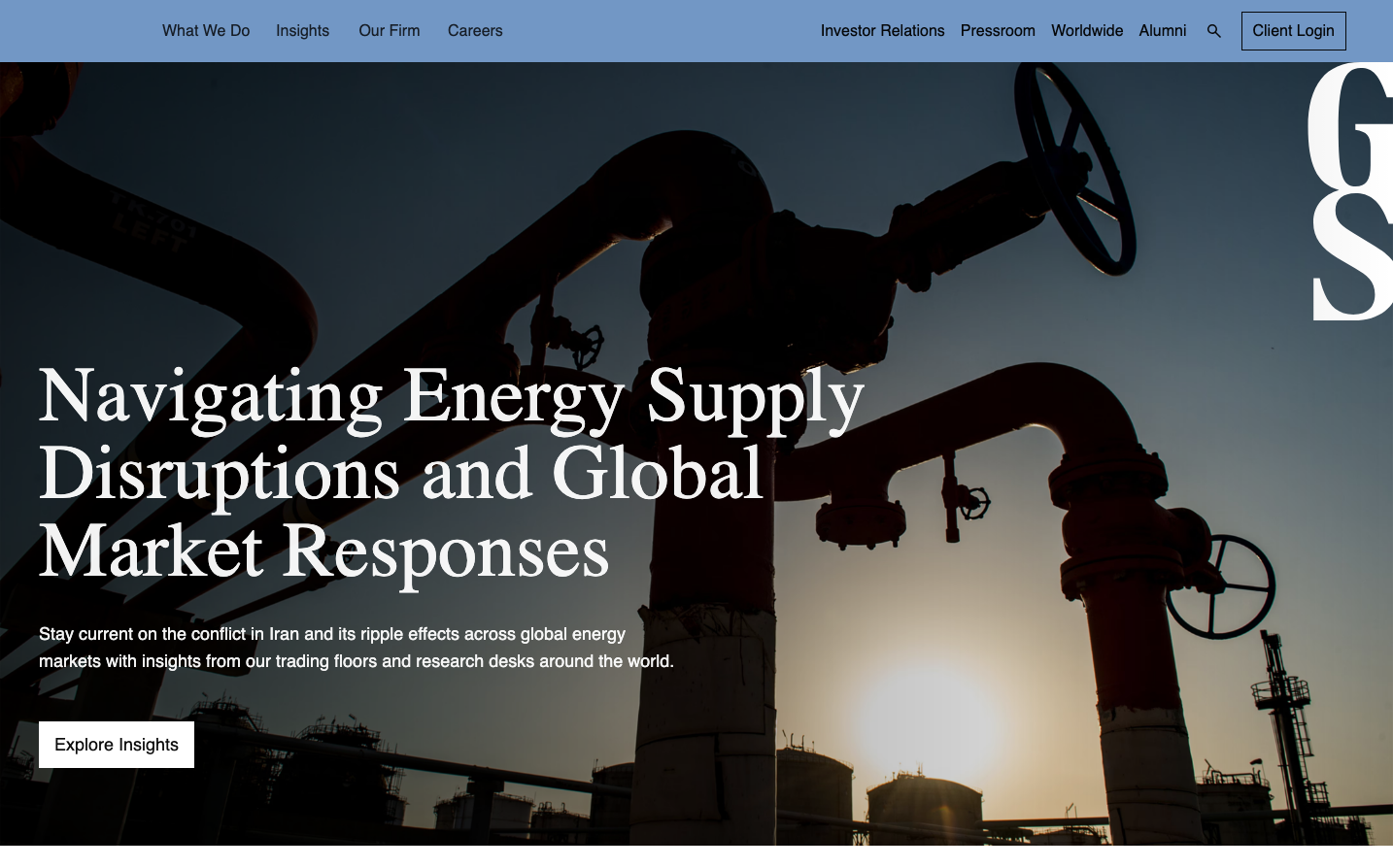
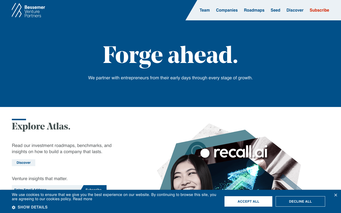
FinanceBessemer projects institutional gravitas through a deep nautical blue paired with bold serif headlines that command authority. The design balances venture capital sophistication with approachable warmth, using dramatic typography contrasts and generous whitespace to convey both prestige and accessibility.
Design Identity
Signature Color
Bessemer Deep Blue
#015089
institutional trust and venture capital authority - the color of serious money and long-term partnerships
Visual Identity
The dramatic juxtaposition of massive serif headlines against clean sans-serif body text on rich blue backgrounds - it's unmistakably editorial yet corporate, like a financial magazine cover
Component Style
Minimal, borderless elements with subtle rounded corners. Buttons appear clean with moderate padding, no heavy shadows - everything feels refined and understated rather than flashy tech startup
Spacing Philosophy
Luxuriously generous vertical spacing creates breathing room between major sections, while maintaining tight, purposeful groupings within content blocks - the rhythm suggests patience and long-term thinking
Design Principles
- Headlines use NoeDisplay serif at massive 100px sizes for maximum impact
- Body text maintains readable 22px Europa sans-serif throughout
- Blue dominates with #015089 as primary brand expression
- Whitespace ratios favor generous padding over dense information
- Typography hierarchy jumps dramatically from 22px to 100px
Target Audience
Series A through growth-stage founders who value institutional credibility and long-term strategic partnerships over quick wins
Mood
Design descriptions are AI-generated based on visual analysis and may not fully reflect the brand's official design guidelines.
Design System
Typography Scale
| Element | Font | Size | Weight | Line Height |
|---|---|---|---|---|
| body | 22px | 400 | normal | |
| h1 | 100px | 700 | 110px | |
| h2 | 40px | 700 | normal | |
| h3 | 40px | 700 | normal | |
| p | 19px | 400 | 25.9996px | |
| a | 22px | 400 | normal | |
| input | 14px | 700 | normal | |
| nav | 22px | 400 | normal | |
| header | 22px | 400 | normal | |
| footer | 22px | 400 | normal |
Color Palette
#7a00df#007cba#006ba1#005a87#000000#abb8c3#ffffff#f78da7#cf2e2e#ff6900#fcb900#7bdcb5