Help us build this. Leave comments, suggest improvements, and help create better design documentation for agents.
Bloomingdale's
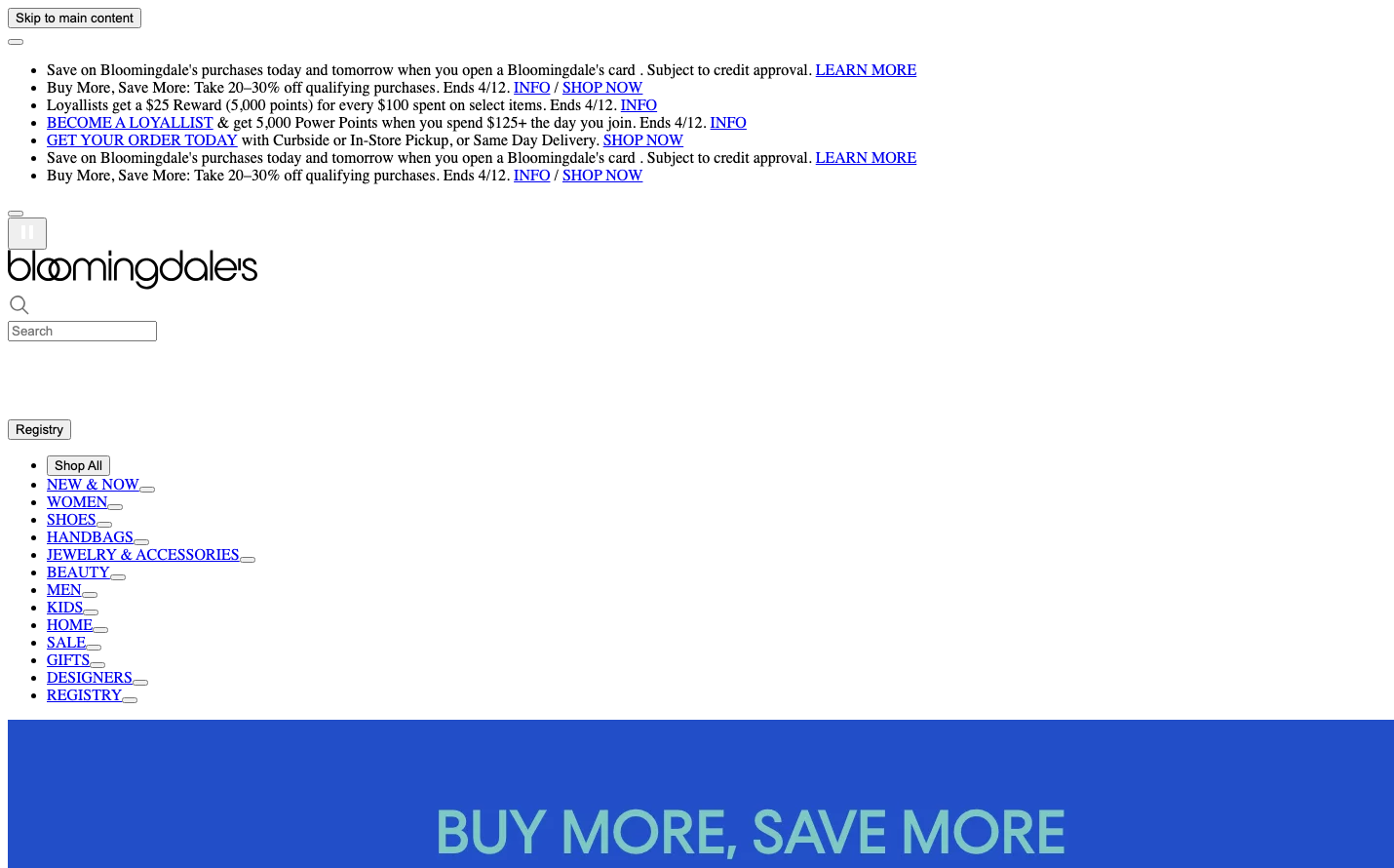
RetailBloomingdale's embodies traditional luxury retail through classical typography and institutional whitespace, creating an atmosphere of established prestige. The heavy use of Times serif across all content suggests heritage and sophistication, while the stark blue promotional banner creates dramatic contrast against the otherwise minimal interface.
Design Identity
Signature Color
Bloomingdale's Royal Blue
#2E5BBA
Luxury retail authority and established department store heritage
Visual Identity
The distinctive all-lowercase, custom-spaced logo wordmark with its unique letterforms, particularly the circular 'o's and flowing connections between letters, creates an immediately recognizable luxury retail signature.
Component Style
Utilitarian buttons with sharp corners and minimal styling - no shadows, subtle borders, focusing on functionality over ornamentation. The design prioritizes content hierarchy through typography rather than decorative UI elements.
Spacing Philosophy
Generous vertical whitespace creates breathing room between promotional content sections, while navigation links are tightly grouped. The layout feels spacious yet organized, reflecting traditional retail catalog sensibilities.
Design Principles
- Times serif dominates all content for editorial credibility
- Arial reserved strictly for form controls and interaction elements
- Blue promotional sections create stark contrast against white backgrounds
- Navigation uses consistent text-based links without decorative styling
- Minimal use of visual effects - relies on typography for hierarchy
Target Audience
Affluent shoppers who value established luxury brands and traditional department store experiences over trendy digital-first retailers
Mood
Design descriptions are AI-generated based on visual analysis and may not fully reflect the brand's official design guidelines.
Design System
Typography Scale
| Element | Font | Size | Weight | Line Height |
|---|---|---|---|---|
| body | 16px | 400 | normal | |
| h2 | 24px | 700 | normal | |
| h5 | 13.28px | 700 | normal | |
| h6 | 10.72px | 700 | normal | |
| p | 16px | 400 | normal | |
| a | 16px | 400 | normal | |
| button | 13.3333px | 400 | normal | |
| input | 13.3333px | 400 | normal | |
| nav | 16px | 400 | normal | |
| header | 16px | 400 | normal |
Color Palette
No colors extracted