Help us build this. Leave comments, suggest improvements, and help create better design documentation for agents.
Best Buy
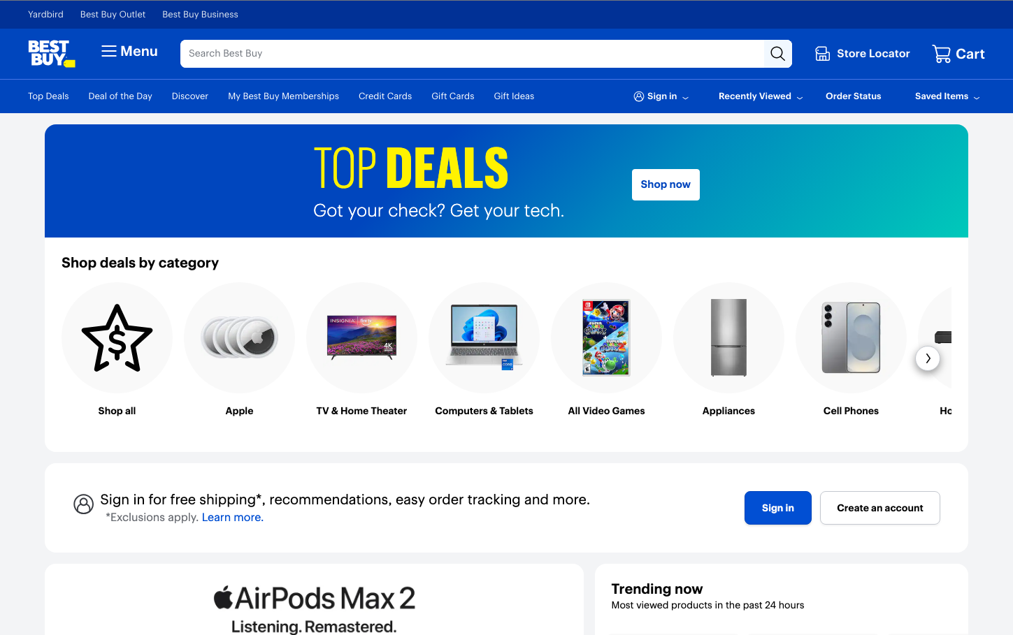
RetailBest Buy's brand aesthetic centers on bold technological optimism, using a striking blue-to-teal gradient that evokes digital transformation and electronic energy. The massive yellow 'TOP DEALS' typography creates an urgent, retail-focused hierarchy that screams value and immediacy, while the custom 'Human BBY Digital' typeface adds a distinctly tech-forward personality.
Design Identity
Signature Color
Best Buy Electric Blue
#0046be
Digital trust and technological authority - the color of reliable electronics retail
Visual Identity
The dramatic blue-to-teal gradient backgrounds paired with explosive yellow accent typography - this high-contrast combination immediately signals electronics retail energy and deal-focused urgency.
Component Style
Clean rectangular containers with minimal 4-8px border radius, no heavy shadows or borders. Components feel streamlined and product-focused, with white cards floating on gradient backgrounds. Buttons are solid fills with subtle rounding - utilitarian but approachable.
Spacing Philosophy
Generous vertical spacing creates breathing room between major sections, while product category grids use tight, efficient spacing to showcase maximum inventory. The layout prioritizes product discovery over luxurious whitespace.
Design Principles
- Border radius stays minimal: 2-8px maximum for subtle softening
- Typography hierarchy uses extreme size jumps: 13px body to 80px headlines
- Blue gradients always flow from deep blue to teal, never flat
- Yellow accents reserved for highest-priority content like deals
- Product imagery gets equal visual weight in grid layouts
Target Audience
Deal-conscious tech enthusiasts and mainstream consumers who want trusted electronics retail with clear value propositions
Mood
Design descriptions are AI-generated based on visual analysis and may not fully reflect the brand's official design guidelines.
Design System
Typography Scale
| Element | Font | Size | Weight | Line Height |
|---|---|---|---|---|
| body | 13px | 400 | 15.6px | |
| h1 | 80px | 300 | 76px | |
| h2 | 20px | 500 | 24px | |
| h3 | 15px | 600 | 30px | |
| h5 | 20px | 500 | 24px | |
| p | 25px | 300 | 30px | |
| a | 13px | 400 | 15.6px | |
| button | 13px | 400 | 15.6px | |
| input | 15px | 400 | 18px | |
| nav | 13px | 400 | 15.6px |
Color Palette
#ffffff#f0f2f4#c5cbd5#90959e#55555a#1d252c#000000#e0e6ef#0046be#001e73#70757d#040c13