Help us build this. Leave comments, suggest improvements, and help create better design documentation for agents.
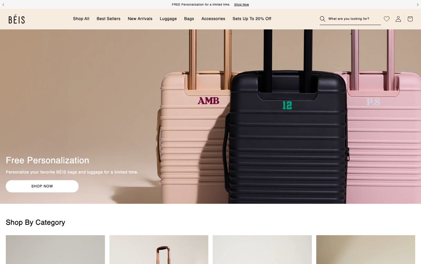
Beis
RetailBeis embodies warm, approachable luxury through its signature peachy-beige palette and distinctive Bebas Neue headings that feel confident yet inviting. The brand creates an atmosphere of aspirational accessibility - premium enough to feel special, approachable enough for everyday travel dreams.
Design Identity
Signature Color
Beis Blush
#f7ece0
warm aspirational luxury that feels approachable and feminine
Visual Identity
The warm peachy-beige background color combined with personalized luggage featuring custom initials creates an instantly recognizable lifestyle aesthetic that screams 'curated travel essentials for the modern woman'
Component Style
Soft, rounded elements with the primary CTA using generous pill-shaped borders (40px radius). Components feel cushioned and approachable rather than sharp or aggressive, with minimal shadows and emphasis on color over stark contrasts.
Spacing Philosophy
Generous breathing room with large hero sections that let products shine against the warm background. Tight 8px internal spacing keeps components intimate while allowing the lifestyle imagery to dominate the visual hierarchy.
Design Principles
- Bebas Neue headlines only, never for body text - creates strong hierarchy
- 40px border radius for pills, 0px for media - no in-between values
- Warm beige (#f7ece0) as the primary background, white reserved for overlays
- Personalization always prominently displayed on products
- Minimal shadows (0.0 opacity) - relies on color and typography for depth
Target Audience
Style-conscious millennial and Gen-Z women who view travel as lifestyle expression and want luggage that photographs well for social media
Mood
Design descriptions are AI-generated based on visual analysis and may not fully reflect the brand's official design guidelines.
Design System
Typography Scale
| Element | Font | Size | Weight | Line Height |
|---|---|---|---|---|
| body | 16px | 400 | 28.8px | |
| h1 | 30px | 400 | 0px | |
| h2 | 24px | 400 | 27.6px | |
| h3 | 16px | 400 | 16px | |
| p | 18px | 400 | 20.7px | |
| a | 12px | 400 | 14.4px | |
| button | 13.3333px | 400 | normal | |
| input | 16px | 400 | 24px | |
| nav | 16px | 400 | 28.8px | |
| header | 16px | 400 | 28.8px |
Color Palette
#000000#f7ece0#ffffff#7f7f7f#e2e2e2#111827