Help us build this. Leave comments, suggest improvements, and help create better design documentation for agents.
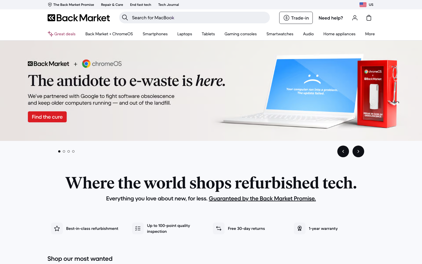
Back Market
E-commerceBack Market employs a bold, editorial aesthetic that positions refurbished tech as a premium lifestyle choice rather than a compromise. The design balances environmental urgency with consumer confidence through dramatic imagery, oversized headlines, and strategic color blocking that feels more magazine than marketplace.
Design Identity
Signature Color
Emergency Red
#DC2626
Environmental urgency and brand confidence - signals both the e-waste crisis and bold disruption of traditional retail
Visual Identity
Dramatic product photography combined with editorial headline treatments and strategic red accent packaging creates an unmistakably premium refurb marketplace aesthetic
Component Style
Clean, minimal buttons with subtle rounded corners and no heavy shadows - everything feels approachable yet sophisticated, prioritizing content over decorative elements
Spacing Philosophy
Generous breathing room around hero content with tight, efficient spacing in navigation - creates focus on key messages while maintaining functional density in utility areas
Design Principles
- Headlines use dramatically large font sizes to create editorial impact
- Red accents used sparingly but boldly for maximum attention
- Product imagery dominates with minimal decorative elements
- Typography hierarchy relies on size and weight, not color
- White space used strategically to isolate key value propositions
Target Audience
Environmentally conscious consumers who want premium tech experiences without the premium price - people who see refurbished as smart, not settling
Mood
Design descriptions are AI-generated based on visual analysis and may not fully reflect the brand's official design guidelines.
Design System
Typography Scale
| Element | Font | Size | Weight | Line Height |
|---|---|---|---|---|
| body | 16px | 400 | 24px | |
| h1 | 16px | 400 | 24px | |
| h2 | 16px | 600 | 24px | |
| h3 | 14px | 400 | 20px | |
| p | 16px | 600 | 24px | |
| a | 16px | 600 | 24px | |
| button | 16px | 400 | 24px | |
| input | 16px | 400 | 24px | |
| nav | 16px | 400 | 24px | |
| header | 16px | 400 | 24px |
Color Palette
#93c5fd#ffffff